IV Crown Showdown
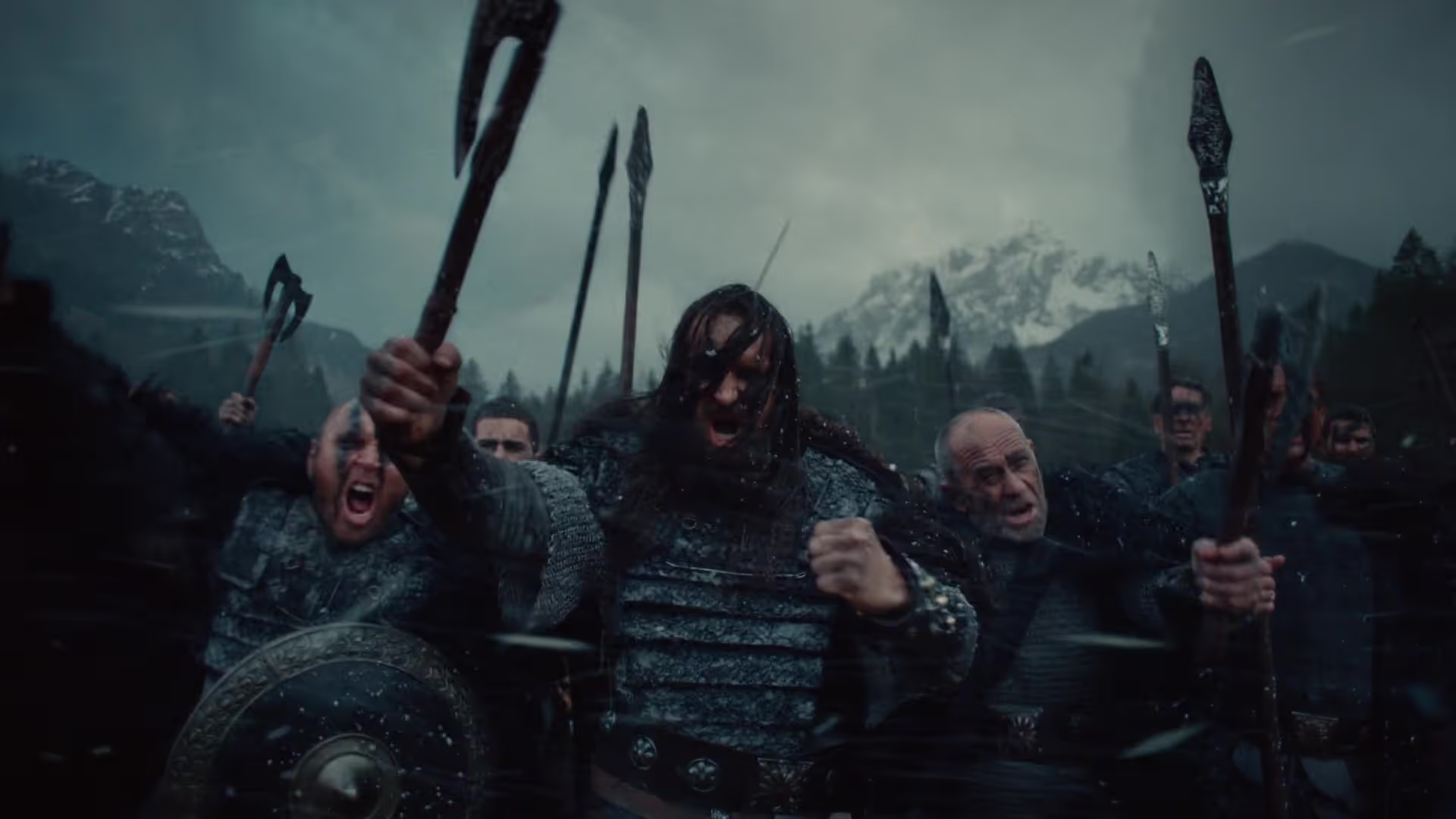
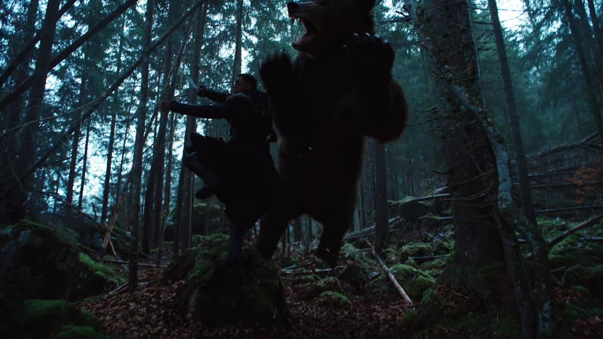
Prior to the release of the promo for the Beterbiev versus Bivol light-heavyweight fight, our studio worked alongside director Salomon Ligthelm to bring the warrior roots of Old Rus to life in the treatment stage. Cinematic tension and a dark, atmospheric tone formed the foundation of this concept. Rather than relying on the traditional, comedic promotional tropes often seen in modern combat sports marketing, the vision leaned into something gritty, grounded, and refreshingly filmic.
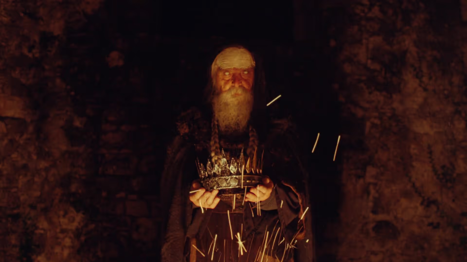
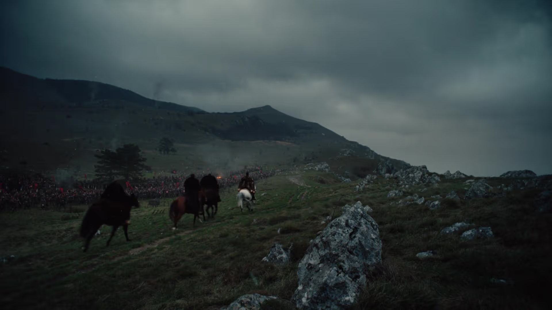
Capturing that mood within the pitch deck was a complex task. It required an extensive dive into historical film and television archives to find references that reflected both the heritage of these fighters and the ancient traditions of combat. We paired images of weathered landscapes and battle scenes with visual abstractions of nature, human endurance, and the elements. This created a sense of mysticism that gave the IV Crown the narrative weight of a ancient folklore legend. To honour the depth of this sporting legacy, every page layout was balanced to blend raw realism with mythic scale.
The design of the pitch deck was crafted in reverse, woven around our curated imagery like a tapestry. We selected gothic, runic typography to anchor the written narrative, whilst a sombre colour palette established the primary mood. Stark red and white accents provided simple but powerful highlights, echoing historical manuscripts and standing out boldly against the dark visual background to reinforce the theme of battle. By incorporating medieval etchings as a recurring graphic motif throughout the document, we tied individual story beats back to historical folklore.
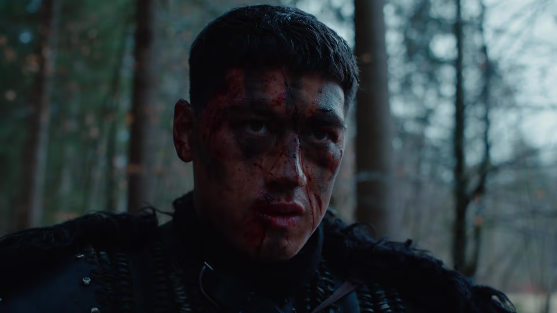

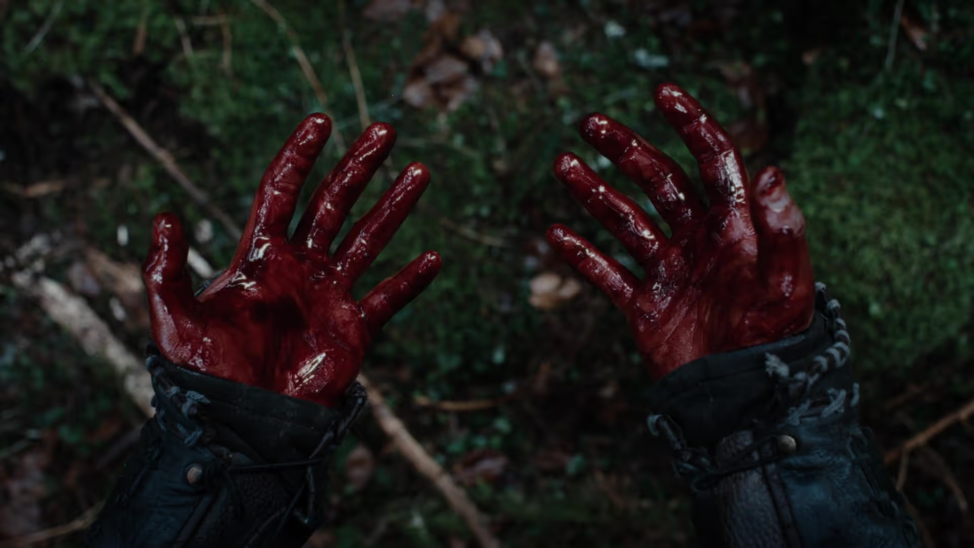
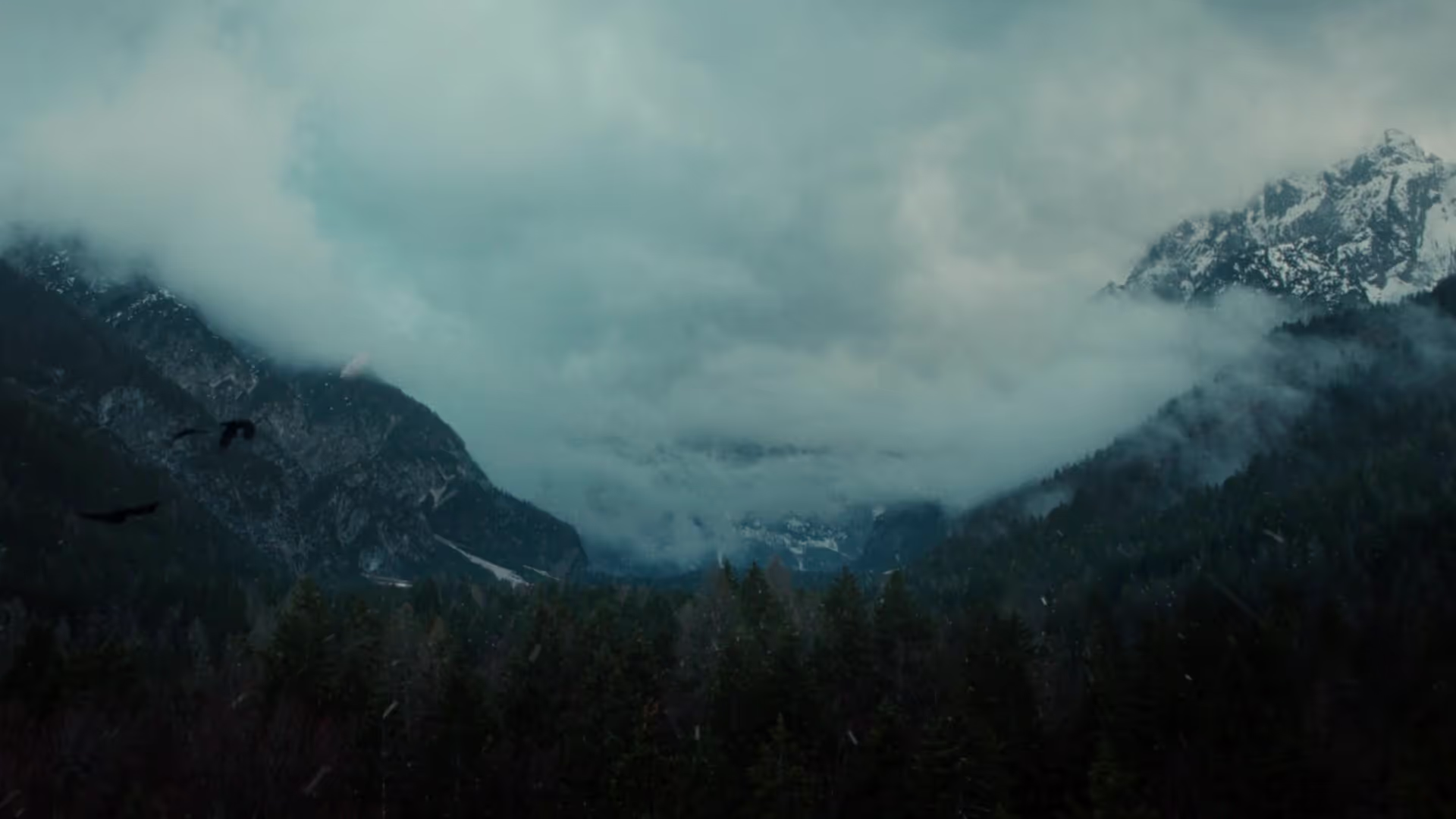
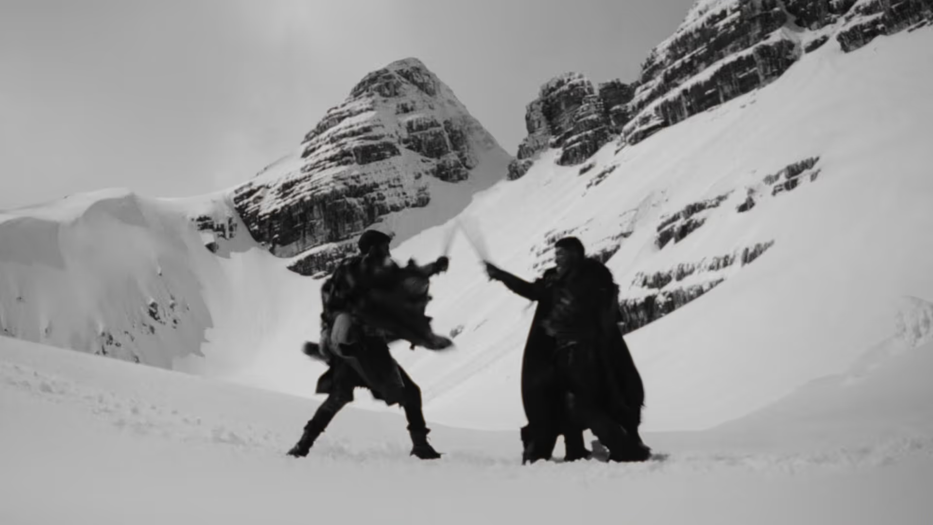
When the final promo debuted, we were thrilled by its intensity and cinematic quality. Salomon had promised a film that sincerely celebrated the history of combat sports, and he delivered on that promise. The project demonstrated how sports storytelling can transcend fight hype, resulting in a film unique to the IV Crown Showdown that could easily stand alone on a cinema screen.