Mam
Before filming began, Loveboat, the production company behind the picture, executive producer Greg Panteix and producer Marine Garnier approached us to see if we’d like to collaborate on the project. In particular, they wanted us to assist the art department with graphic design, create the film’s title sequence, end credits and the poster art. It was a tall order but an unbelievably exciting opportunity.
The producers have trusted us with many creative development projects over the years, including long-running campaigns for Nan himself, but this was something else. True to the indie spirit, the project had a turnaround time and budget that demanded creative and nimble thinking. We were all in!
First, we answered the call of the art department. The film featured Chen’s Restaurant – a takeout joint that had seen better days. Our team conducted research to accurately dial in the visual language typical of the area. In this case, modern day Chinatown in Lower Manhattan.
We designed a range of physical assets that helped make the space feel rich, layered and authentic – from wall menus and calendars, to signage, food hygiene notices, sunbleached food photography and missing cat posters.
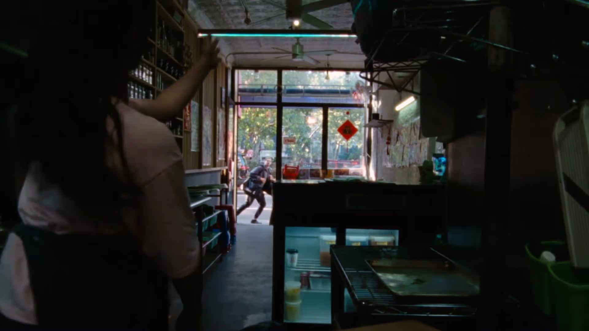
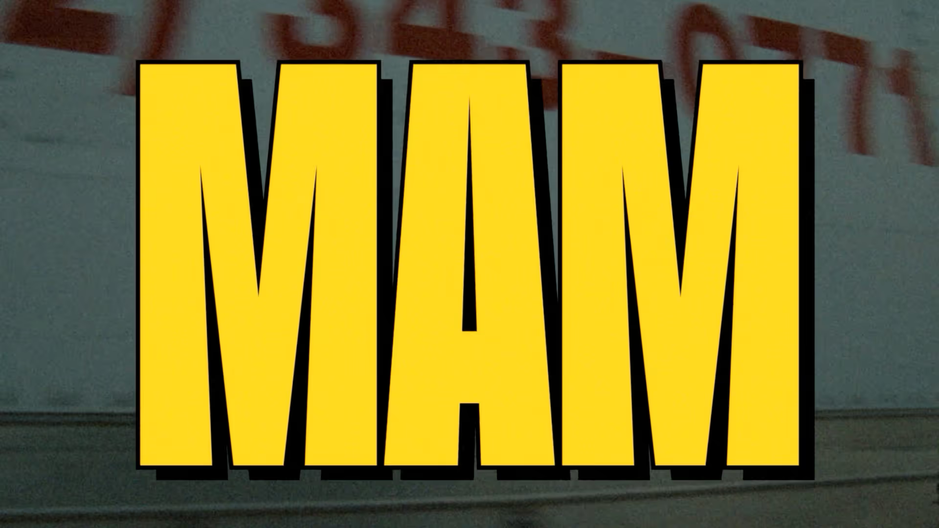

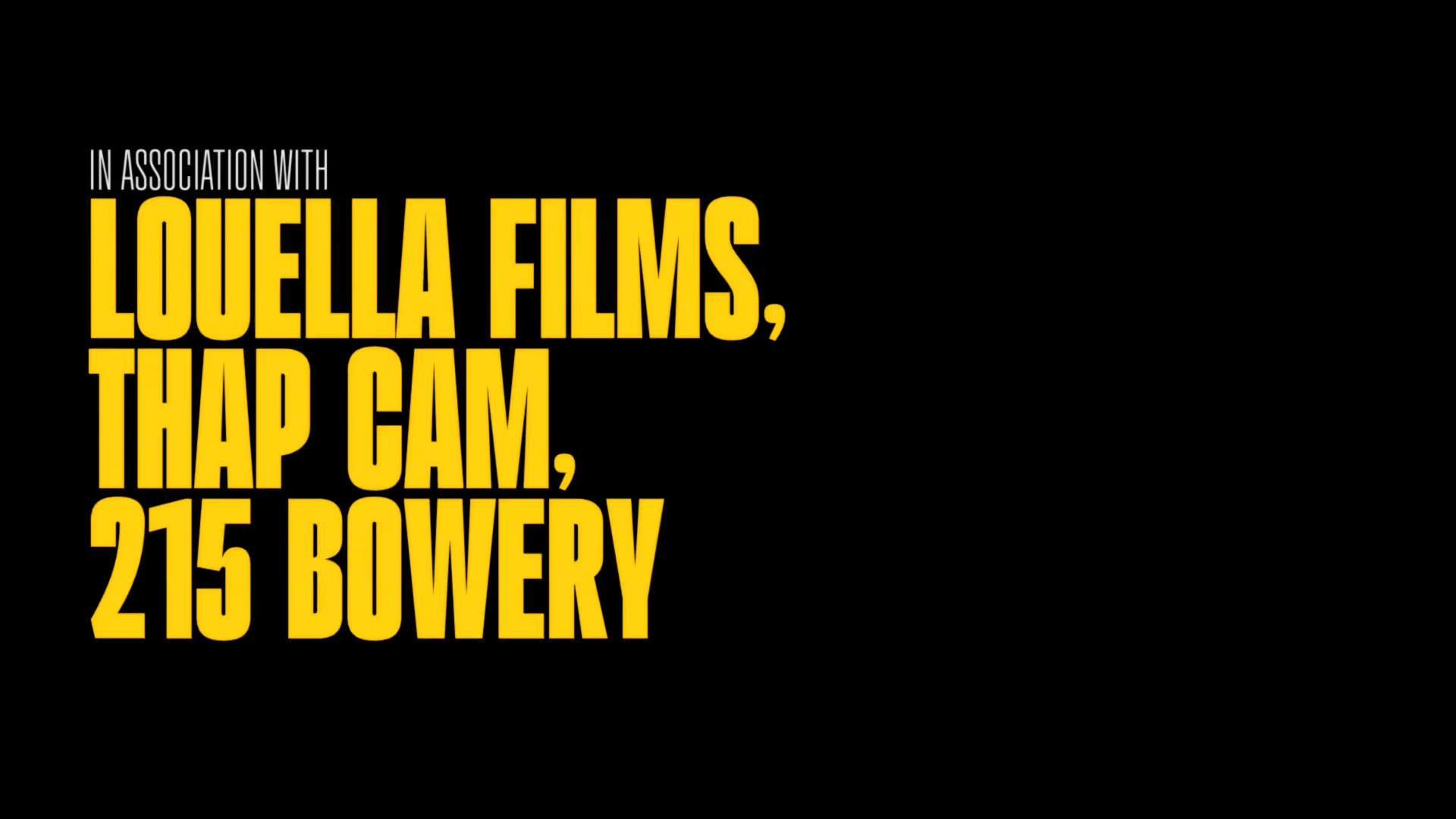
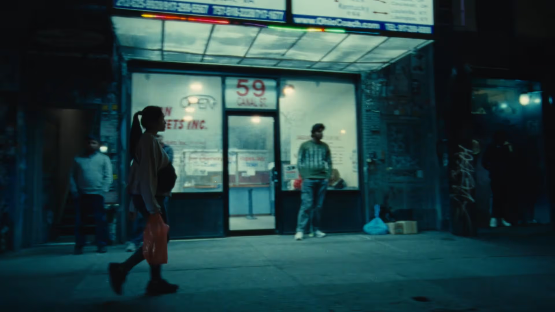
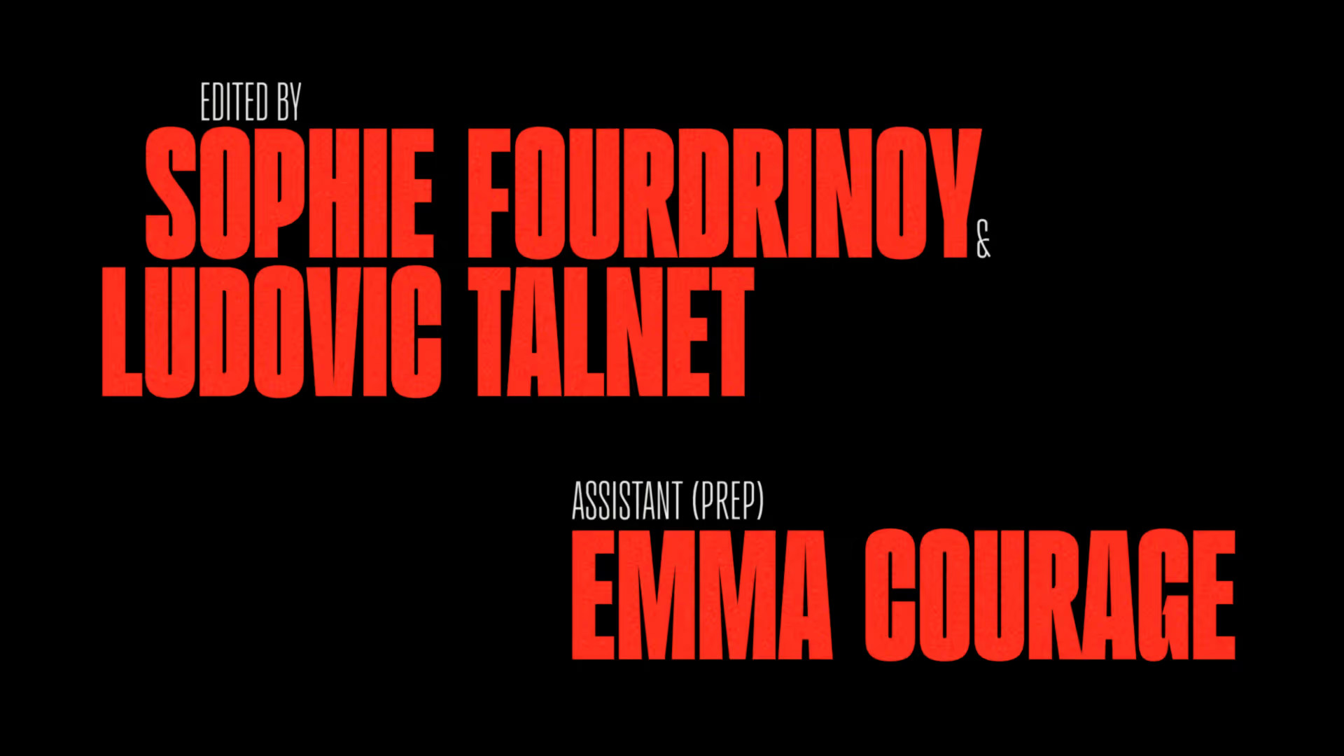
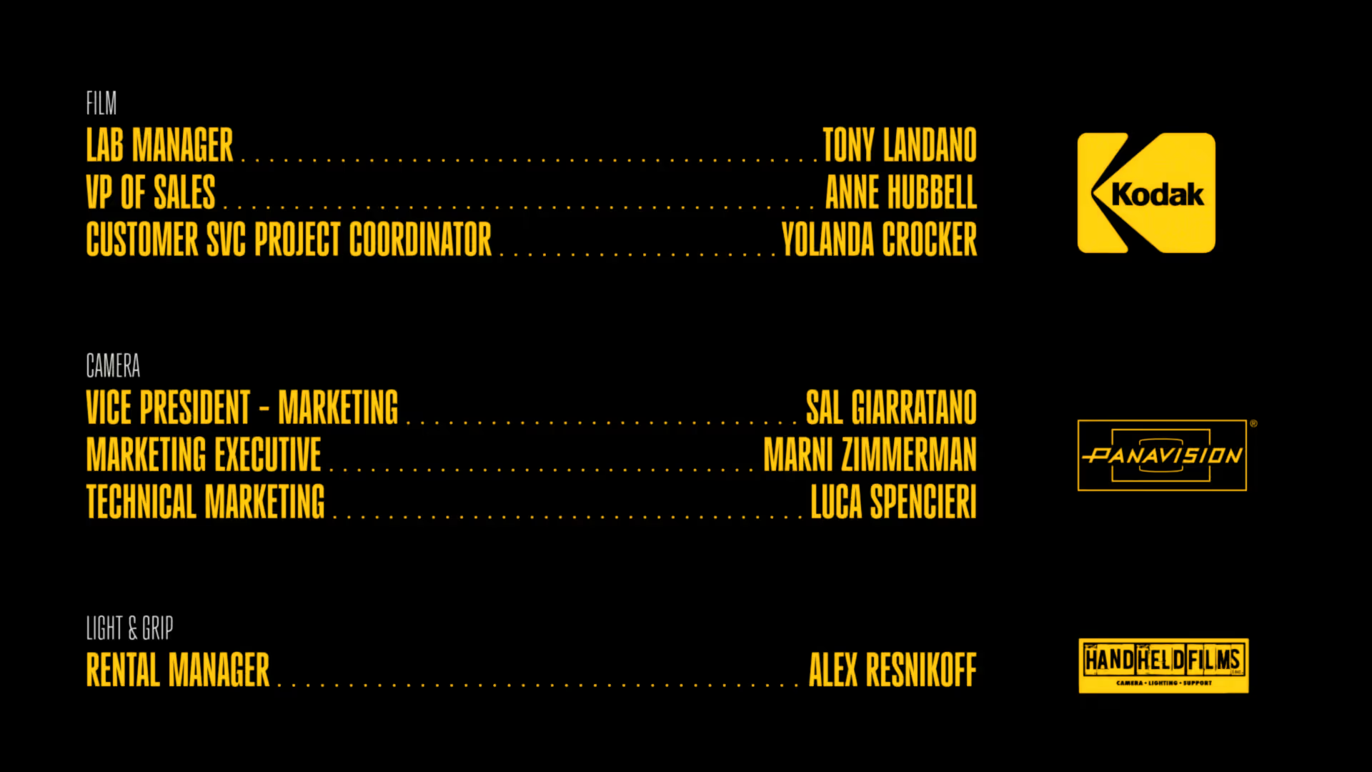
Next, working closely with the director and producer, we started designing the title and credit sequences for the film. Their initial brief was for us to explore looks that were big, bold and elegant with an analogue, almost retro feel. Colours needed to be simple but punchy too, directly connecting to the subject matter. So we developed a colourway and title set inspired by the Vietnamese flag and takeout menu layouts that felt warm and familiar but still bold and distinct.
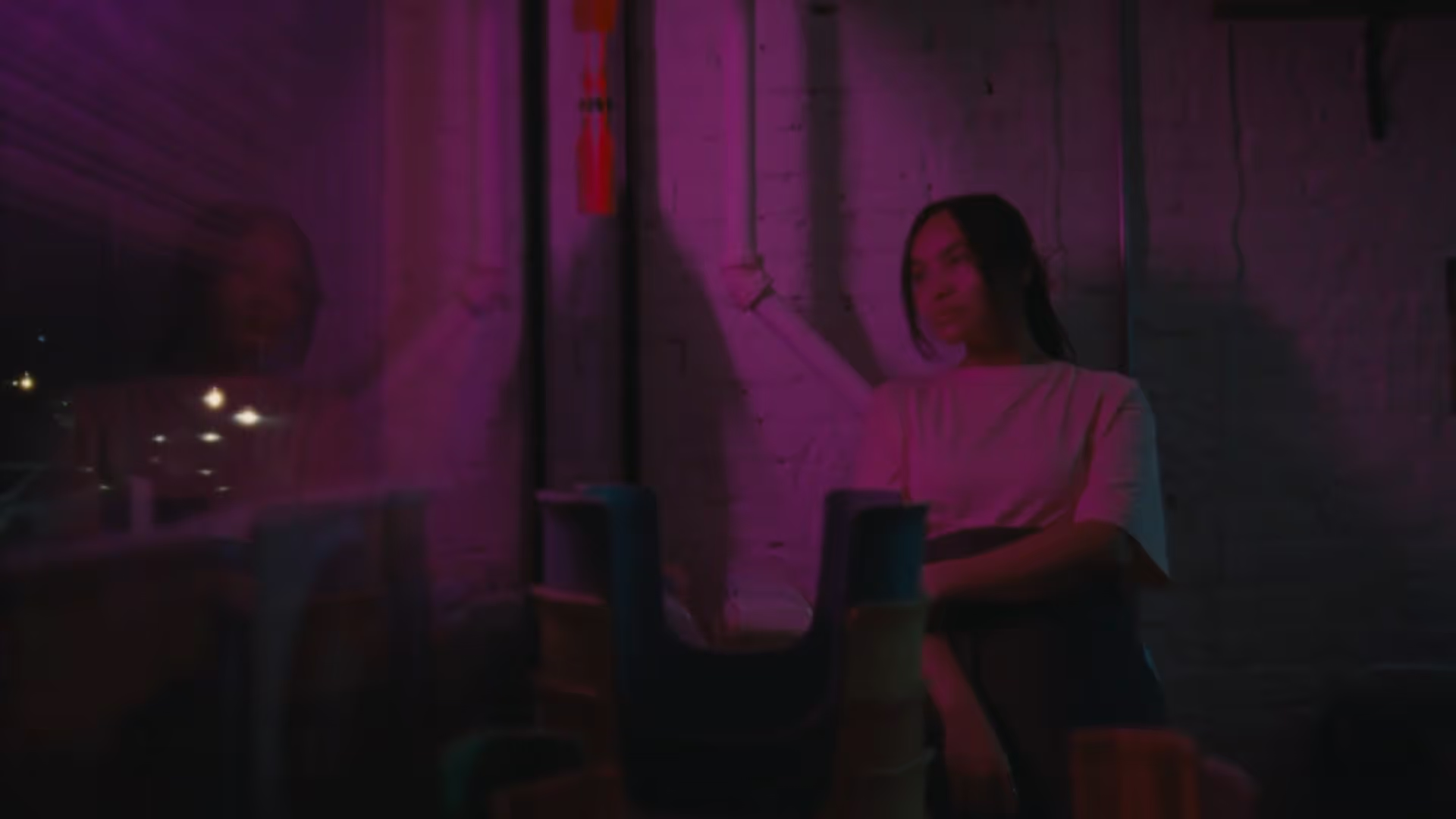
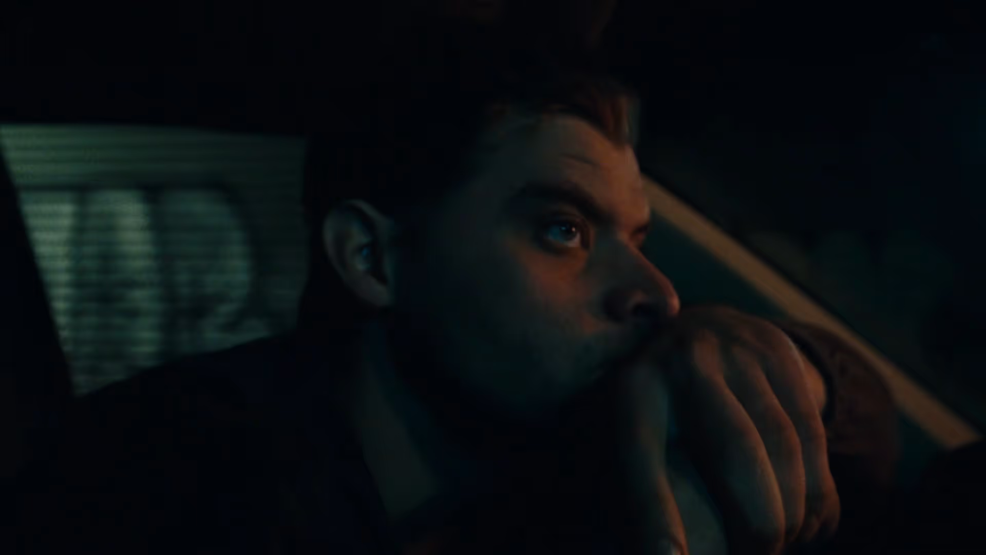
Borrowing from past features, using traditional static cell overlays and mixing them with simple wipe techniques, we crafted a look that felt in the anachronistic mode, while still fresh. To finish, we added subtle grain and gate weave to match the 16mm character of the film.
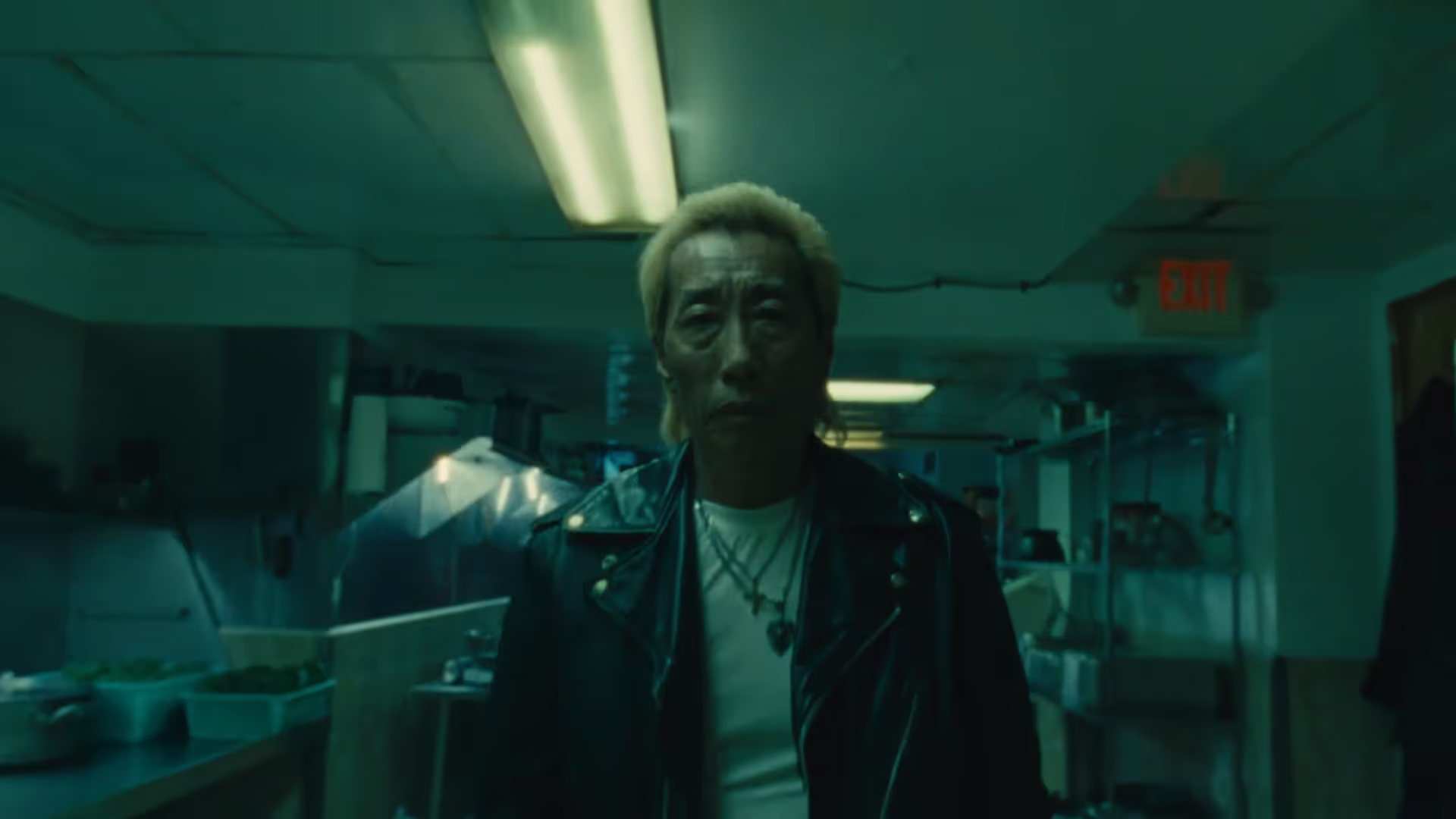
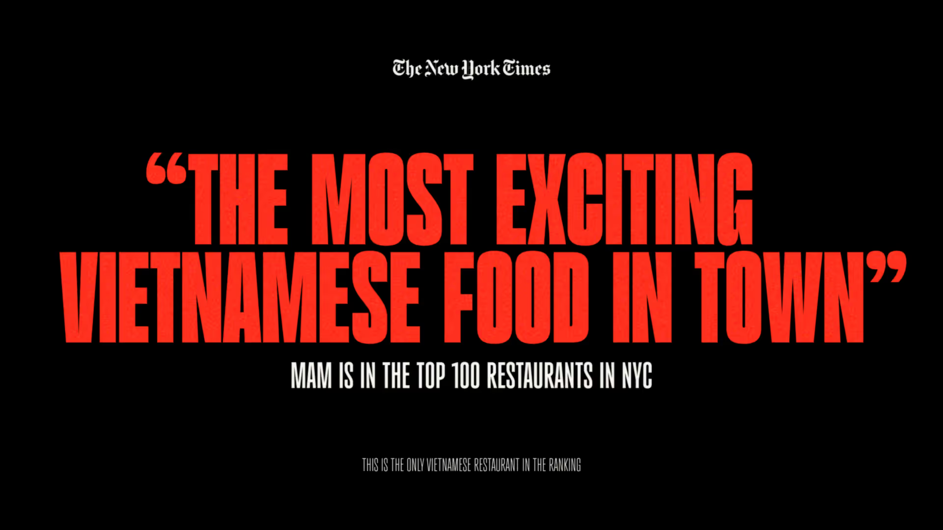
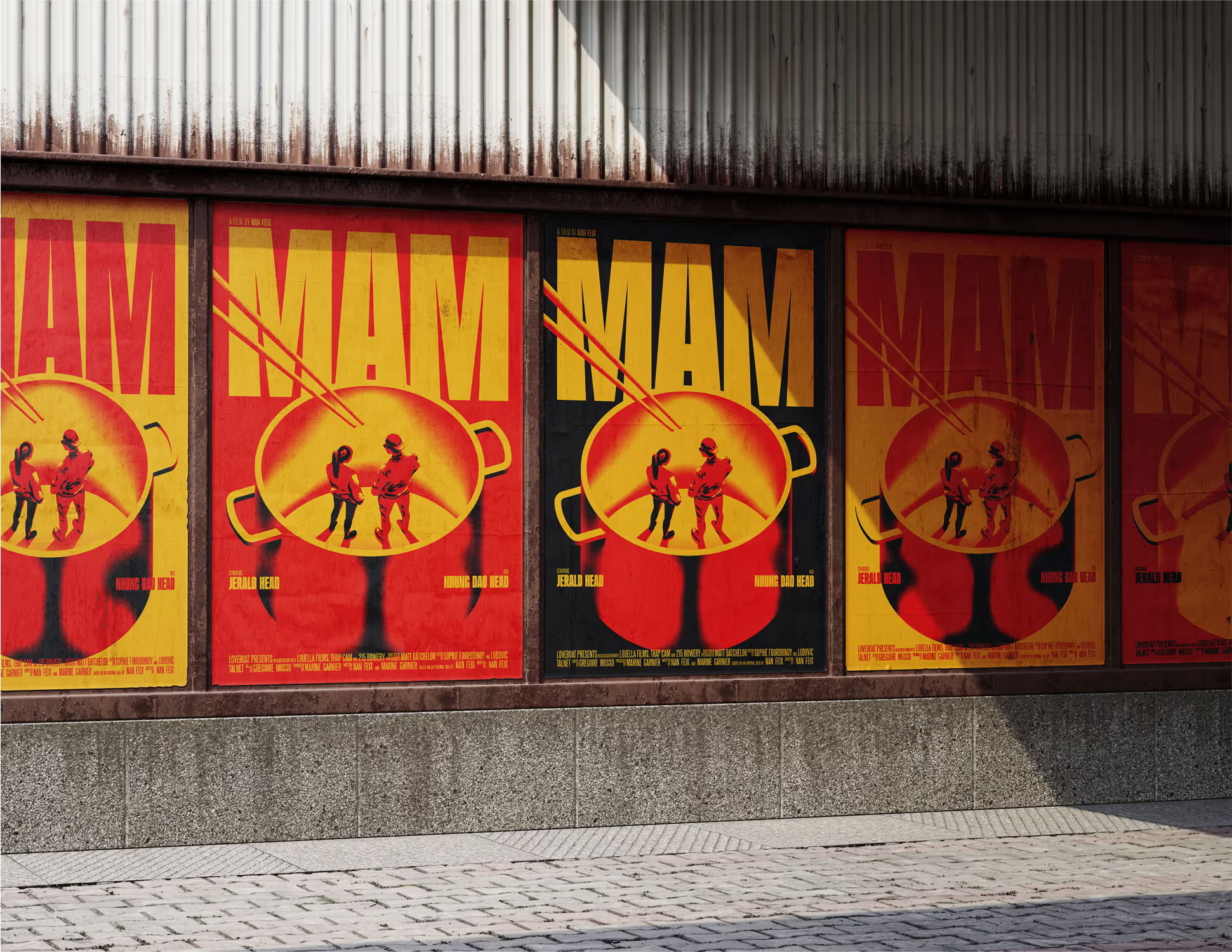
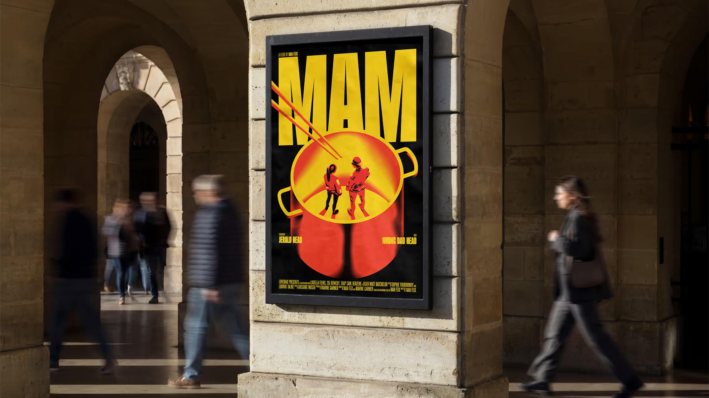
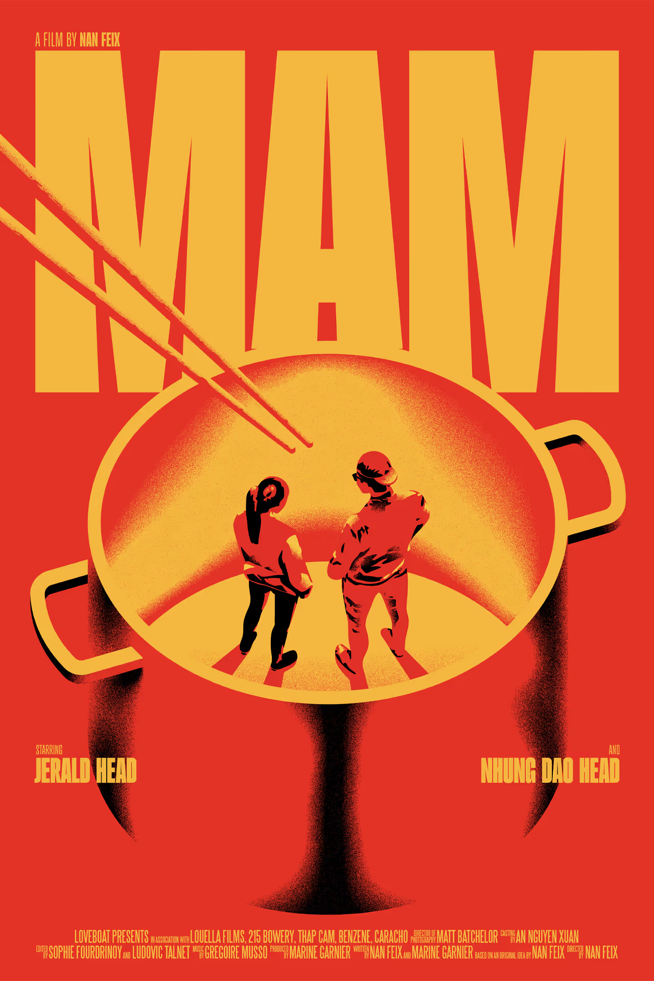
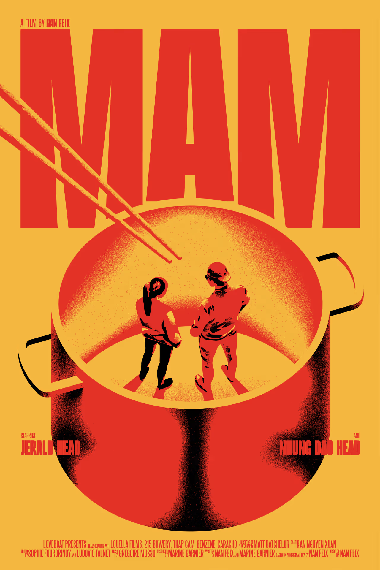
Finally, we arrived at the poster design. As the first thing that most audiences encounter, we knew this was an incredibly important asset. Film posters have their own established language and they have to convey so many things while grabbing people’s attention, creating curiosity or excitement.
We had to get it right, so we conducted research into the medium and tested a range of different approaches. Ultimately, we felt the best way to pique people’s interest was to be stylish and intriguing with the artwork. We experimented with representing the leading characters in the kitchen, but then realised it would be fun to visually place them out of their depth, playing with scale in a way that created a strong visual and metaphor. A fun fact is that the chopsticks were initially just a throw-away idea, but we found they added a bit more context, depth and tension to the final image. It was a good reminder that you should try even your corniest ideas - they might just be good!
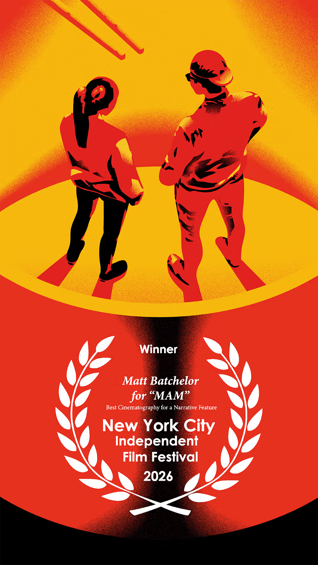
Mam won Best Film in the Culinary Cinema category at San Sebastián International Film Festival in 2025. It made its US Premiere at SXSW in 2026, the same year cinematographer Matt Batchelor won Best Cinematography in a Narrative Feature at the New York City Independent Film Festival. Its journey continues as we write this and we're so excited to follow along.
It’s the first time we’ve ever been given this kind of opportunity and appreciate the trust and huge responsibility that went with it. We’re incredibly proud of the results – being credited by the hard working team behind this wonderful film is an honour. And having our poster as the official artwork on both the film’s IMDB and Letterboxd pages is a lifelong dream fulfilled. Go see it and support independent filmmakers!