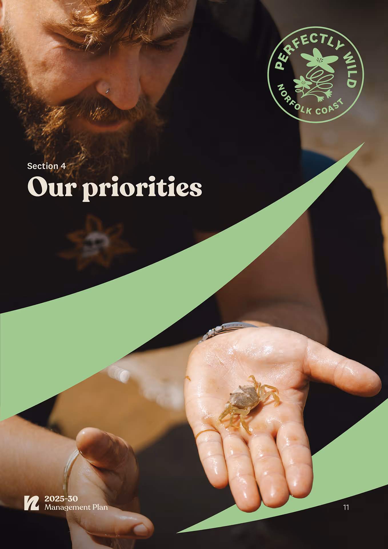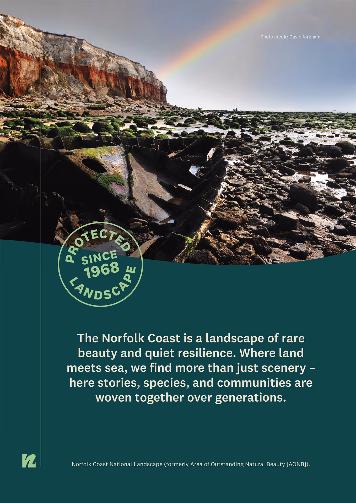
Norfolk Coast Protected Landscape
The NCPL team is on a mission to re-connect the public with Norfolk’s amazing natural landscape in ways that feel bold and refreshing.
Norfolk Coast Protected Landscape is an organisation which unites the local authorities that manage the Norfolk Coast National Landscape, an area which covers 453 km² of East Anglian coastline. Their goal is to conserve and enhance the natural beauty of the landscape with a broader responsibility for the social and economic needs of the area. Their work spans nature recovery, climate change, sustainable tourism, farming and land management.
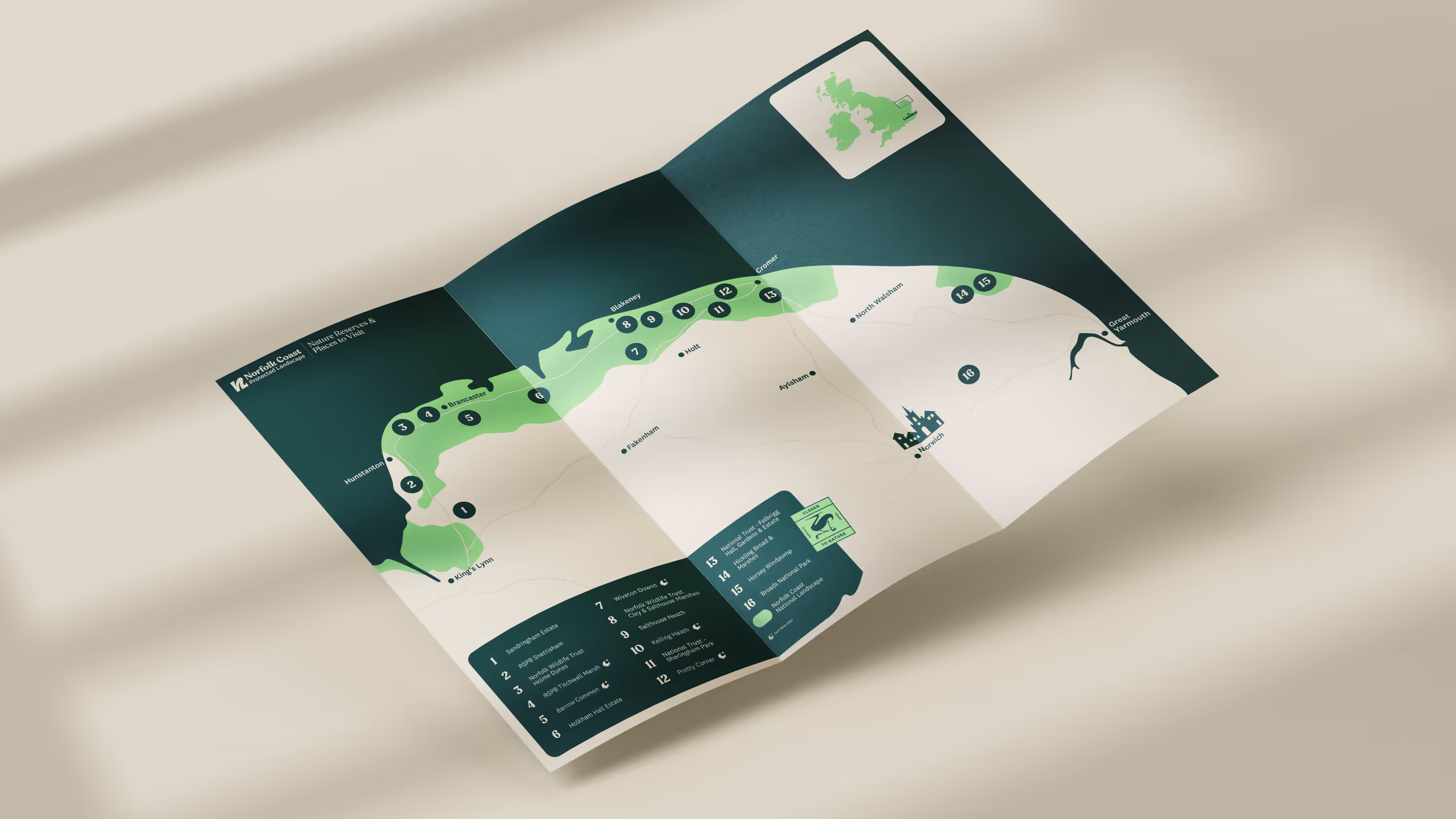
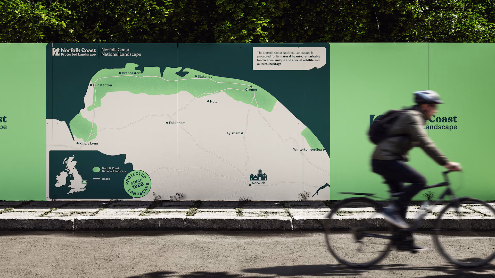
Our studio initially came on board to produce a new suite of maps for the NCPL, taking the organisation's fresh new visual identity and applying their inclusive design language to maps that had historically been overly technical and difficult to read. The goal was producing public facing map designs that were not only accessible to a broad audience, but fun to engage with.
From the outset the team, led by Dr Katy Owen, were keen to cut through the stuffiness and impenetrable jargon of traditional map design and focus on engaging, stripped back communication that pushes clarity and bold design to the fore.
This was a dream brief for our studio, allowing us to engage with a new aspect of design and reinterpret what is one of humanity's oldest forms of visual communication. Map making has proven stubbornly resistant to the evolution of design, continuing to favour a language developed by and for specialists. Working within this convention-laden format brings a kind of inherited grammar, which we simultaneously had to challenge and honour.
Inclusive design adds another layer of complexity, particularly in a field where assumed knowledge is baked into a lot of design conventions. We stripped that away, designing for the first-time visitor, the child, the person who finds dense spatial information overwhelming. It was a challenging but educational process that forced us to look at colour, hierarchy and scale in new ways.
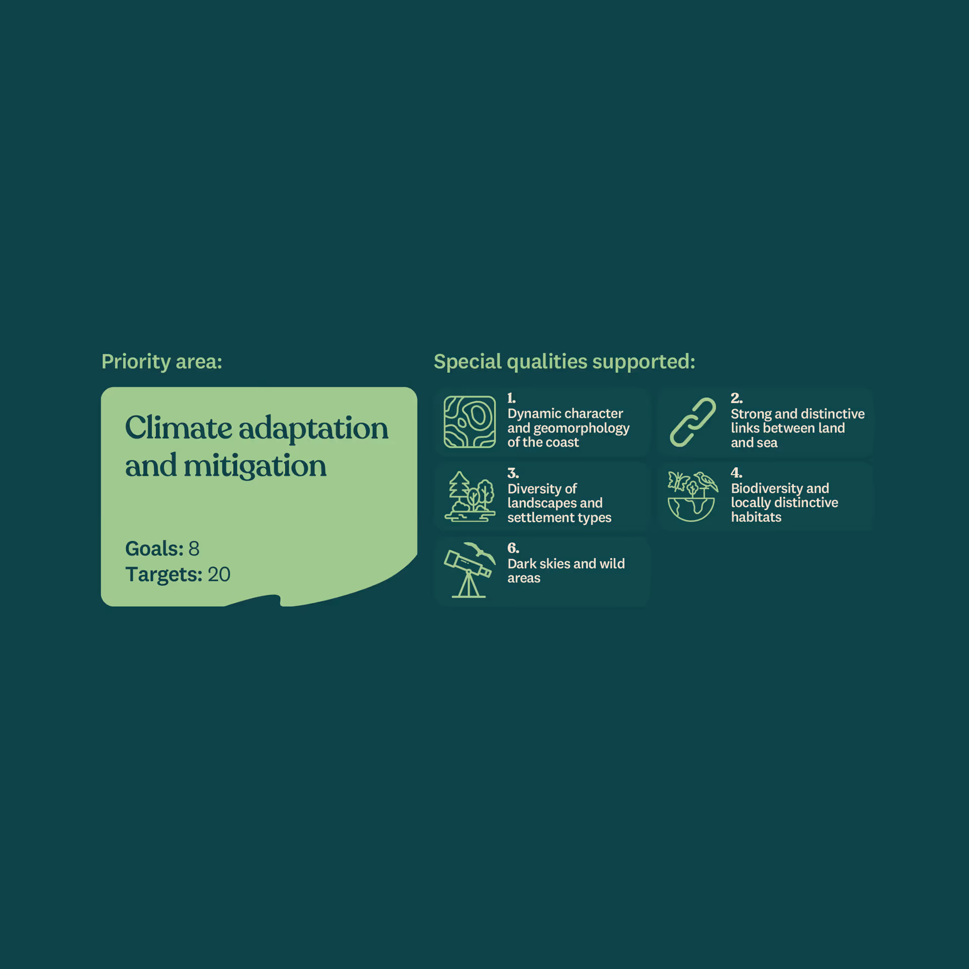
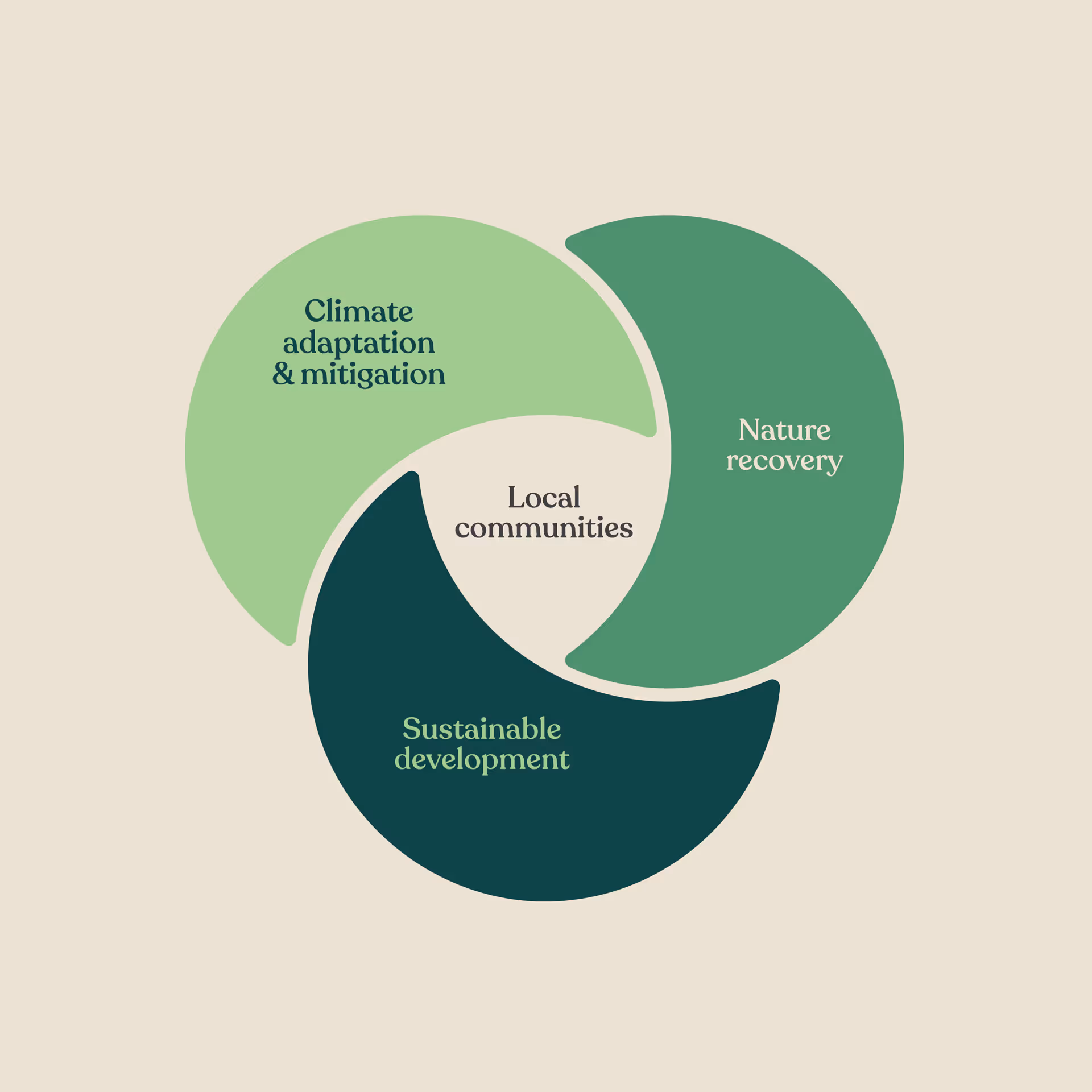
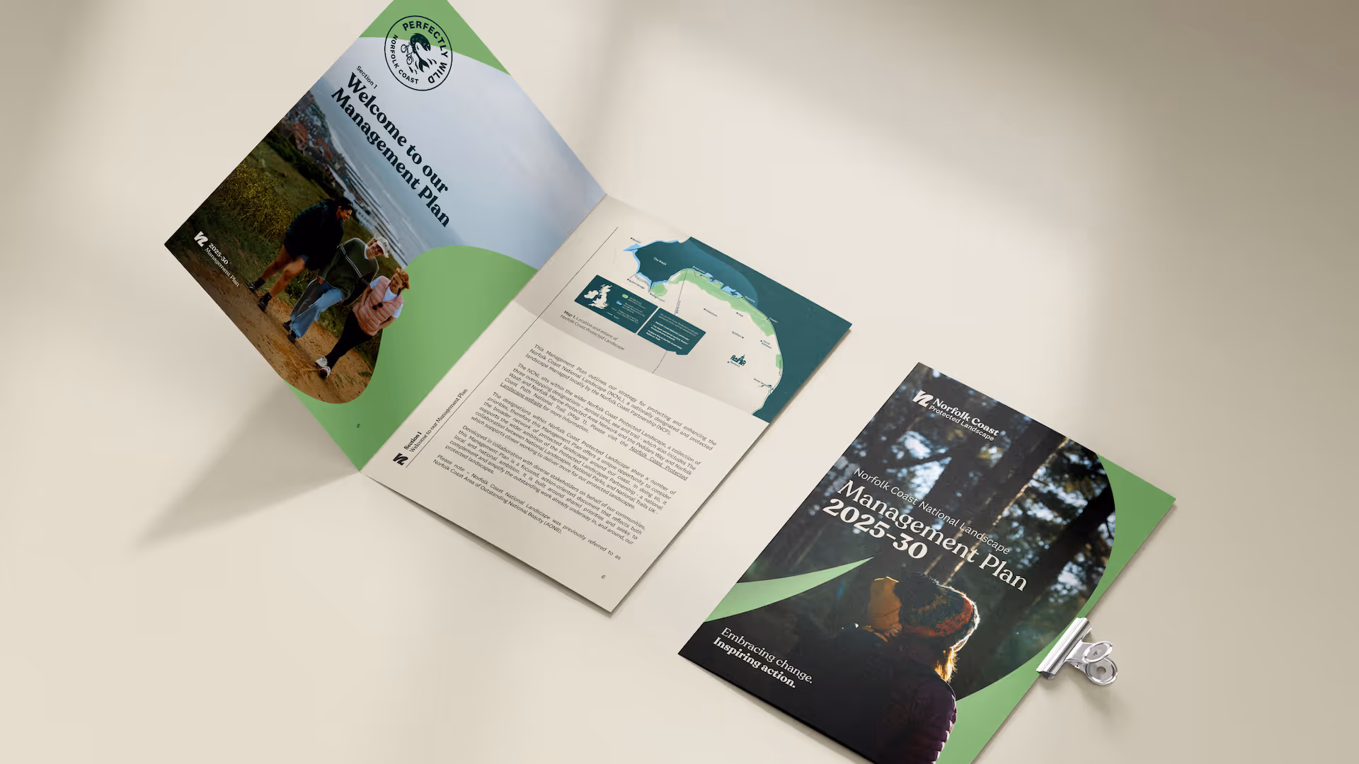
The NCPL is guided by a five-year management plan, which sets out the wide range of ambitions the organisation will focus on. Our studio was engaged to design this in-depth report document which translates large volumes of text and information into an easily digestible, fully illustrated, published document. We followed the same guiding principles when it came to realising this project, ensuring this was as accessible as possible, leading the reader through the chapters with eye-catching photography and clear, engaging info-graphics, all produced with the organisation’s visual language as a guiding principle.
With subsequent projects for Dark Skies Festival, the Norfolk Land Recovery Project and an ongoing commission for a range of merchandise and collectable art prints, we are loving working with a local government organisation who are seeking to enact change with a visual led approach.