Cambridge is at the centre of one of the most ambitious economic visions in recent British history. With the Labour government calling for the region between Oxford and Cambridge to become “Europe's Silicon Valley”; a corridor of world-class science, technology and innovation.
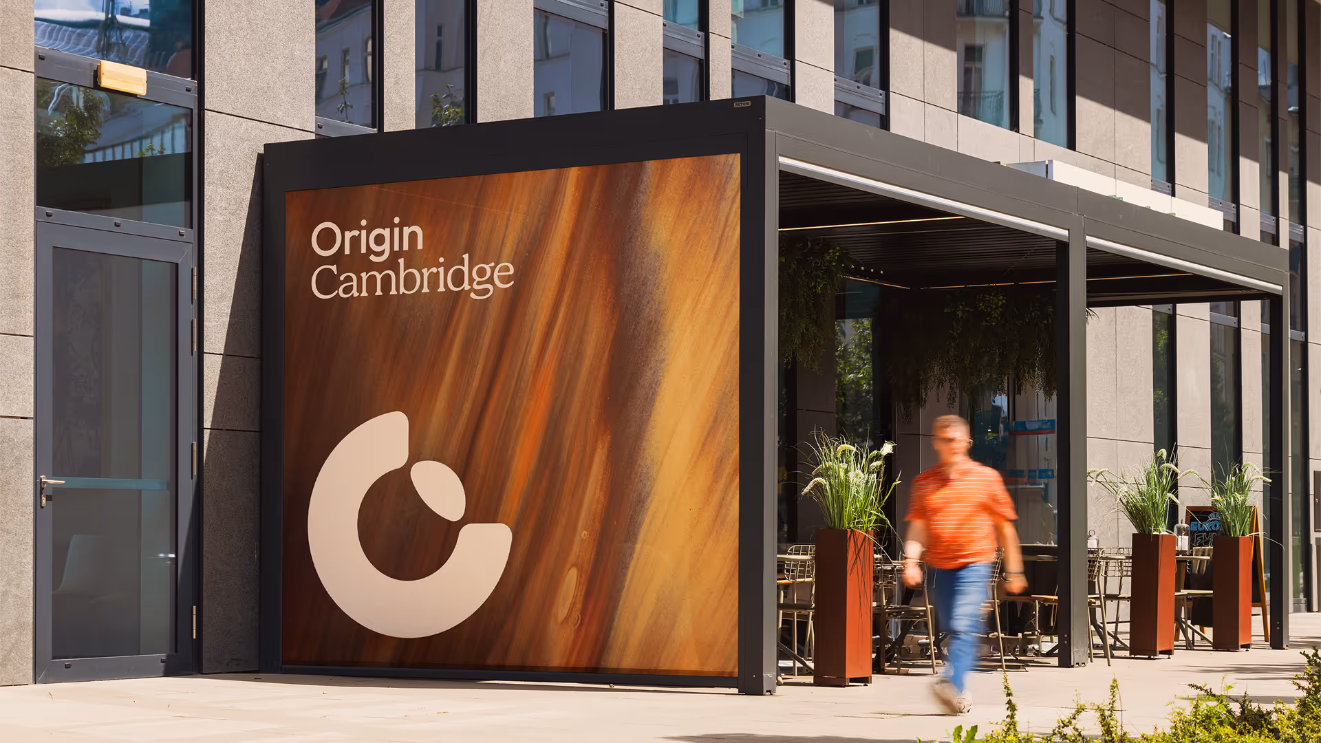
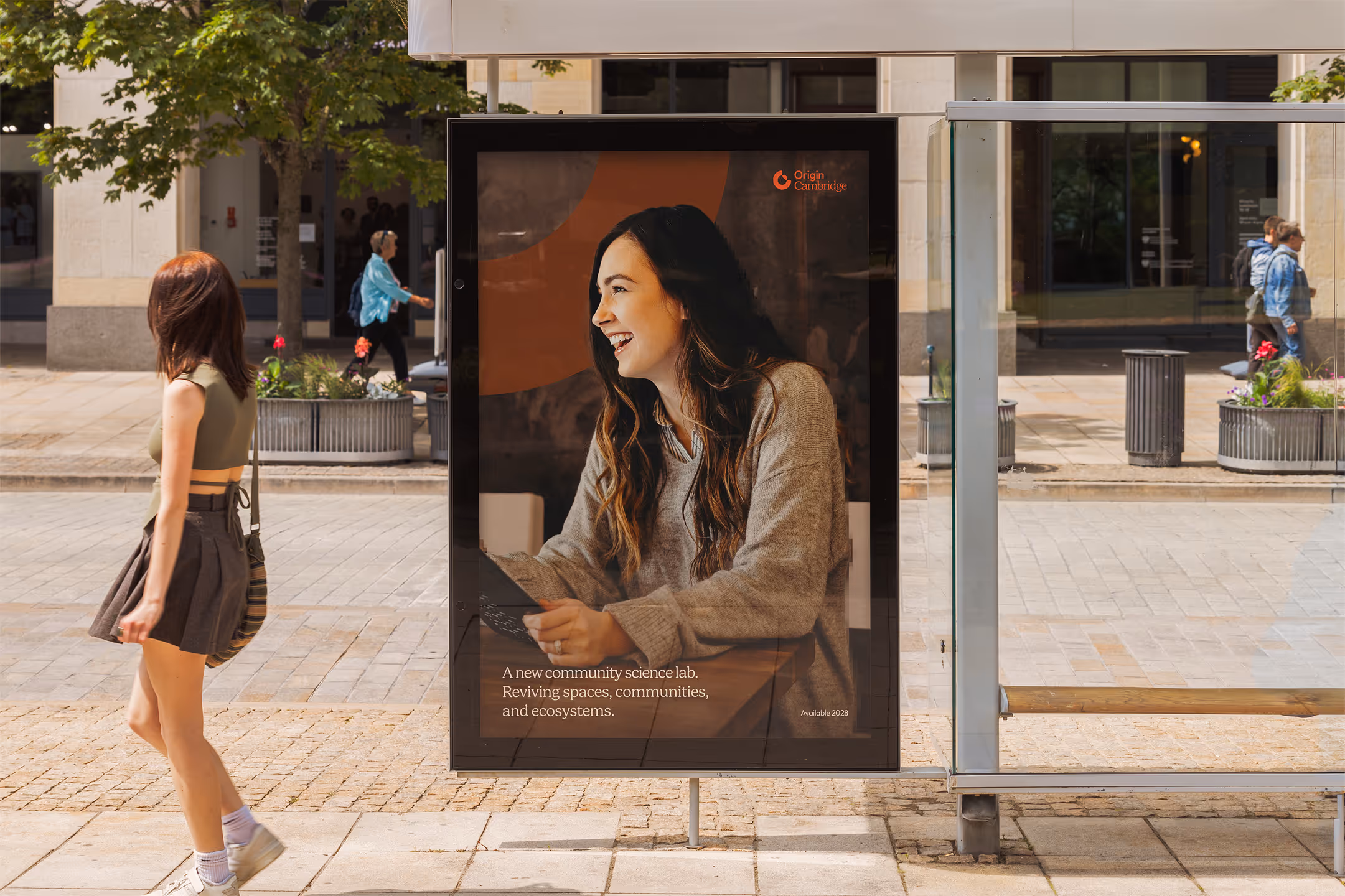
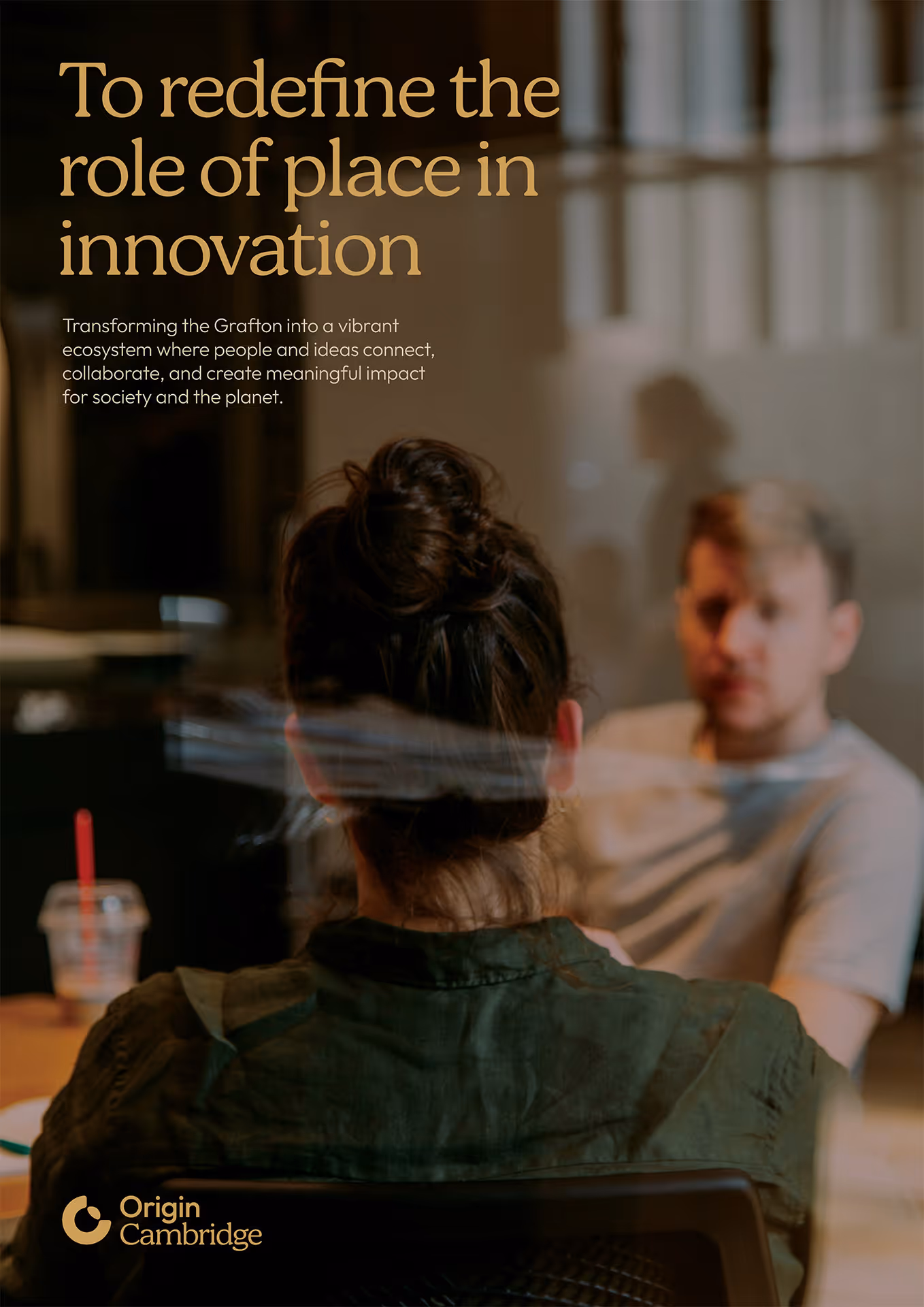
The Pioneer Group saw an opportunity to do something meaningful with the Grafton Centre, a large ailing central retail site, giving it renewed purpose that aligned with the government’s vision. Origin Cambridge will breathe new life into this part of the city, creating up to 2,000 jobs, investing in STEM education and delivering community outreach programmes that ensure the benefits of this growth are felt by the surrounding communities.
The Pioneer Group – owner, developer and operator of 14 innovation-focused campuses across the UK and Ireland – appointed us to create the visual identity for Origin Cambridge.
Engaged at the funding stage, our role was to give the project a tangible visual presence, helping investors and stakeholders picture the scale and ambition before development begins on site.
Working to an accelerated timeline ahead of an early presentation, we delivered a complete design suite encompassing brandmarks, wordmarks, lockups, typography, colourways and key applications.

The Pioneer Group pride themselves on creating inviting spaces centred around human connections; balancing scientific credibility with an open, inclusive spirit.
Although very much within the Life Sciences specialism, Origin Cambridge also encompasses lifestyle, leisure and retail. The repurposing of the Grafton Centre (a 1980s shopping mall) will be a new kind of venture for Pioneer Group, creating a multi-use complex, consisting of laboratory space, offices, a new hotel and a select retail offering. This required a versatile brand identity, flexible enough to suit a site with such a broad mix of uses.
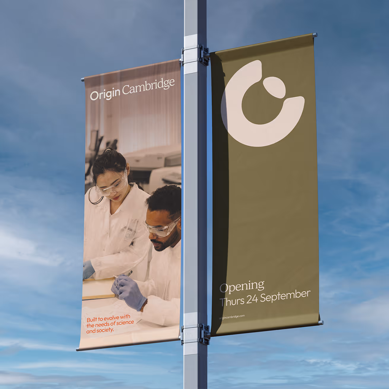
Setting out to inspire and spark the imaginations of investors, The Pioneer Group wanted to create a distinct identity for the Origin Cambridge project, giving a sense of the huge scope and potential of the redevelopment. The goal was to avoid any cold, clinical notions associated with science and research, instead creating a brand that felt like a modern interpretation of heritage, with an aspirational and welcoming appeal that refuses to be pigeonholed.
The Origin Cambridge brand concept is rooted in something timeless and future facing. Its whole purpose is to bridge worlds; creating a cluster of mutually beneficial spheres that span research, workspaces, seed growth and retail. Our challenge was uniting them through a design language that resonates with those seemingly disparate worlds.
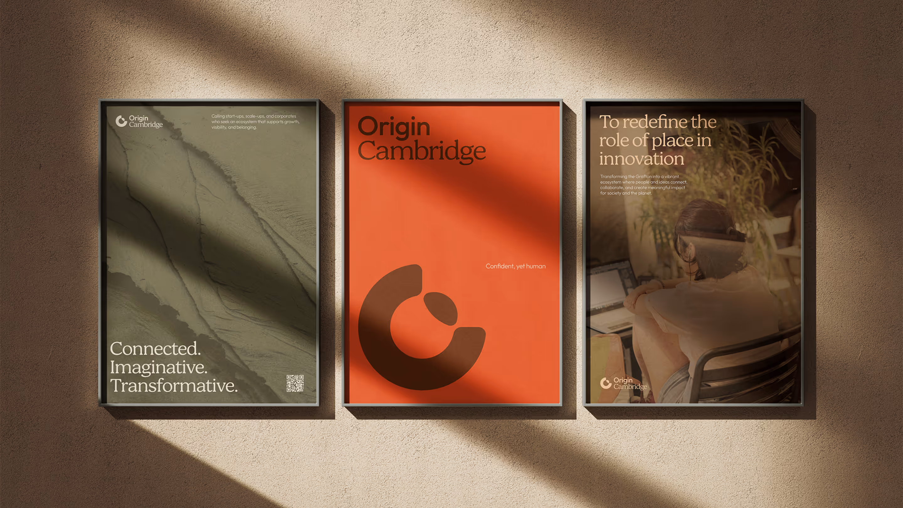
Our goal was to balance a modern minimalism with an identity that had gravitas and adaptability. Inviting curiosity was key, inspiring and demonstrating what could be possible for the site. We’re encouraging people to talk about it, remember it and feel part of it.
Tonally we wanted to avoid anything trend seeking, instead thinking about longevity and a brand that sat comfortably in the modern city that Cambridge has become in recent decades.
As past graduates of the neighbouring university ARU, our creative directors had a deeper insight into the history of the site and how it sits within the social geography of the wider community. We used that understanding to inform how Origin could position itself in the local neighbourhood.
Colour can provide an instant read for establishing the tone and voice of a brand. Origin Cambridge was never going to be about the cold, sterile colour-space usually associated with the science and research fields, nor was it aiming for the sanitised anonymity of corporate brand language.
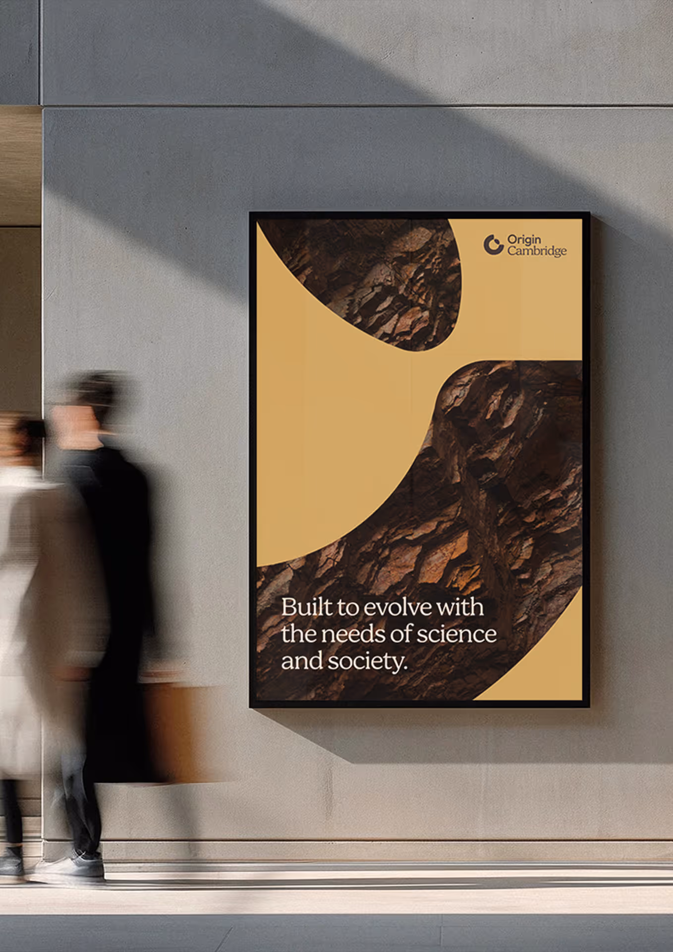
The parent company Pioneer Group wanted an earthy, natural palette that still managed to convey a fresh, modern, welcoming feeling.
Creamy linens and chalky whites form the base, the kind of neutrals that feel like natural light on raw plaster, rather than a clinical, corporate white. From there, warm skin tones in petals and peaches build a sense of lived-in comfort, softened and welcoming.
The mid-range reaches into spice and soil: nutmeg, clay, cinnamon. Rich without being loud, these are the colours of craft and material. Tangerine brings some heat, a warmth that prevents the palette from settling into something too quiet.
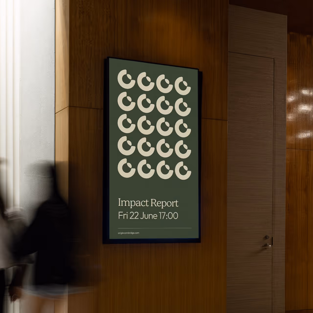
Grounding everything is a layer of muted greens — sage, nettle, olive, pine — and a deep charcoal that anchors the whole. These aren't the bright greens of digital-native brands, closer to lichen or dried herbs, to things that have been growing for a long time.
Together, the palette speaks to something honest and unhurried. Natural without being rustic, warm without being nostalgic. A brand that knows where it comes from.
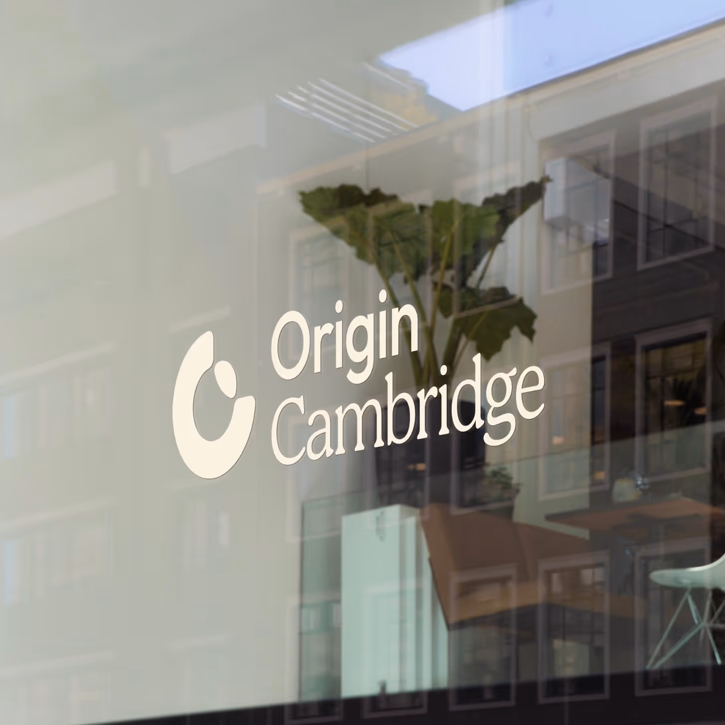
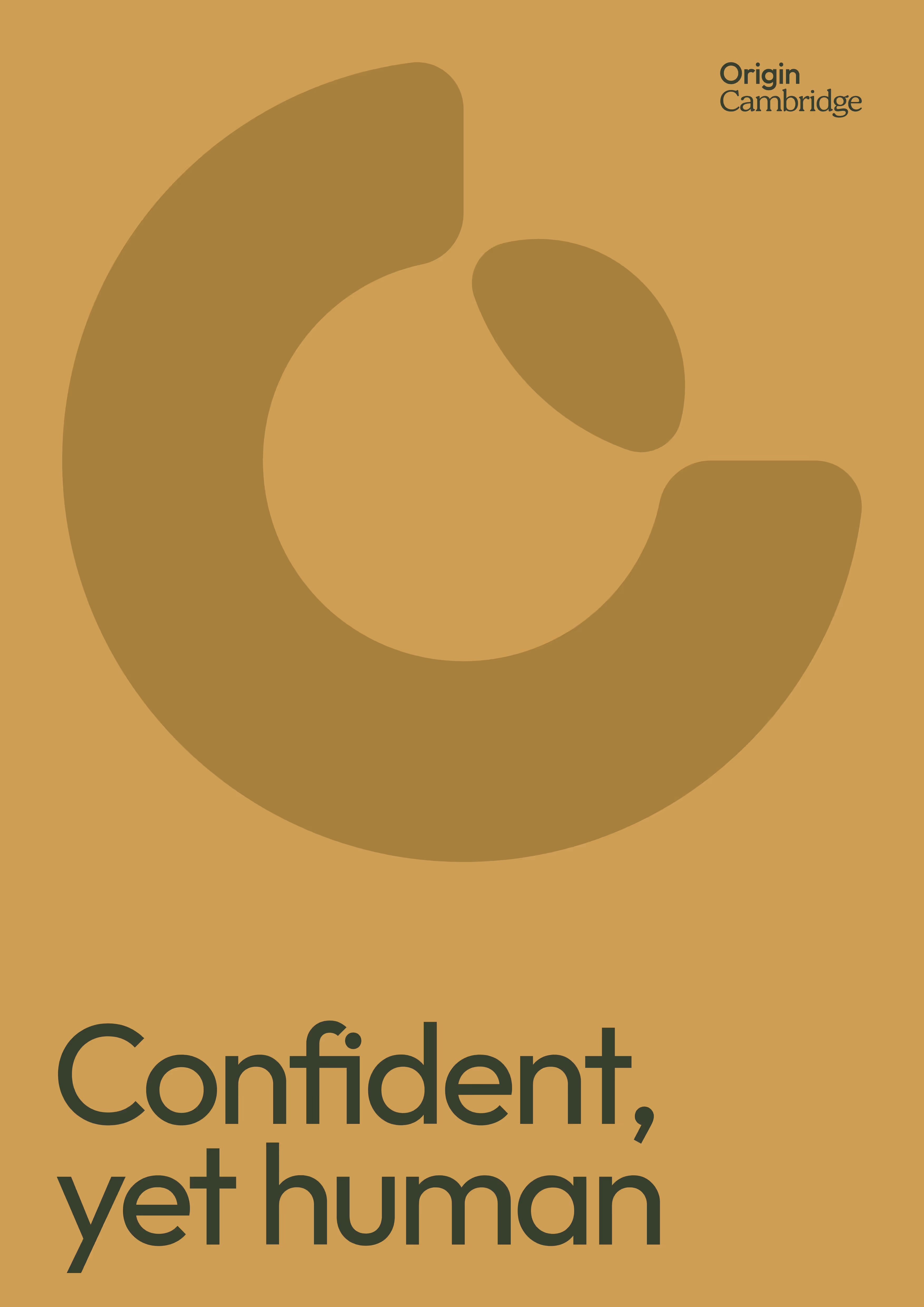
‘New Horizon’ leads with geometry but allows enough ambiguity for a more poetic read. Simplicity and restraint, softly spoken with confidence. No gradients, no effects, no noise. Just two shapes and room for the imagination to create a story.
Two forms; a bold circular arc and a small ellipse sit together in a relationship that is at once simple and quietly layered. At first glance, the dominant form is a letter C denoting the city of Origin. Look longer and the smaller form can be seen as a sun cresting a horizon, a world emerges from behind another, a new dawn breaking, something revealed and the origin of something new.
That duality is deliberate but not heavyhanded. The letterform gives the mark instant brand ownership; the visual metaphor gives it meaning. Neither overpowers the other.

Cambridge, like many UK cities, is facing the challenges of an ailing high street economy. The Grafton Centre, once a retail anchor in the east of the city, struggled to adapt to the changing tastes of consumers, losing many of its flagship retail and entertainment businesses and leaving a large dead space in the heart of the neighbourhood.
Regeneration projects like Origin Cambridge occupy an unusual position. They are, by nature, unfinished. We are asking people to believe in something that doesn't exist yet, to invest time, money and trust in a place that is still becoming itself. In that gap between present reality and future potential, brand identity does something no planning document or financial prospectus can: it makes the vision tangible.
In competitive investment landscapes, first impressions are made long before a site visit or a meeting. A considered, well-executed identity signals that the people behind the project understand what they are building and who it is for.


For communities, the stakes are different but no less real. A brand that speaks honestly and reflects the character of the existing place rather than erasing it builds the kind of goodwill that planning consultations and public exhibitions rarely manage alone. People support what they feel part of.
Stakeholders span both worlds: local authorities, landowners, cultural institutions, transport bodies, future occupiers. Each needs to see themselves in the vision. A strong identity creates a shared language, something everyone can point to and say "this is what we are doing, and this is why it matters".
"The team at In Development responded with speed and efficiency to a short-notice brief on what was a fast-moving project. From the outset, they approached everything, from timeline and planning to feedback and delivery, with a level of professionalism that gave us complete confidence. They very quickly understood the ambition of The Pioneer Group and our ethos for the Origin Cambridge project and translated that into a visual identity that exceeded our expectations. They managed this while working to a tight deadline ahead of a key investor presentation. It's rare to find a studio that can move that fast without compromising on quality or creative thinking and we loved dealing with them at every stage."
Gemma Partington
Marketing and Customer Experience Director