Pāscō
Pāscō is a contemporary food truck brand created for workplace catering specialists TNS and their client Arm. Designed as a flexible pop-up dining concept, the brand introduces rotating global cuisine experiences to Arm’s Cambridge campus through a custom-built food truck.
In Development partnered with TNS and Arm to develop the concept from the ground up, designing a distinctive and flexible brand identity system that could deliver variety, personality and memorable food experiences within the workplace environment.
TNS has been delivering high-quality workplace catering for Arm since 2006, serving around 2,500 people daily at their expanding Cambridge campus.
Maintaining engagement at this scale requires constant creativity and innovation. TNS approached us with a new idea: to develop a distinctive food truck concept with its own identity that could introduce fresh and exciting dining experiences to the campus.
The exciting proposal centred on creating a contemporary brand capable of showcasing a rotating range of authentic and adventurous cuisines.
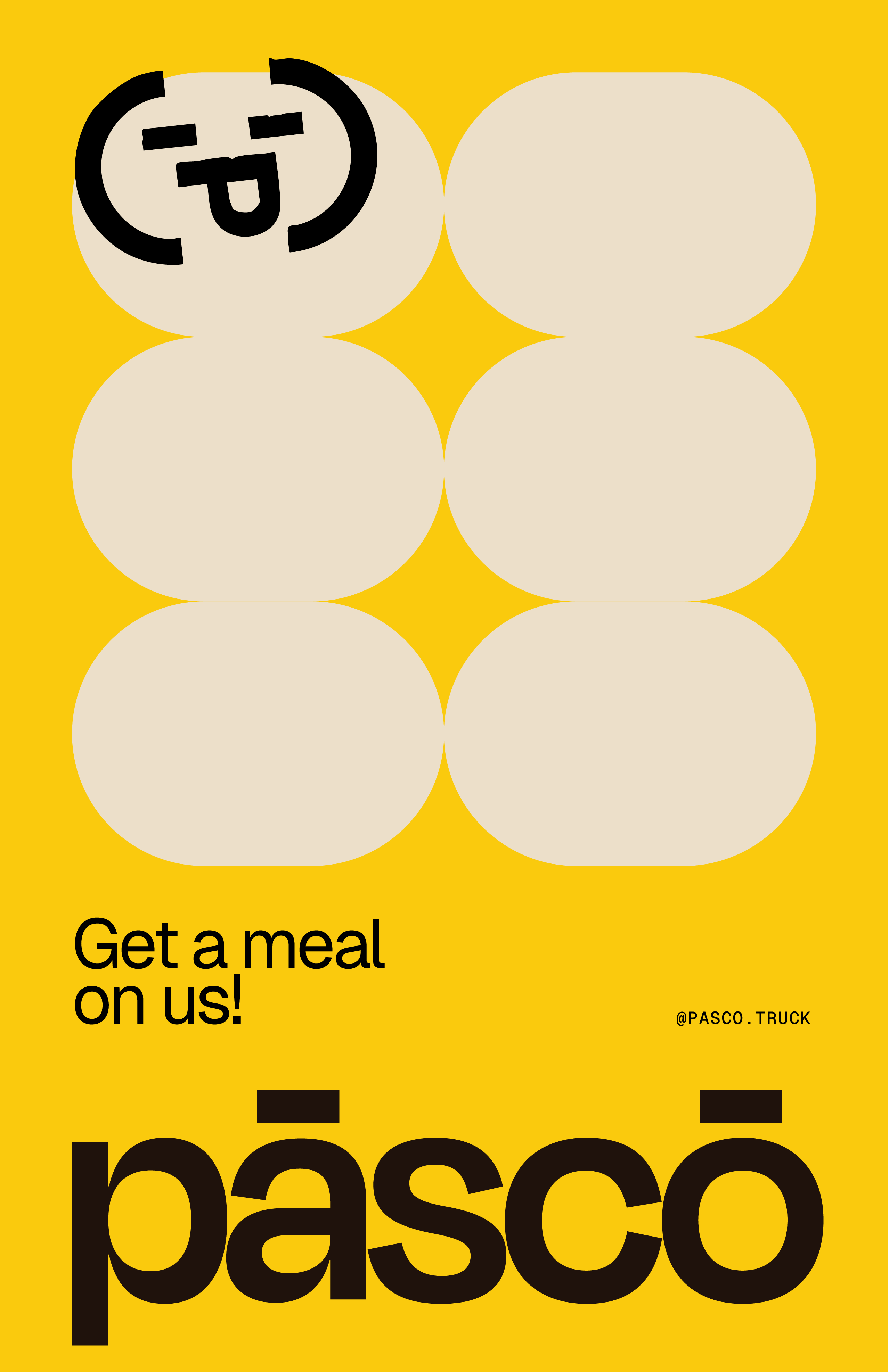
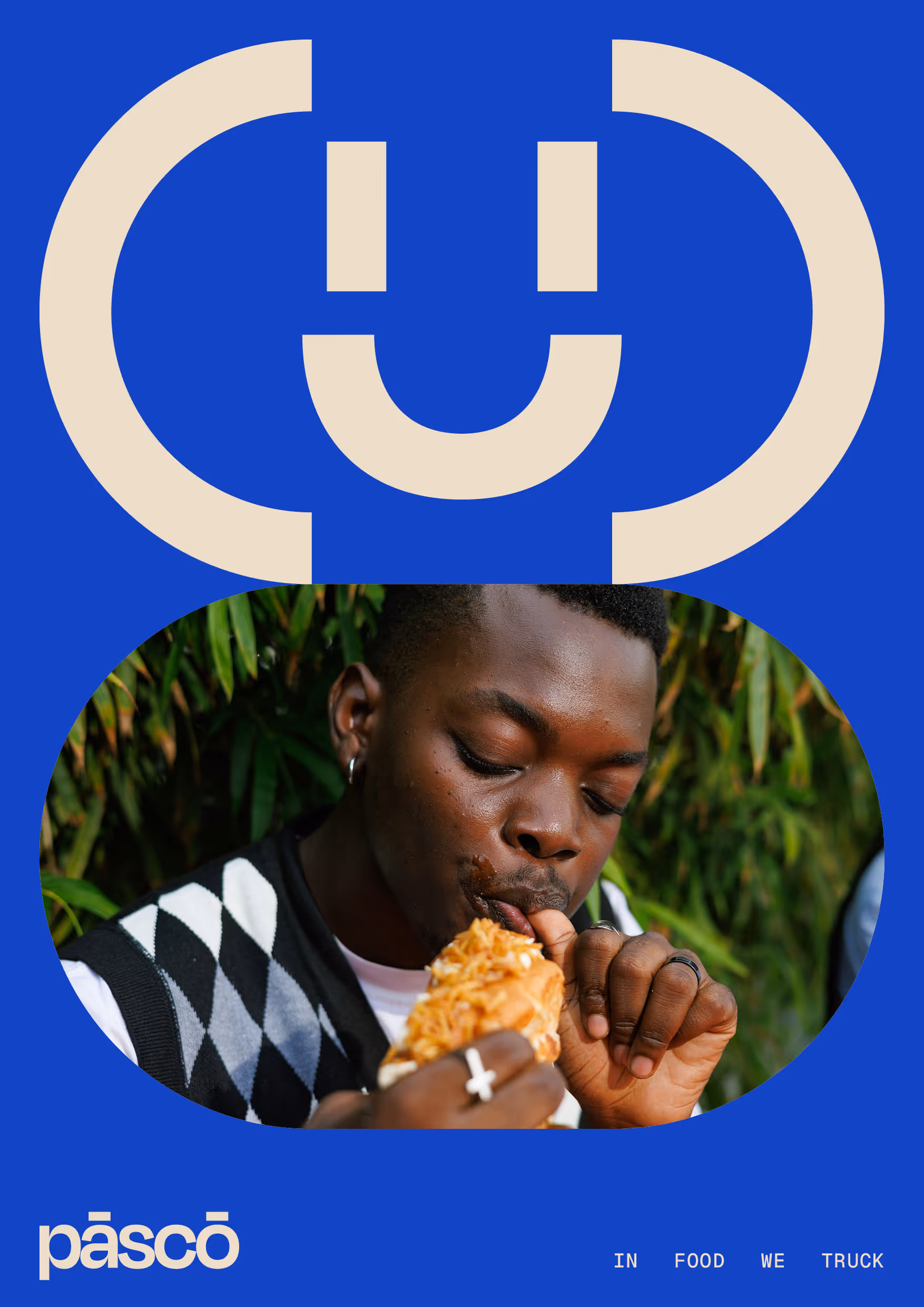
Built around the idea of treat culture, Pāscō is designed to deliver moments of surprise and enjoyment within the workday. The concept brings authentic, adventurous and popular cuisine to Arm’s campus through a bespoke food truck experience.
A key insight during the project was that workplace catering can become routine and predictable. Pāscō was designed to break that pattern by introducing moments of novelty and discovery, transforming everyday lunches into small but meaningful experiences. The custom-designed food truck offers workers a welcome break from routine, delivering tiny pleasures and spontaneous treats that brighten the working day. This philosophy informed the playful, creative and slightly rebellious personality that defines the brand.
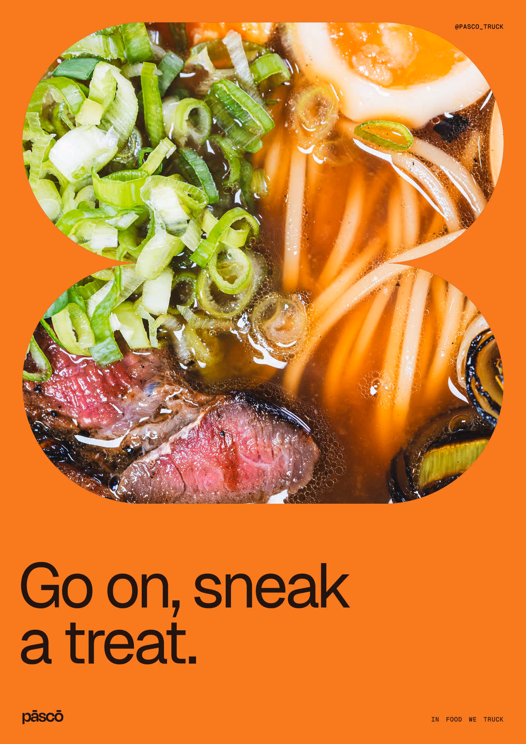
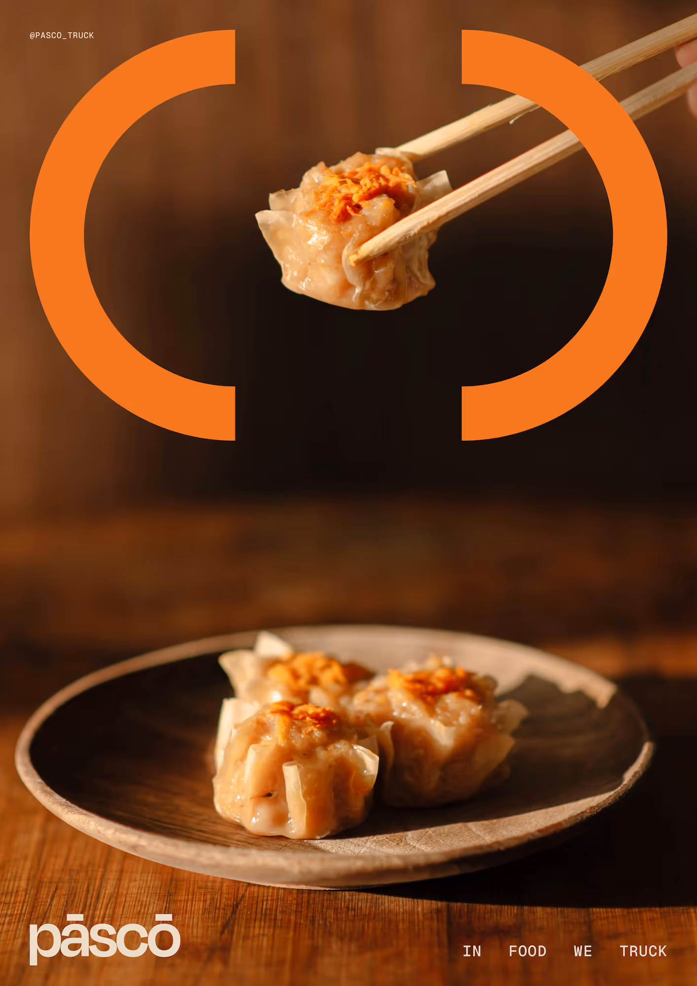
Unlike traditional food trucks that focus on a single cuisine, Pāscō operates as a stage for a rotating pop-up concept, regularly introducing new menus, chef’s specials and themed food experiences. This flexibility allows the brand to be agile, responding to seasons, initiatives and events while keeping the offering fresh and engaging.

Working closely with TNS and Arm, we developed a brand identity that would appeal to the large demographic of Arm employees. The offering centred on celebrating great food, treat-culture and memorable taste experiences.
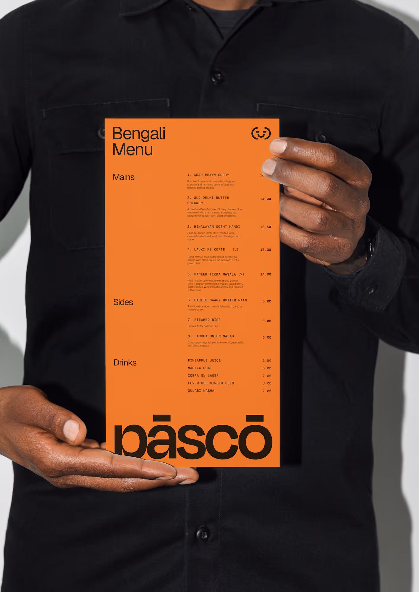
Because the concept revolves around a constantly changing menu, the visual identity needed to be flexible and adaptable, capable of supporting a wide variety of cuisines without overpowering them. The result is a grounded and refined brand system that acts as a canvas for the food offerings, allowing different culinary themes to take centre stage. This ensures the identity supports the constantly evolving menu concepts while allowing the food itself to remain the hero.
The identity was also designed with future expansion in mind. TNS envisioned the potential for a fleet of Pāscō food trucks and mobile catering experiences, so we developed an agile visual system capable of scaling across multiple formats.
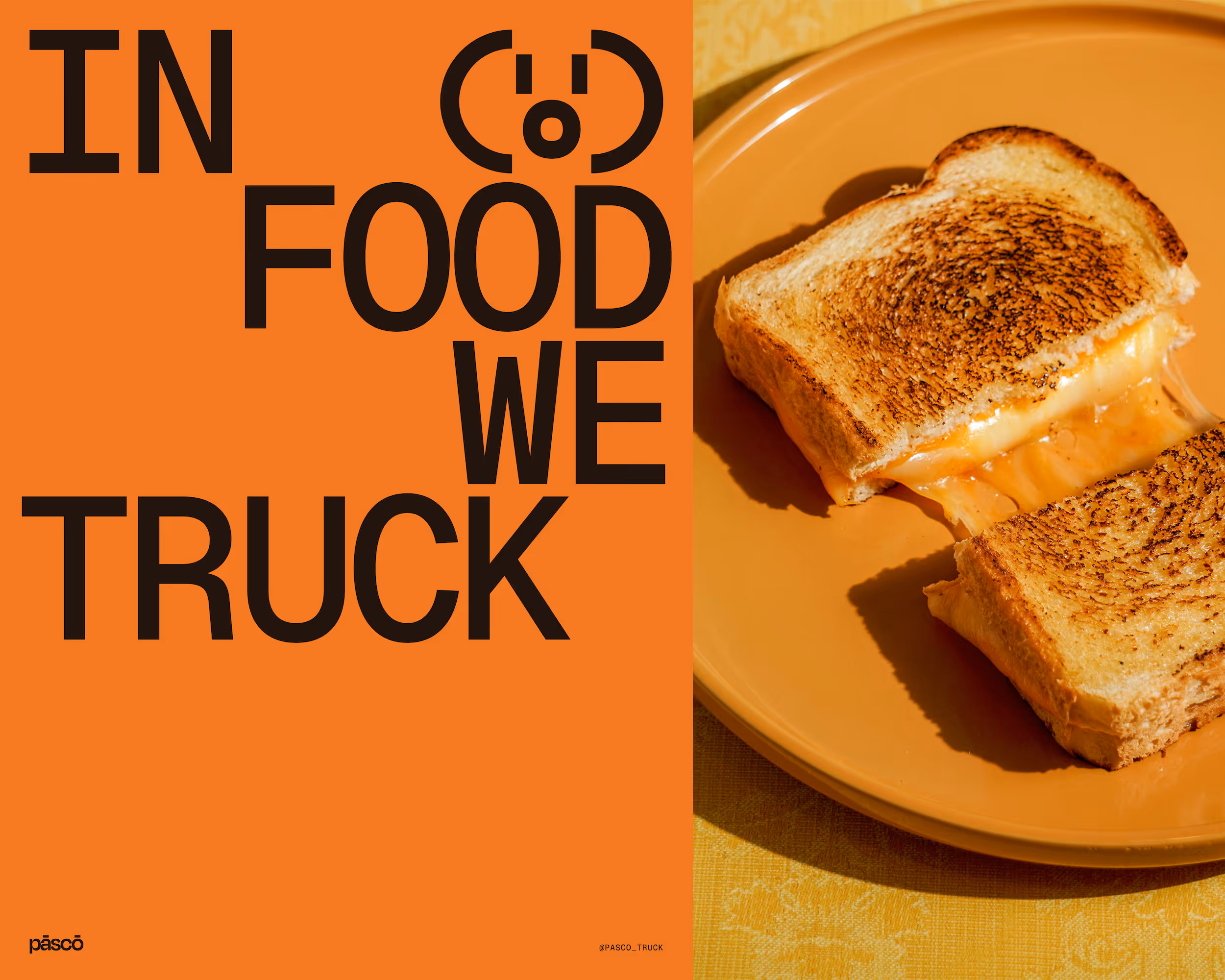
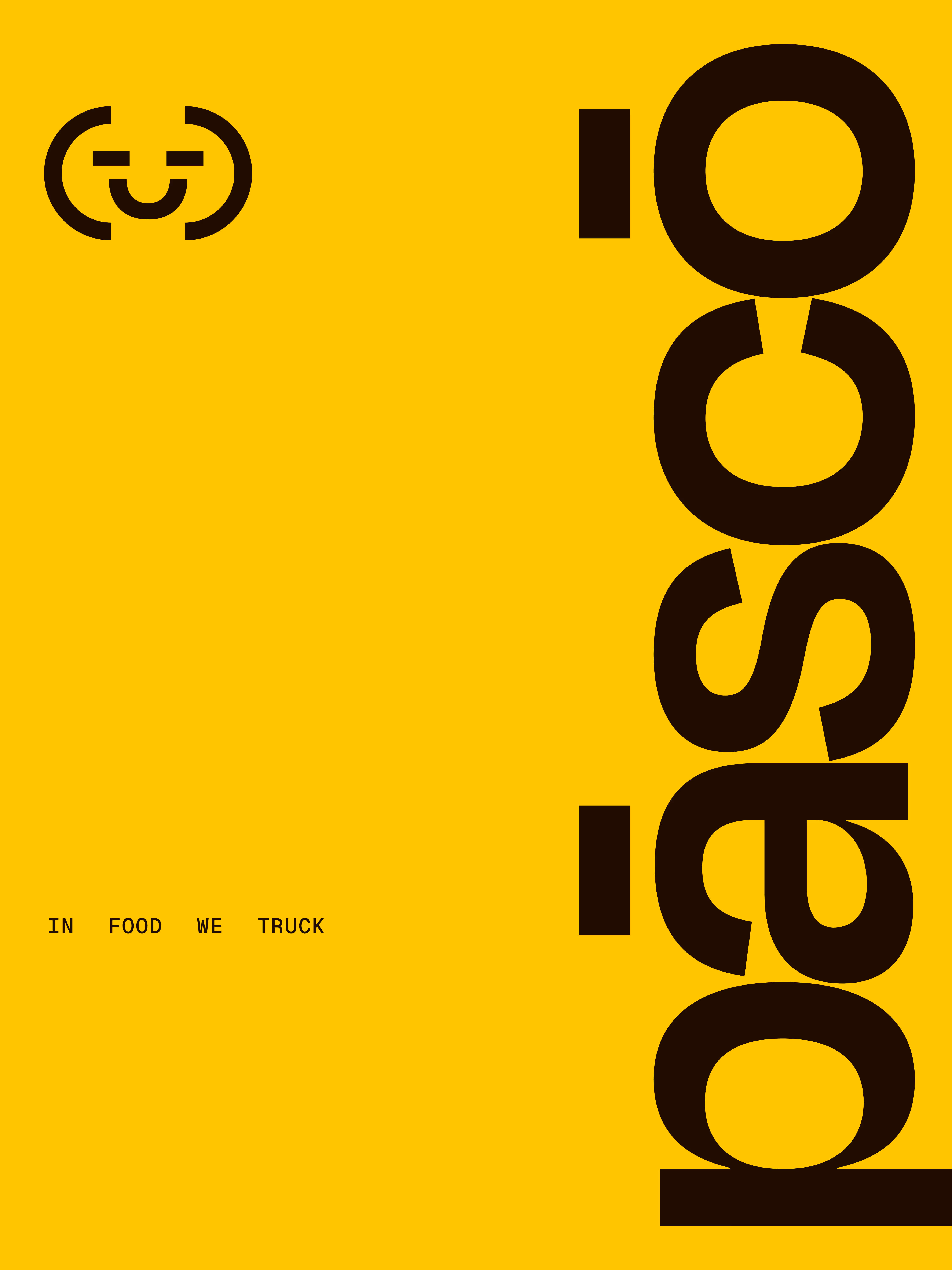
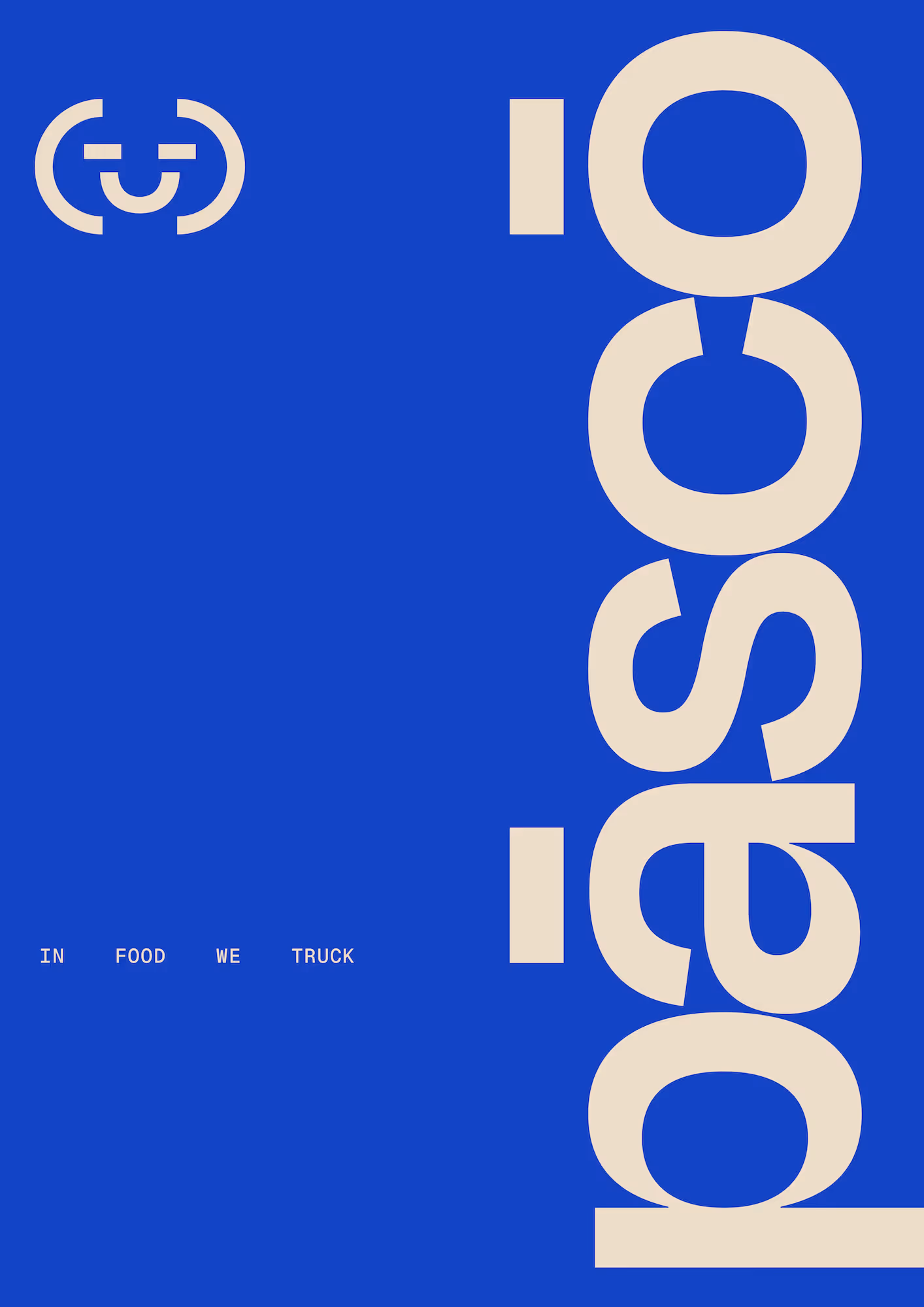
“In Food We Truck”
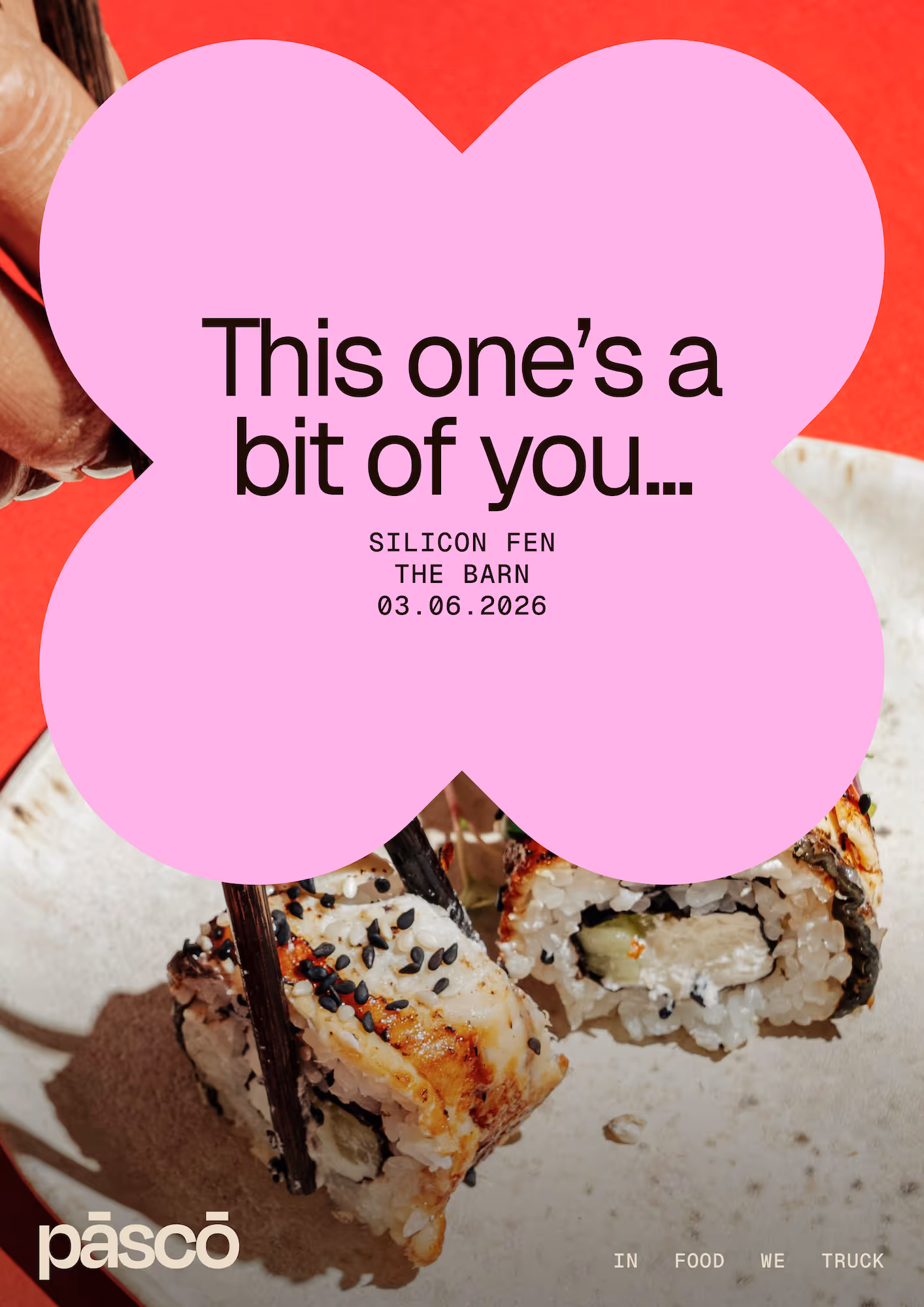
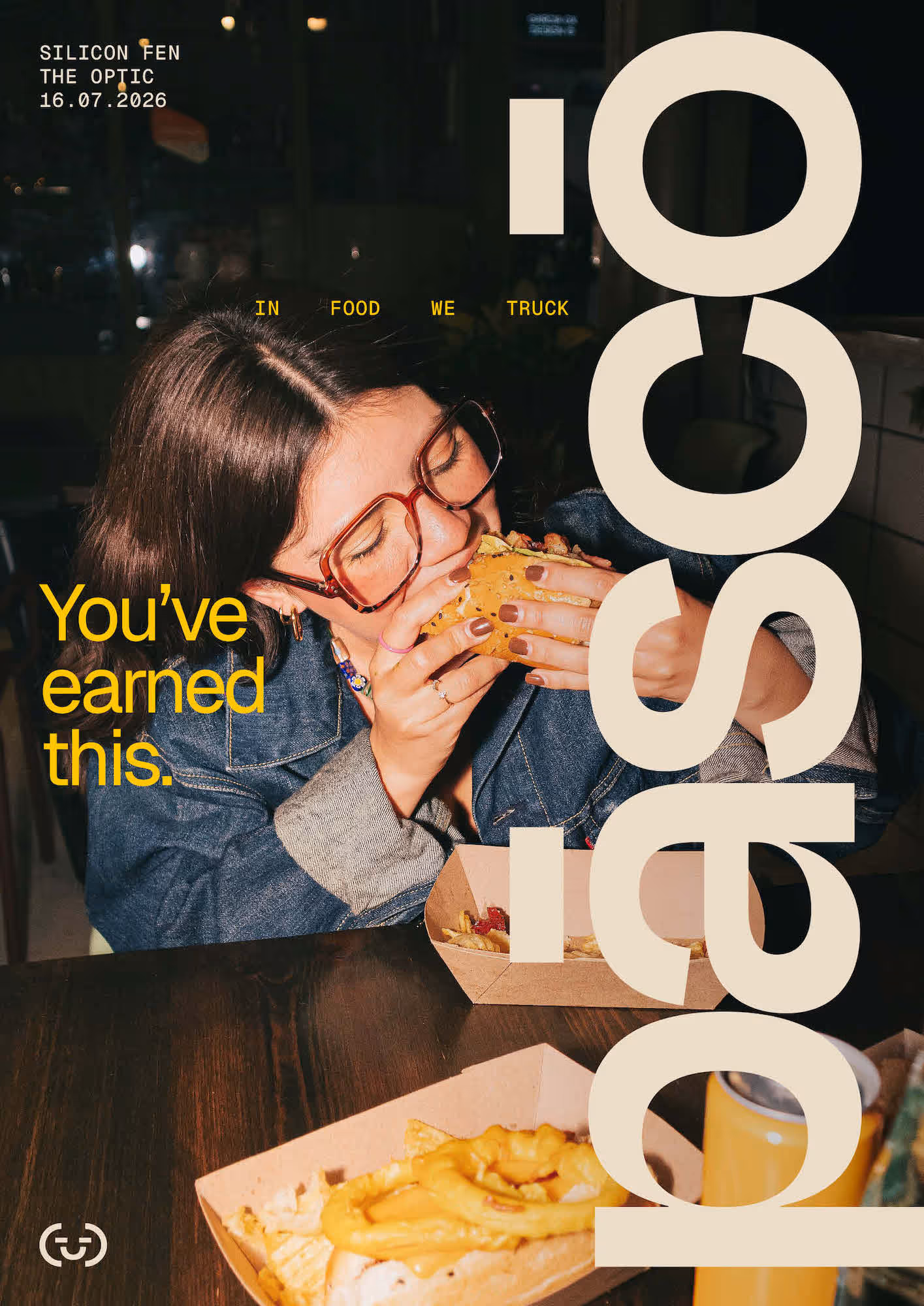
During the exploration phase we developed a playful tagline to help define the brand’s tone of voice. “In Food We Truck” captures the humour and light-hearted spirit that sits at the heart of the concept, reinforcing the brand’s fun and slightly rebellious attitude.
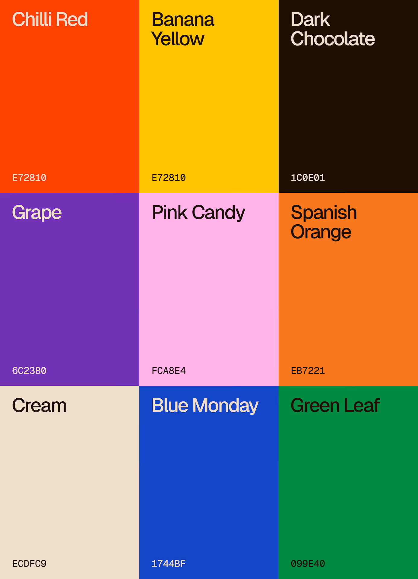
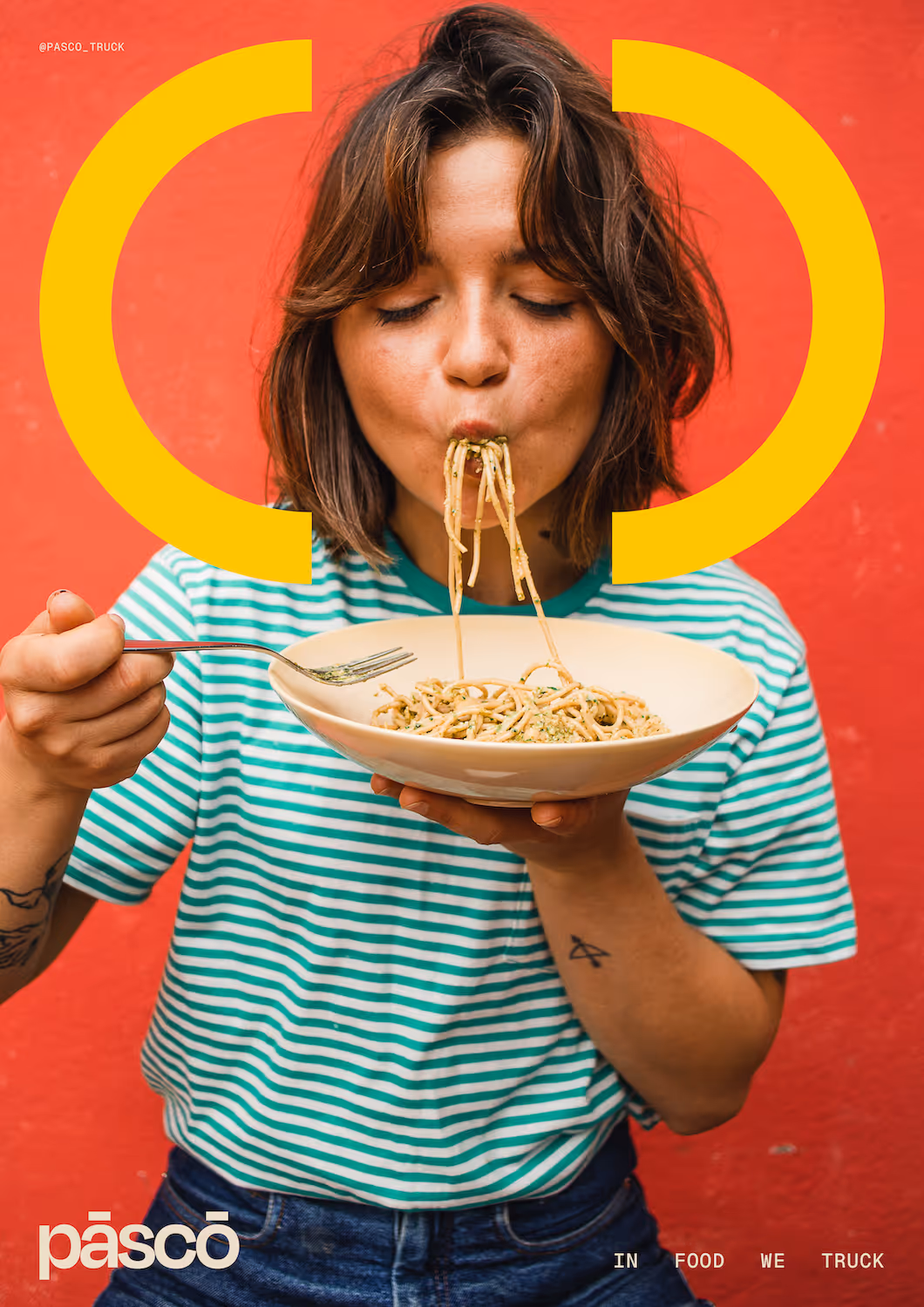
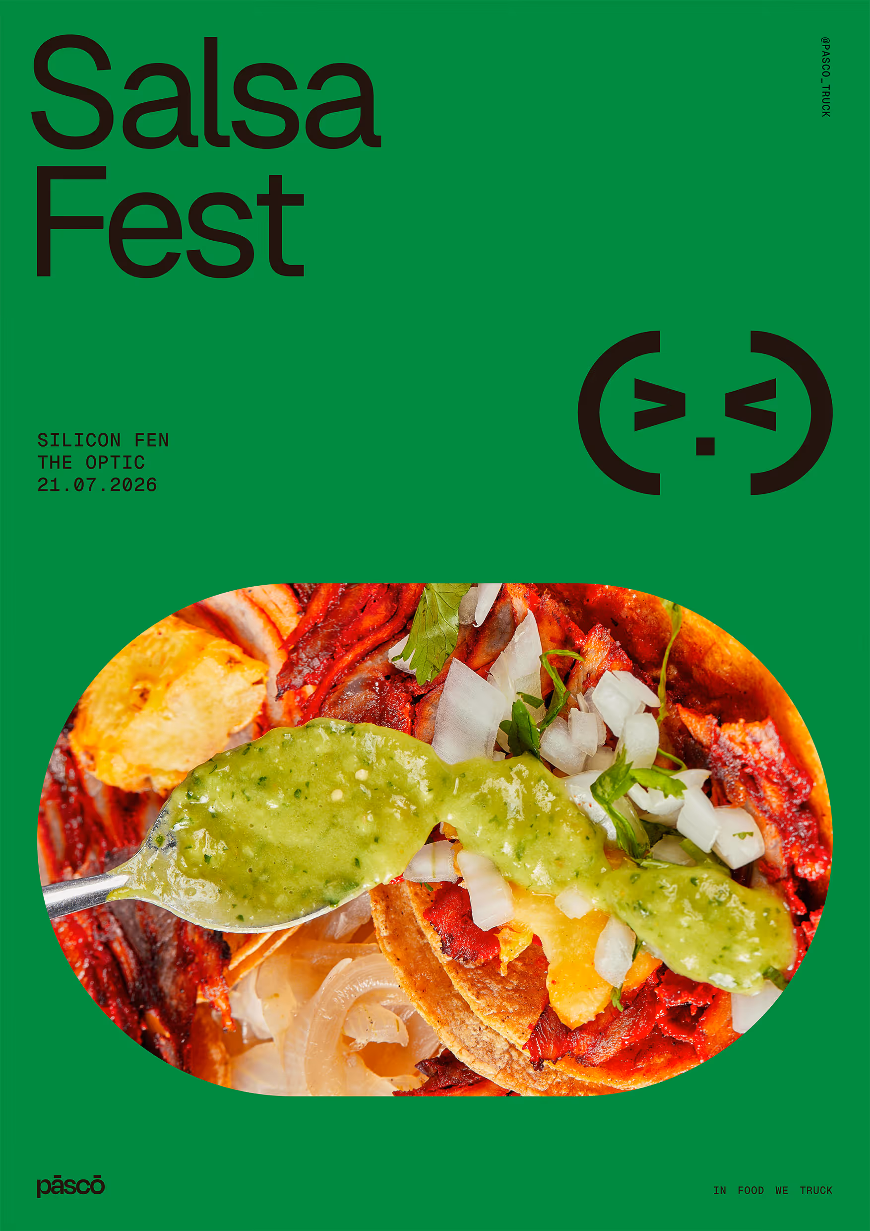
The colour palette supports the bold and playful character of the brand, while remaining flexible enough to accommodate a wide range of cuisines. This colour system allows Pāscō to continually reinvent its menu concepts while maintaining a consistent visual identity.
A foundation of refined neutral tones creates a calm, warm and understated base that allows the food to remain the centre of attention.
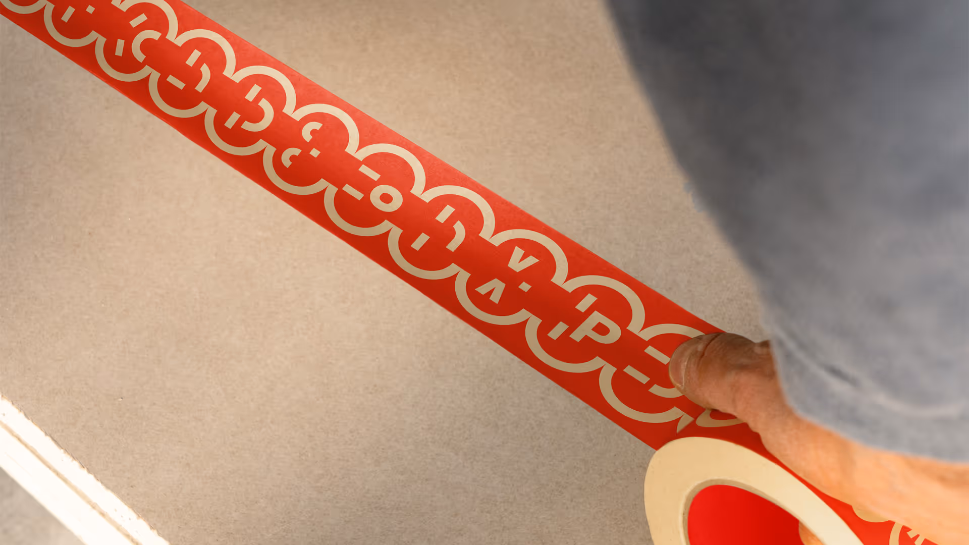
Vibrant secondary colours provide the energy. These pops of colour act as visual garnishes throughout the brand system, helping differentiate menus while adding playful moments of contrast across packaging, signage and other brand applications.
Developing a name that reflected the personality of the concept was a key part of the process. Pāscō was selected for its subtle associations with food and nourishment, as well as the way it sounds and feels when spoken. Sometimes a name simply clicks and all parties quickly recognised that it captured the character we were striving for.
Pāscō - Latin [‘pa:s.ko:]
1. To feed, nourish, maintain, support
2. To feast, delight, satisfy, feed, gratify
3. To supply, cultivate, let grow
4. To graze, browse
5. To pasture, drive to pasture, tend, attend
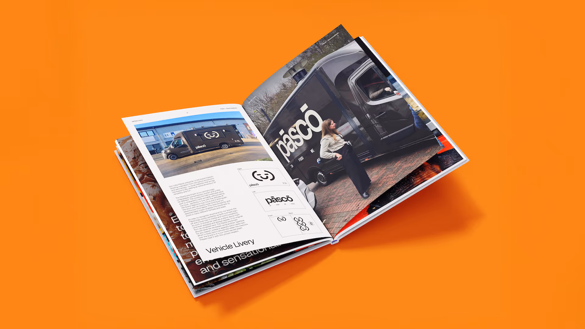
The name naturally informed the logotype design. Its structure lends itself to a clean, contemporary and approachable lowercase sans-serif wordmark. In keeping with the brand’s playful “why not?” attitude, we introduced macrons above the ā and ō, giving the logo a distinctive visual character and a subtle sense of exotic flair. The bold simplicity of the mark allows it to perform confidently across a wide range of formats, from vehicle livery to packaging and digital applications.
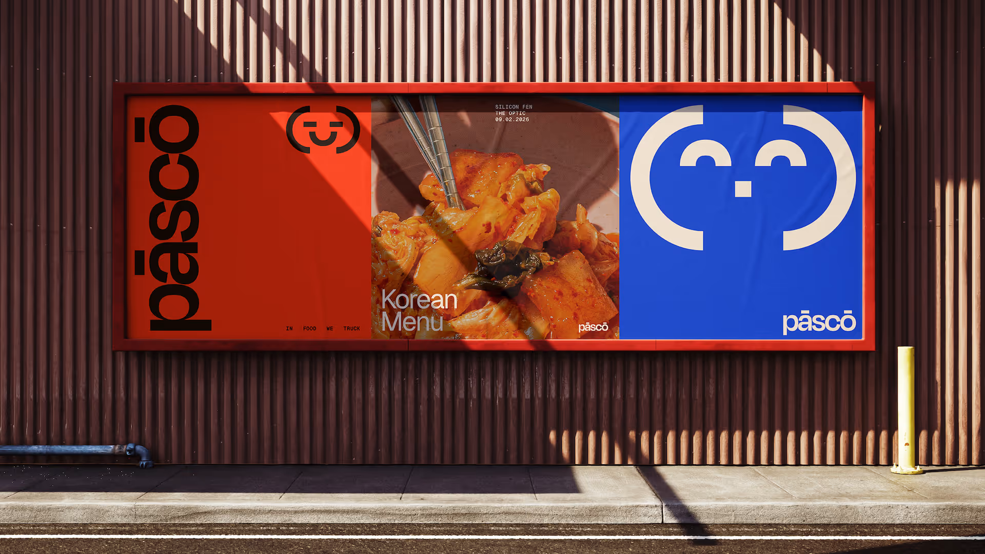
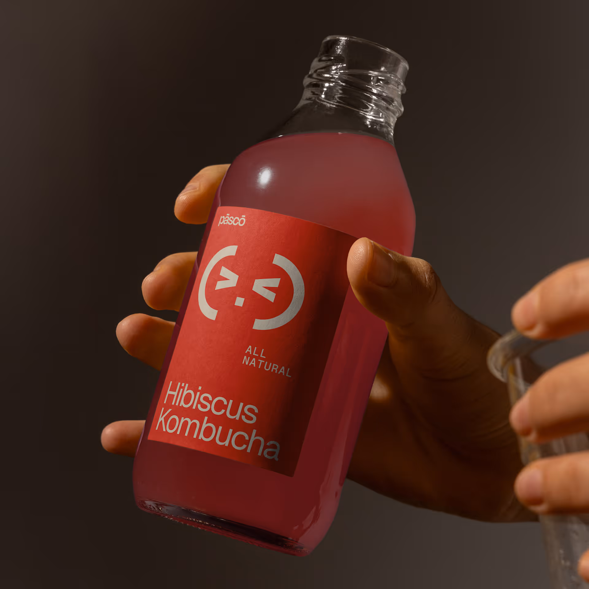
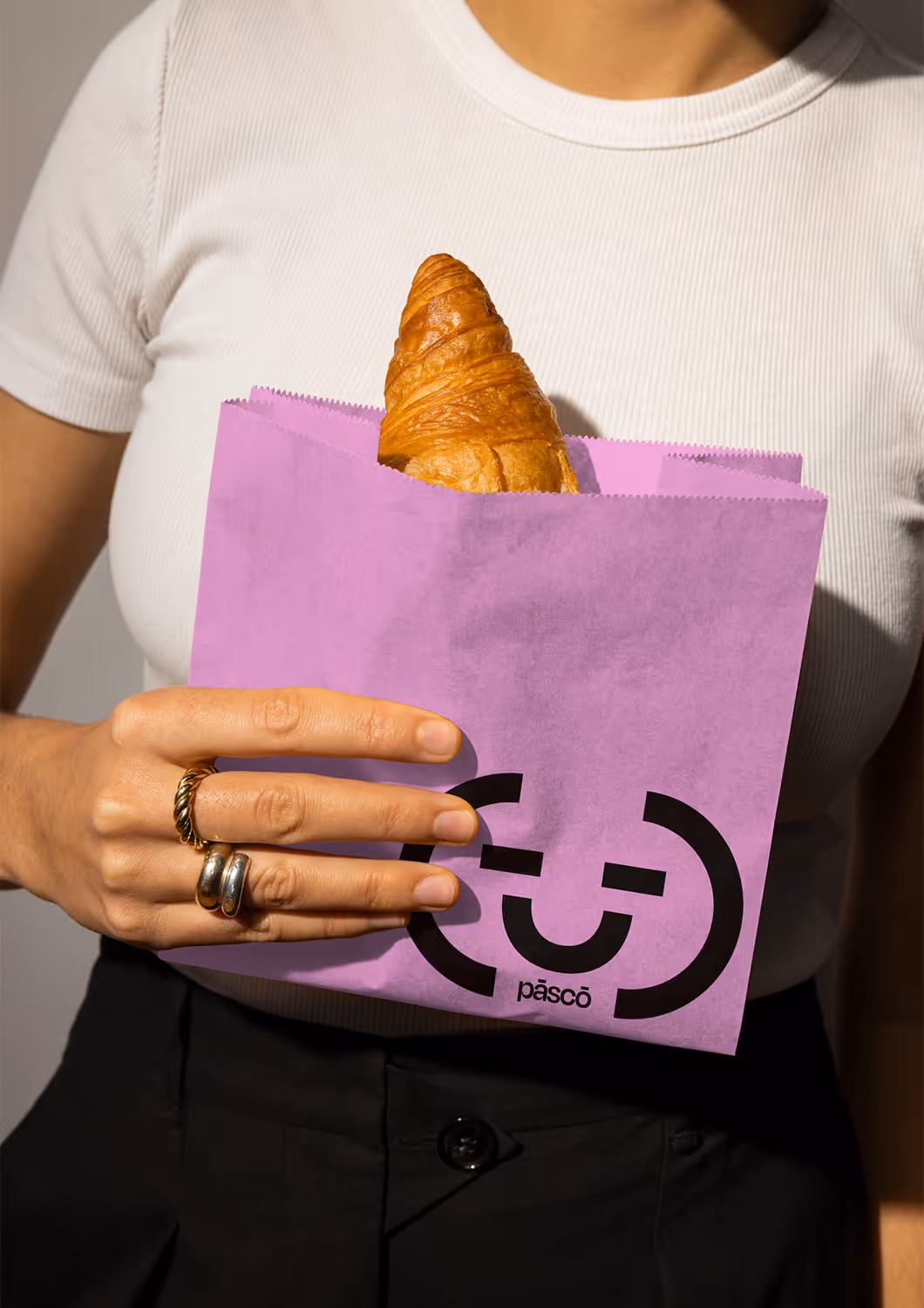
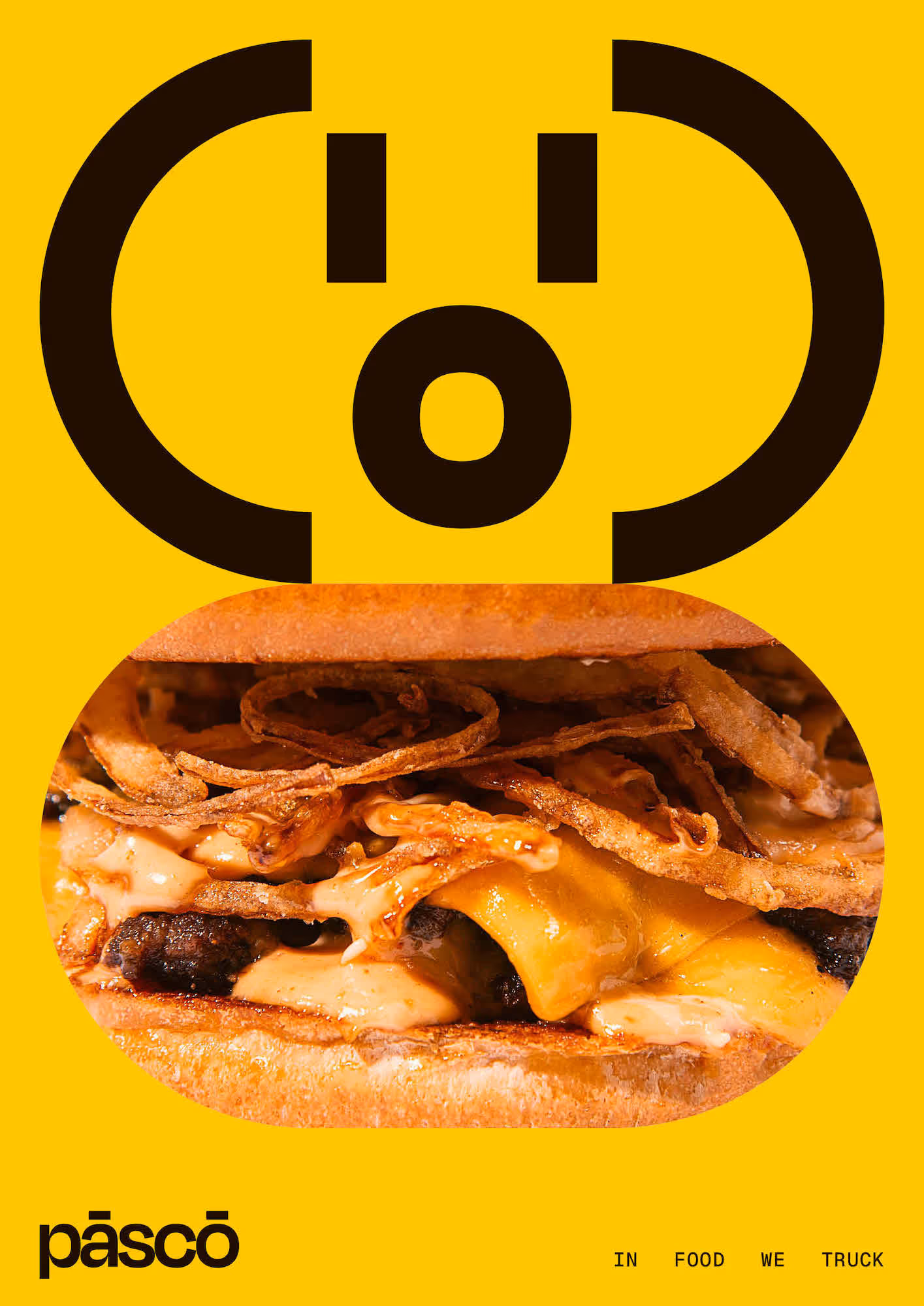
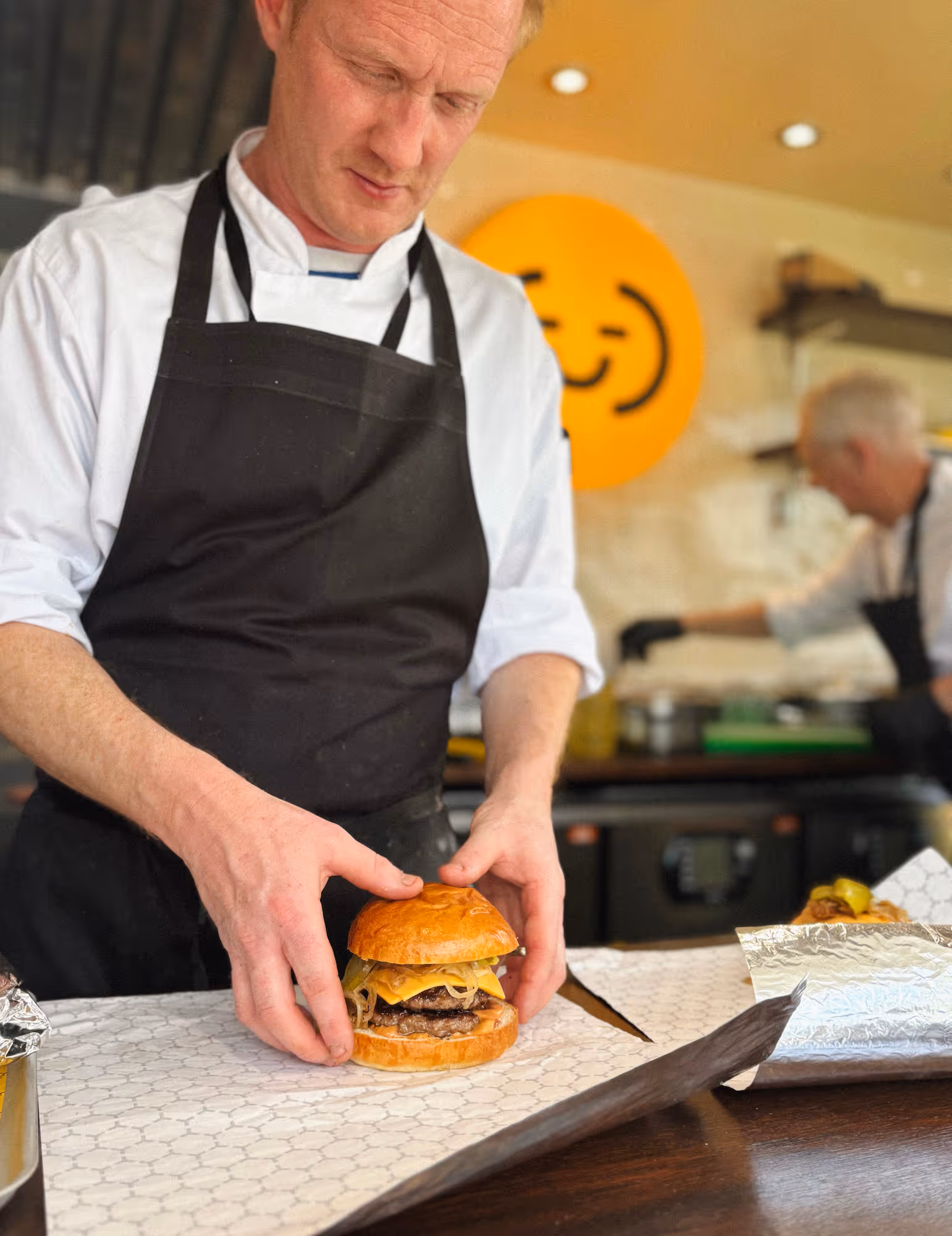
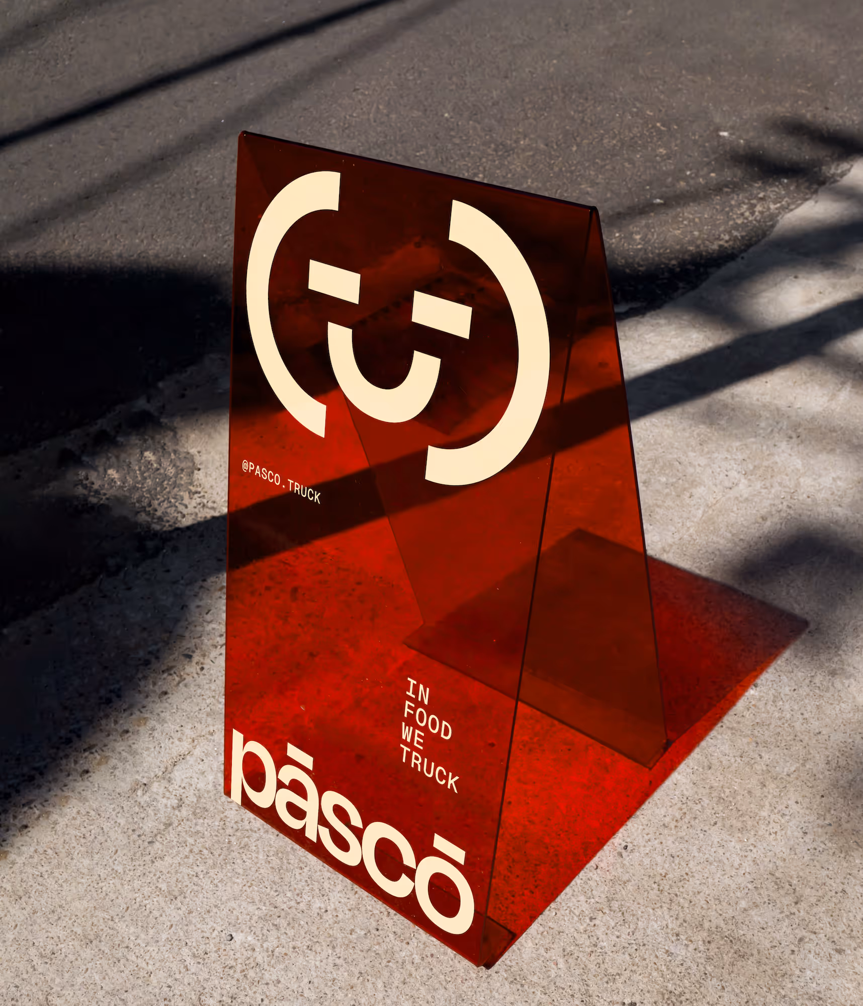
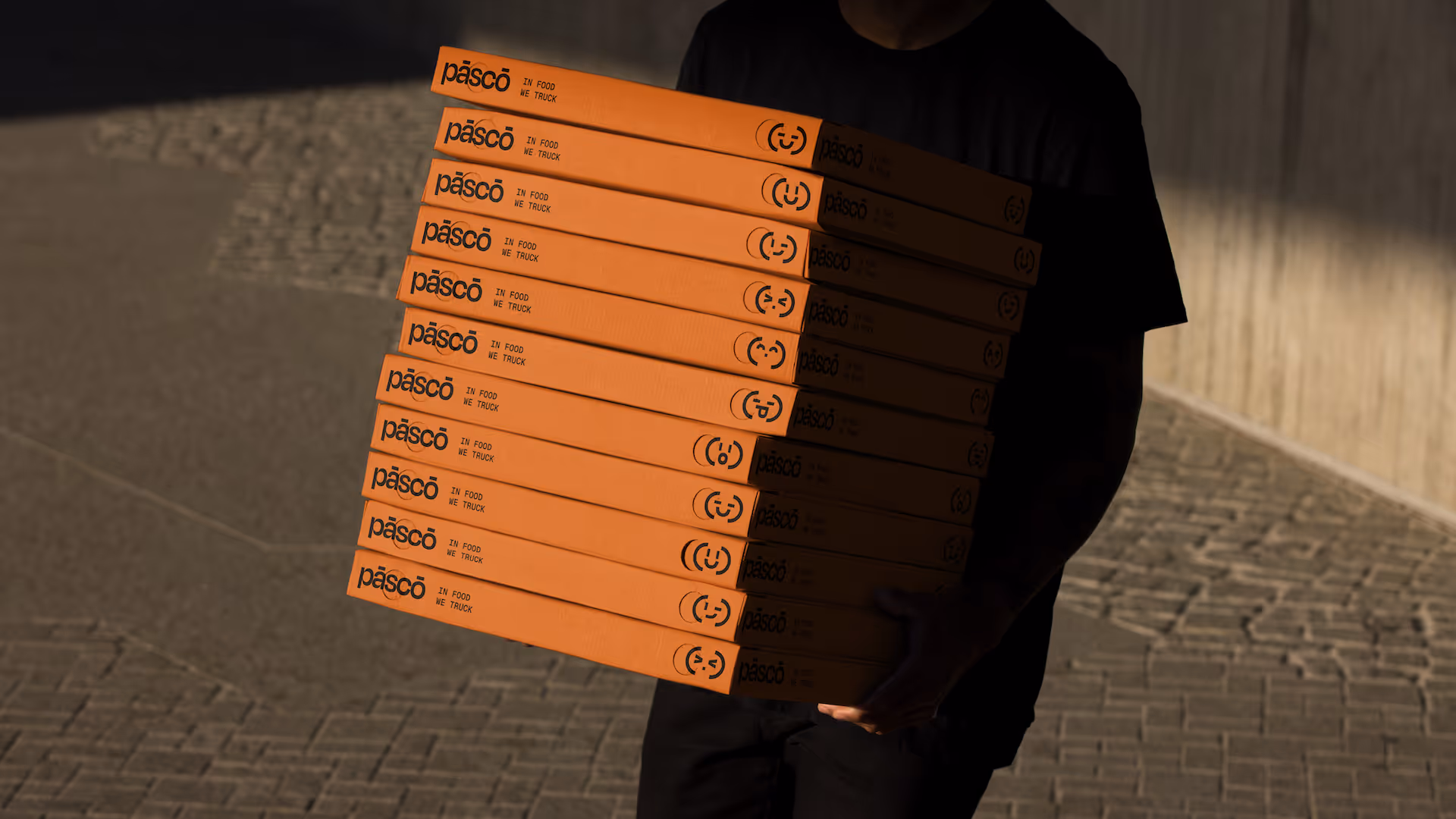
To complement the name and identity, we developed a playful graphic character for the brand.
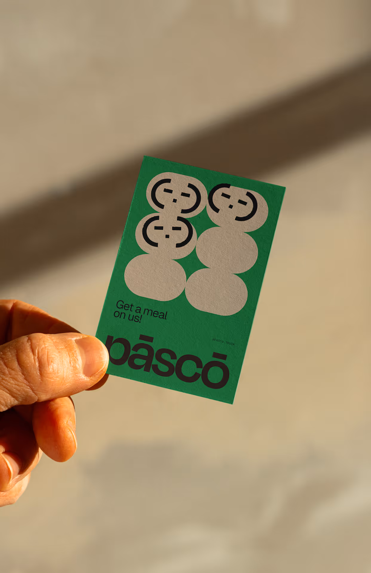
Lil’ Pāscō and its family of expressive variations take inspiration from early emoticons and ASCII-style emojis. Acting as both a mascot and visual companion, the character adds personality and versatility across the brand.
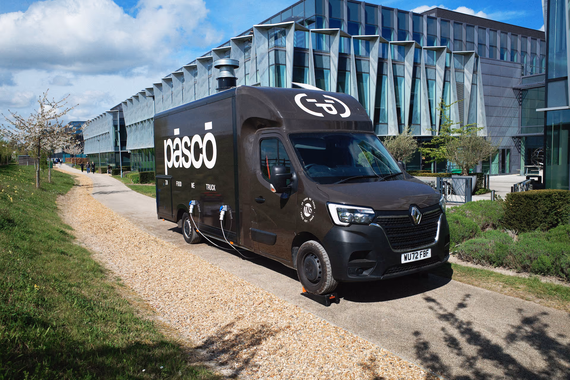
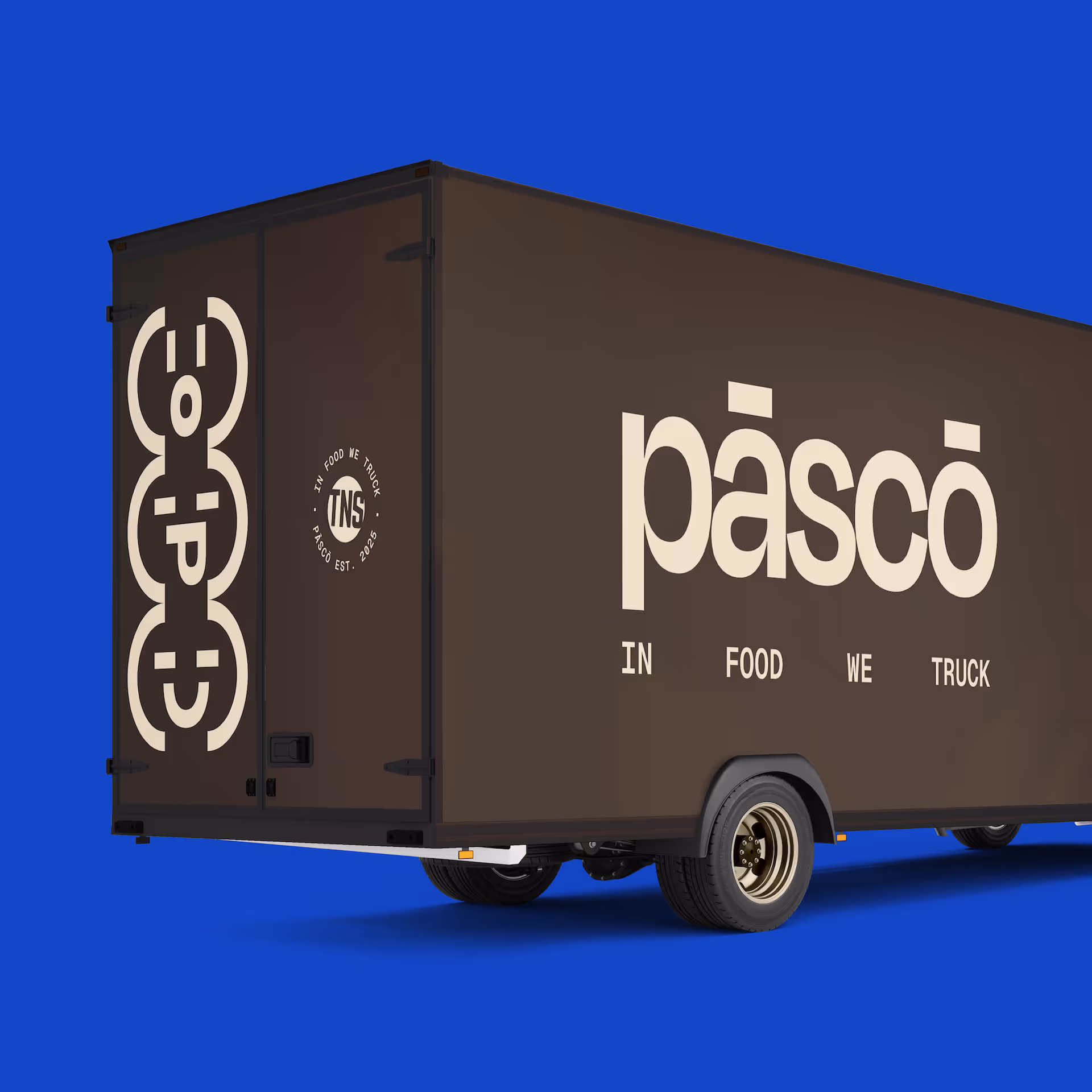
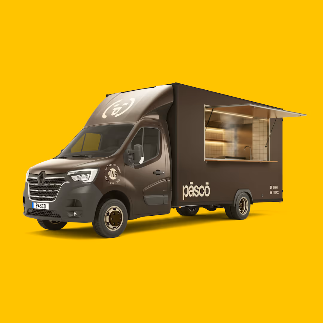
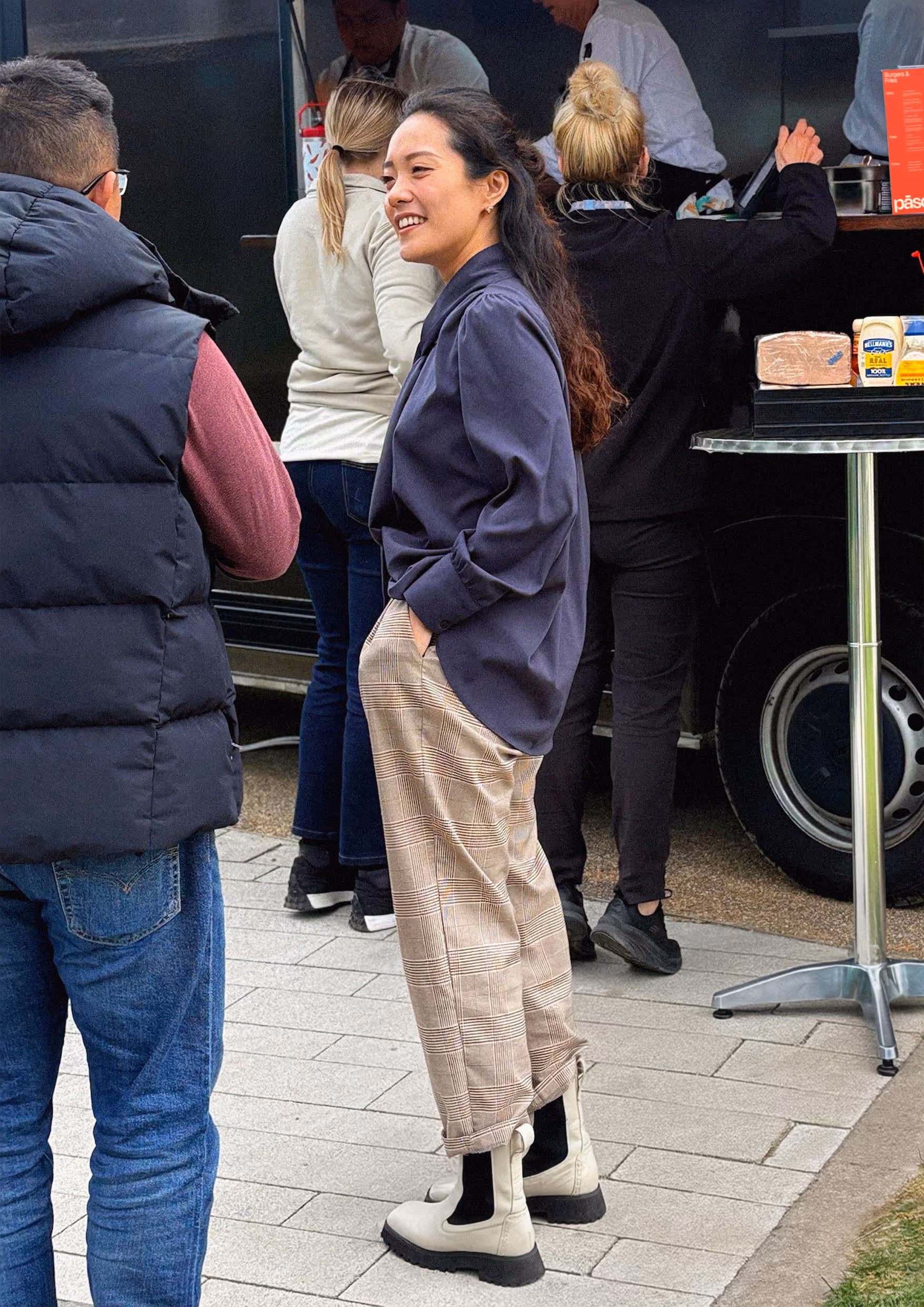
Designing the food truck livery was an exciting opportunity to translate the brand identity into a real-world experience. It was important that the livery design felt different from the average street-food aesthetic, while also still sitting comfortably within the sleek modern architecture of Arm’s Cambridge campus.
As the central touchpoint of the concept, the food truck acts as a large-scale mobile canvas for the brand. It functions not only as a point of service but also as a highly visible brand statement. Its strong visual presence and unique style helps attract attention across the campus while reinforcing Pāscō as a distinctive destination for food experiences.
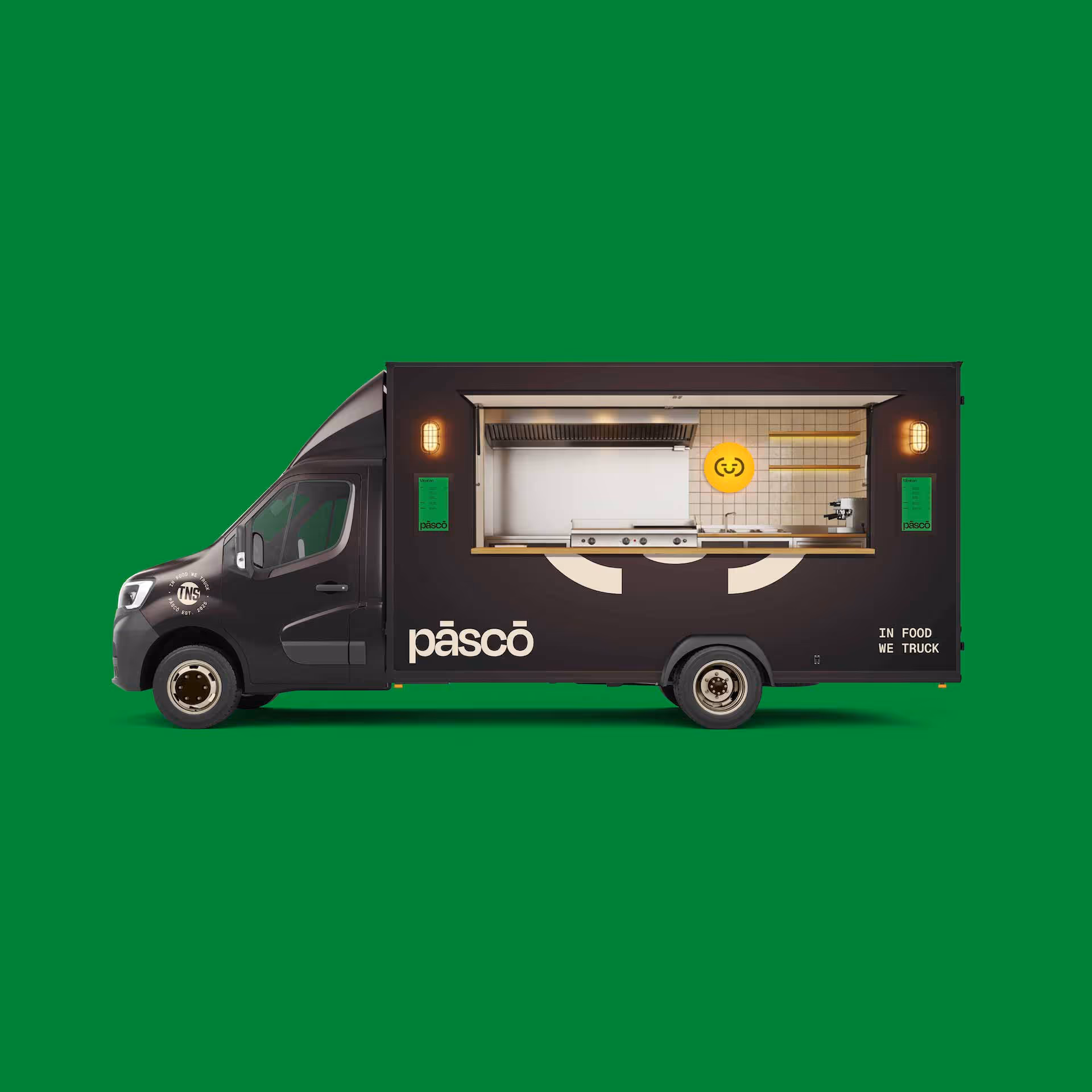
The design ethos extended to the appointments and details of the truck’s serving area and interior.
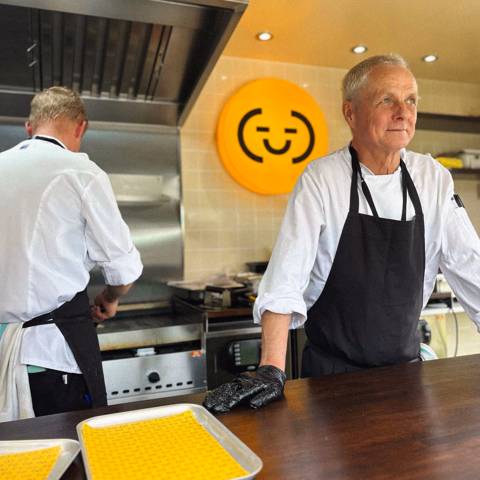
Drawing inspiration from the warmth and minimalism of contemporary Japanese interiors, we specified wooden surfaces, off-white tiles and tungsten lighting to create a space that feels both functional and welcoming. A branded lightbox carries through the playful brand identity to the cooking area while contributing to the soft, warm, inviting atmosphere of the truck.
Brand collateral is where customers encounter the brand first-hand, making it essential in translating the identity into tangible experiences.
We developed a comprehensive suite of materials including menus, food packaging, labels, loyalty cards, signage and out-of-home concepts to demonstrate the flexibility of the visual system across multiple touchpoints.
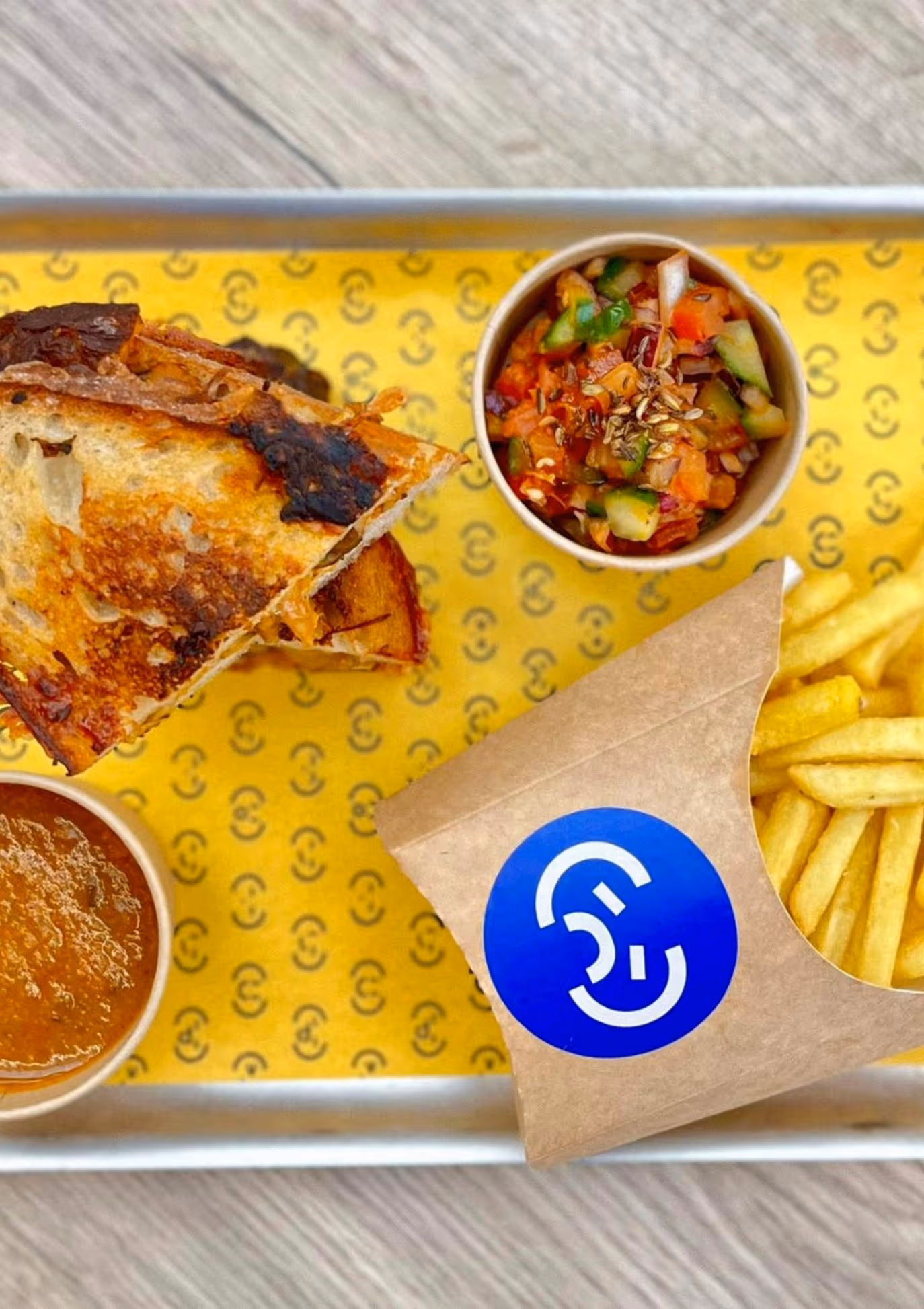
This phase of the project also allowed us to introduce the brand’s vibrant pops of colour across the collateral. These colour accents energise the identity, adding personality while creating a clear visual system for differentiating between menu concepts and cuisine themes.
Together these elements help create a cohesive and memorable customer experience.
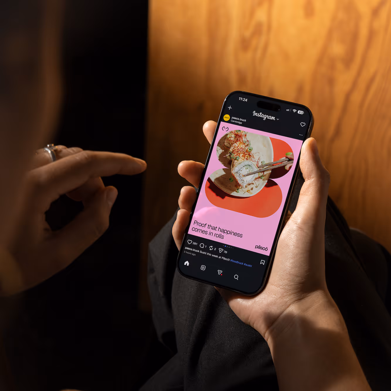
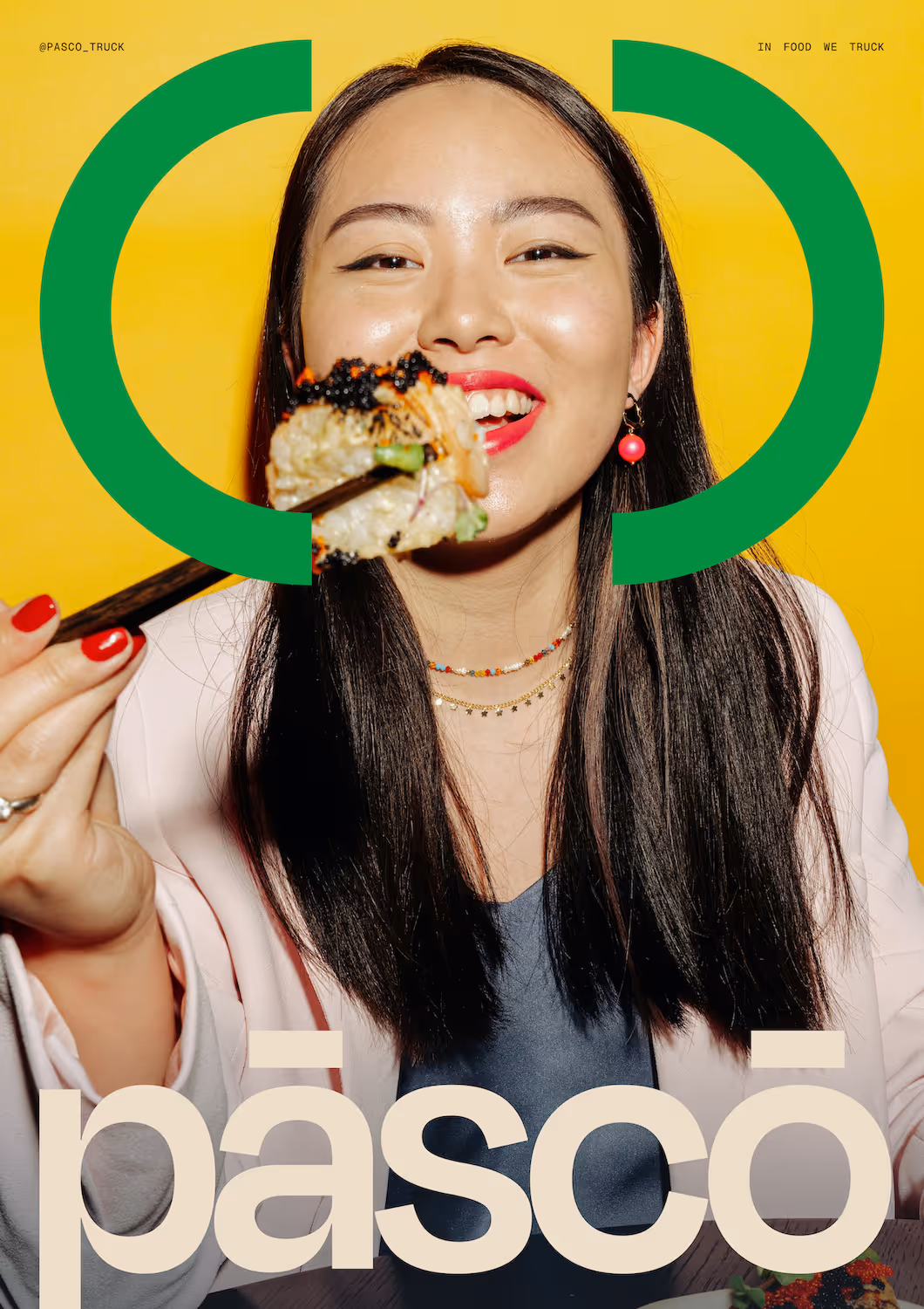
A brand needs to live and breathe with the same tone of voice and brand language carried through all its communications, from social media presence to event posters.
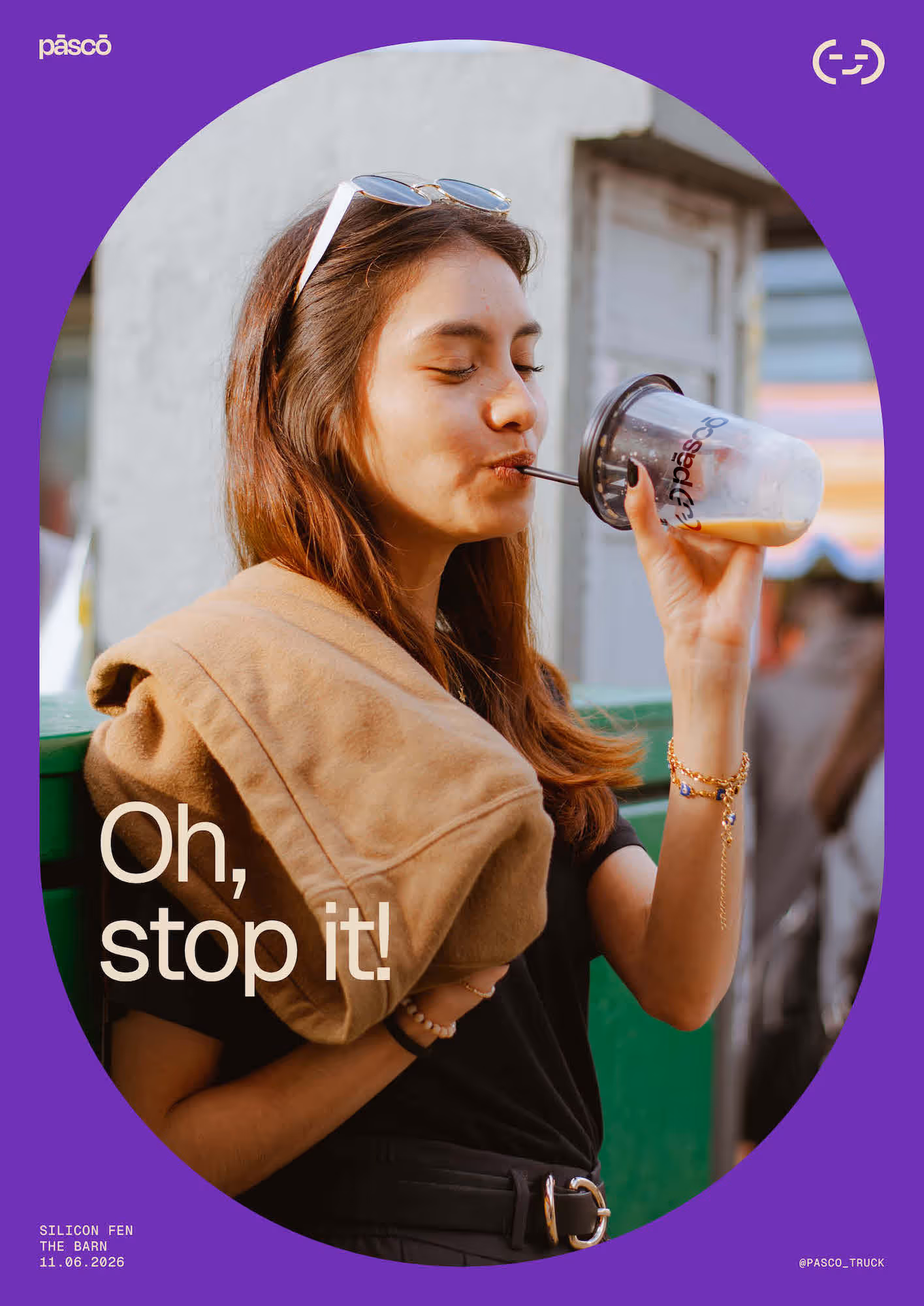
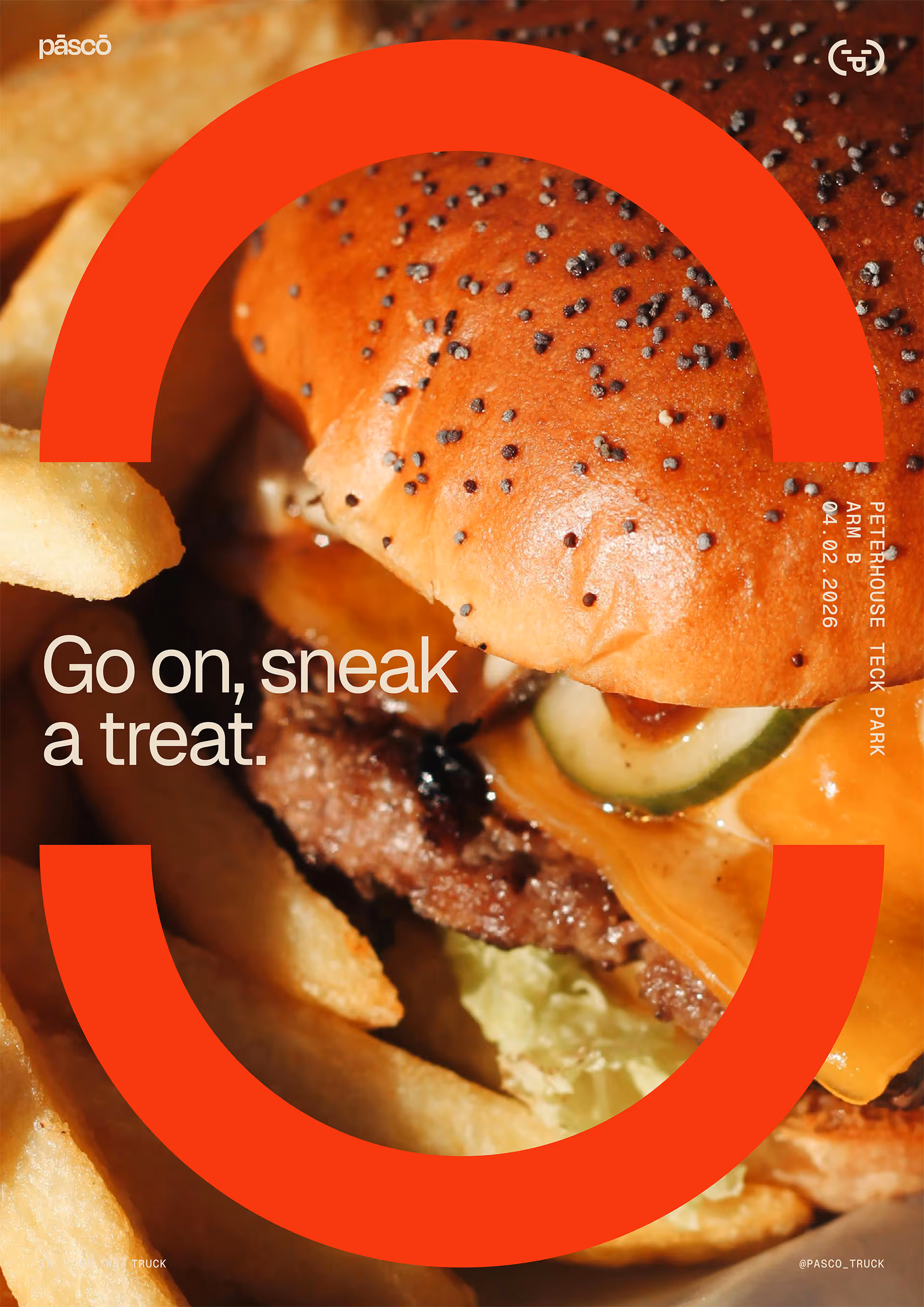
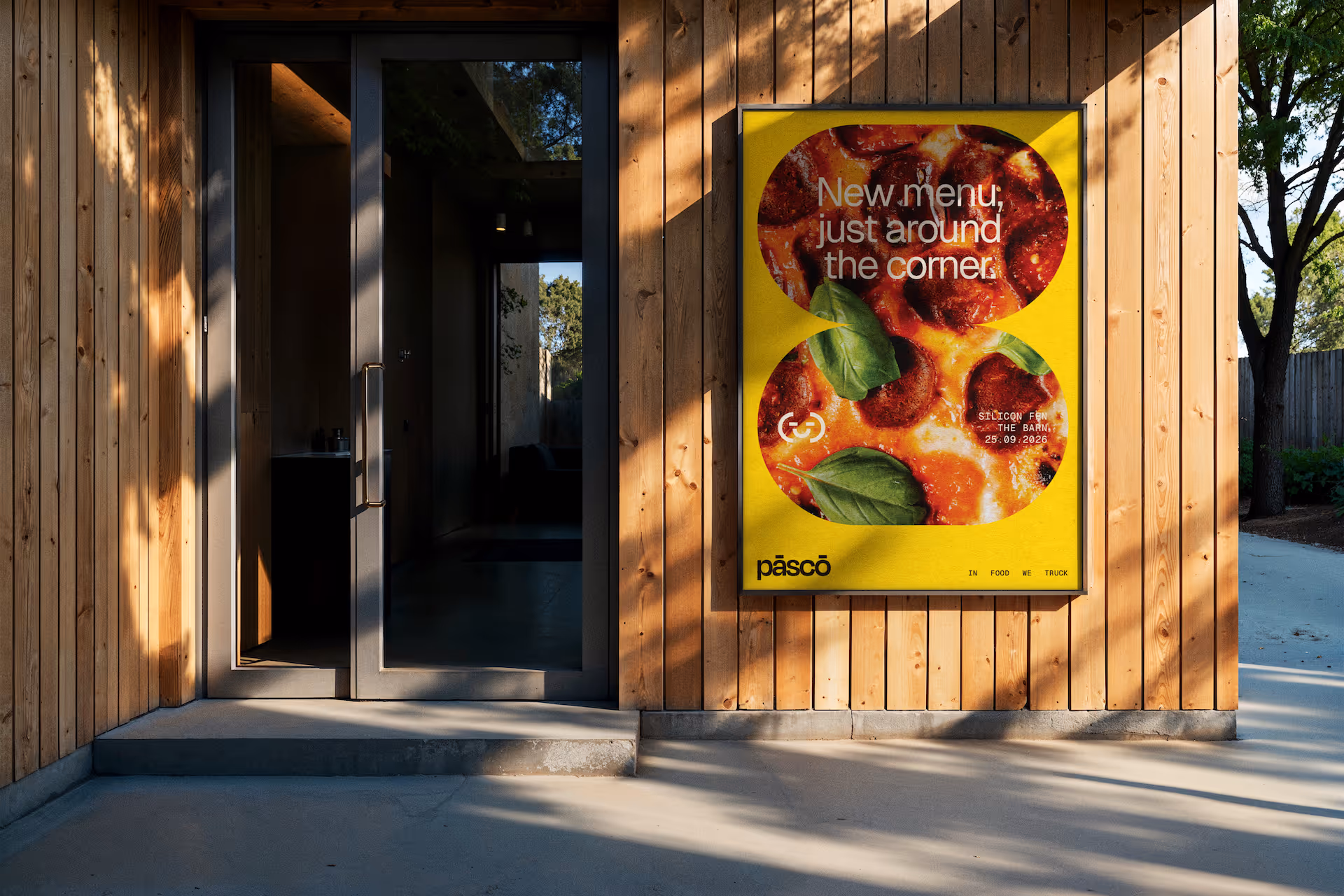
We created a suite of flexible templates that could be used to present offers, new menus, launch initiatives and publicise events. These designs carried through the Pāscō design logic and personality from the core brand in various formats, demonstrating how the brand can live out in the world.
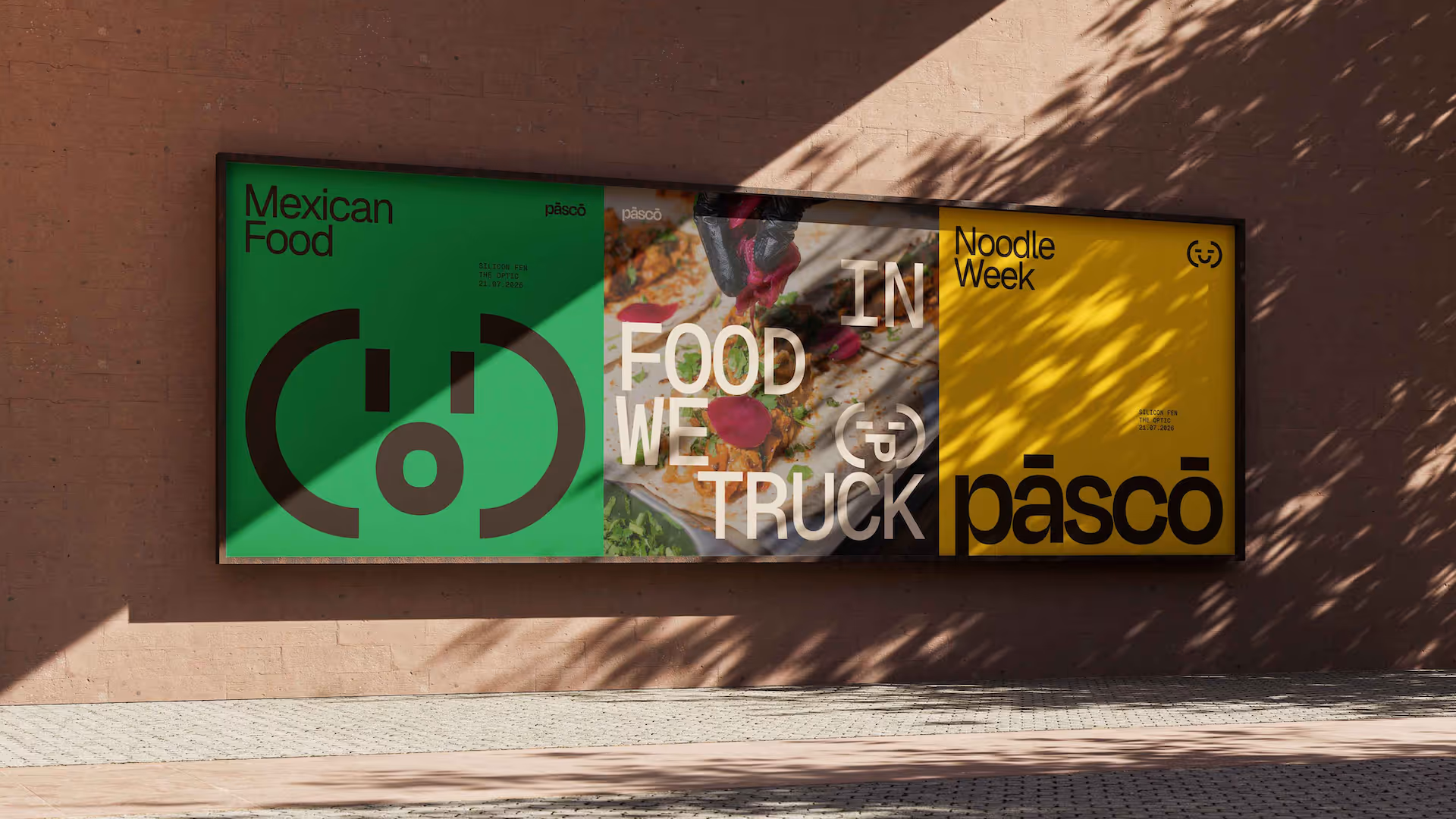
Pāscō has introduced a new layer of energy and variety to Arm’s Cambridge campus, creating a distinctive food destination within the workplace environment.
The flexible brand system allows TNS to continually refresh the offering through new menus, cuisines and promotional initiatives, ensuring the experience remains engaging for employees and visitors alike. The finished food truck now serves as both a catering solution and a highly visible brand presence on campus and is feeding lines of happy punters this year.
"Thank you so much for all the work that's gone into the Pāscō project and the brand guidelines. They're incredibly clear, thoughtful, and genuinely exciting to read through. The examples and level of detail will be a huge help for us as we bring Pasco to life across everything we do."
Gavin Loud
Head of Catering Services - TNS
"A huge thank you to the In Development team for everything you've done on Pāscō. The brand guidelines are really clear and useful, and they really bring the whole vision together. Seeing the finished food truck in person really brings everything to life and marks such a big milestone for us."
Raísa Bohlke
Workplace Coordinator - Arm