Revyoo

Reputation management software platform Revyoo was considering how it could improve its brand design and our studio was consulted to do a brand audit and refresh exercise. This was about getting under the hood and figuring out why some aspects of the existing design were not working or how others could be subtly improved.
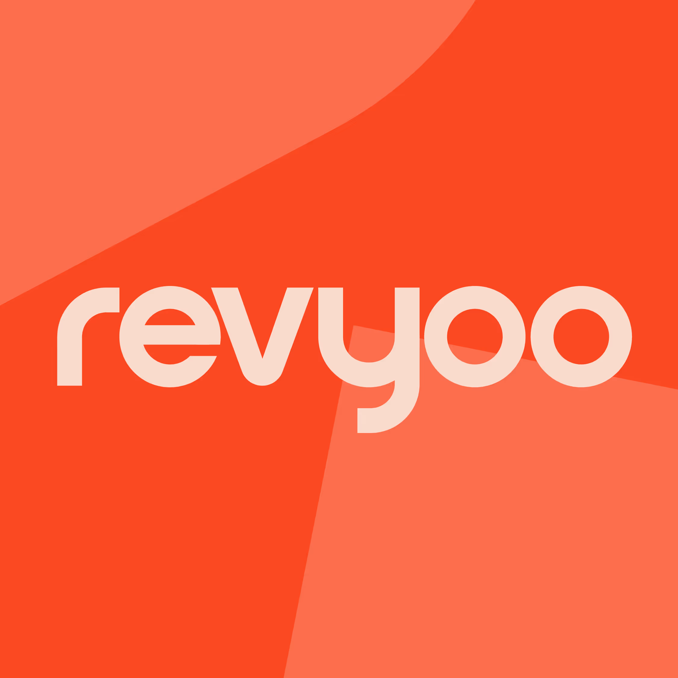
The first issue was the name. The word “Revyoo” is what’s known in the branding world as a ‘neologism’ or a ‘coined term’, a unique word that also still has a connection to meaning. In this case it uses a device called ‘phonetic respelling’ or ‘sensational spelling’ which breaks the word “review” into its constituent sounds as if written by ear. It’s a nice idea that riffs on the core functionality of the platform which aggregates positive customer experiences by pulling together reviews from leading sites like Google and Tripadvisor.
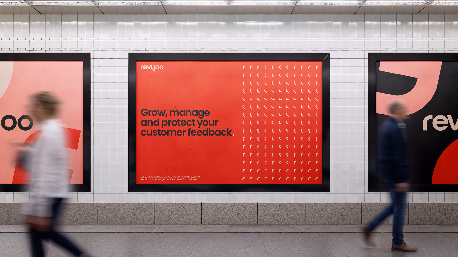
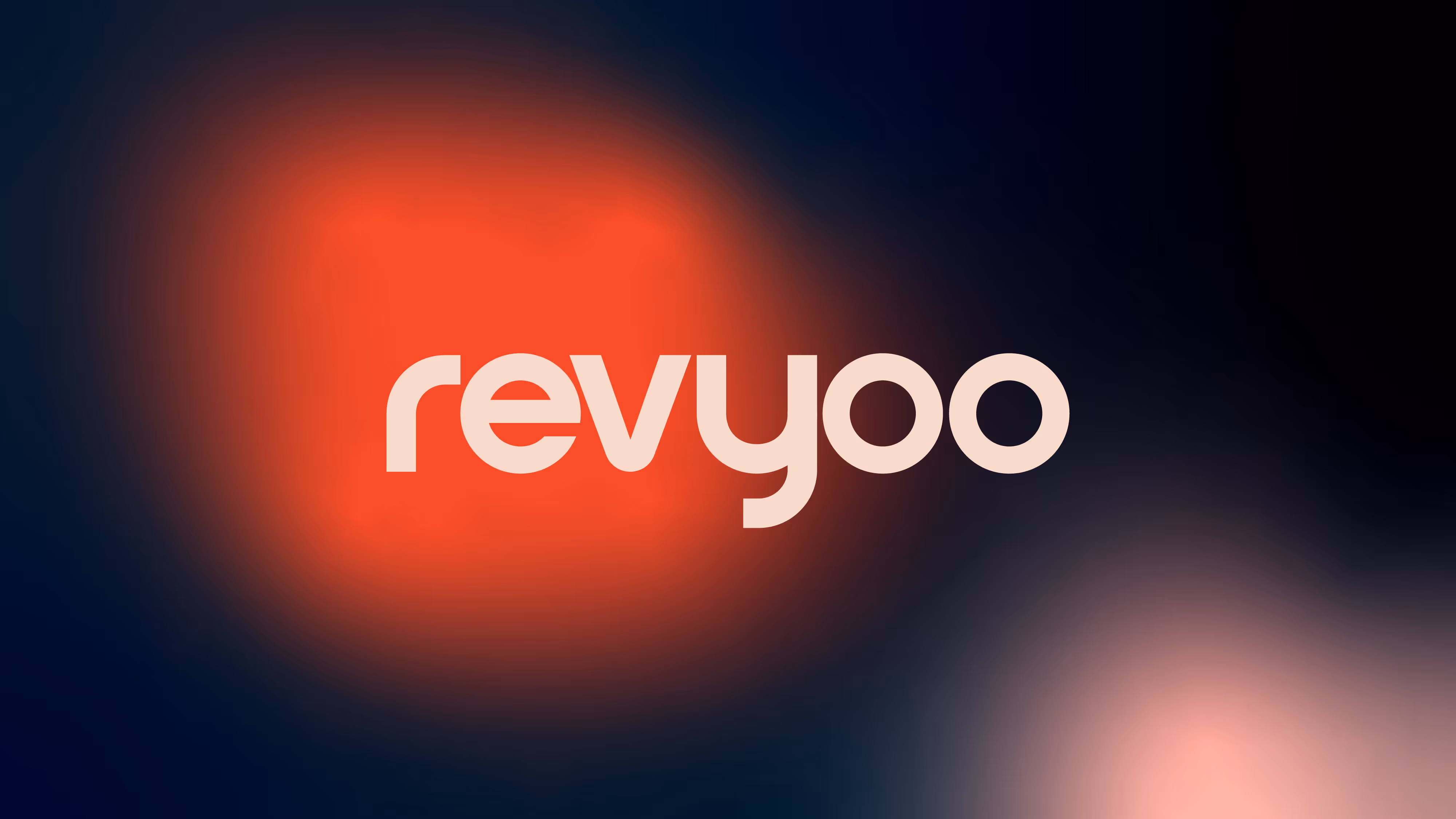
Through discussions with users of the platform, prospective clients and amongst the studio team, we realised early on that the existing wordmark was causing readers to stumble on the name, often mixing the ‘v’ and ‘y’ resulting in mispronunciation and affecting the clarity of the brand messaging. Our first challenge was therefore to look at ways to subtly redesign the wordmark, evolving the typography to improve legibility, aid the readability and help break the word up visually without physically separating the syllables.
When redesigning the wordmark we also looked to soften the style, making it more friendly and moving it away from the harder angles that felt more “tech” than “human”. The result is a gentle curve to the lettering which feels almost like smiles.
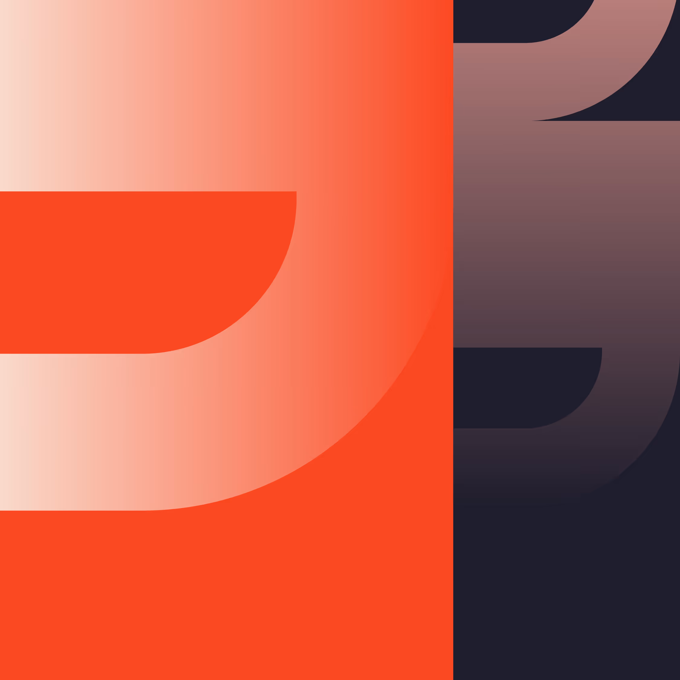
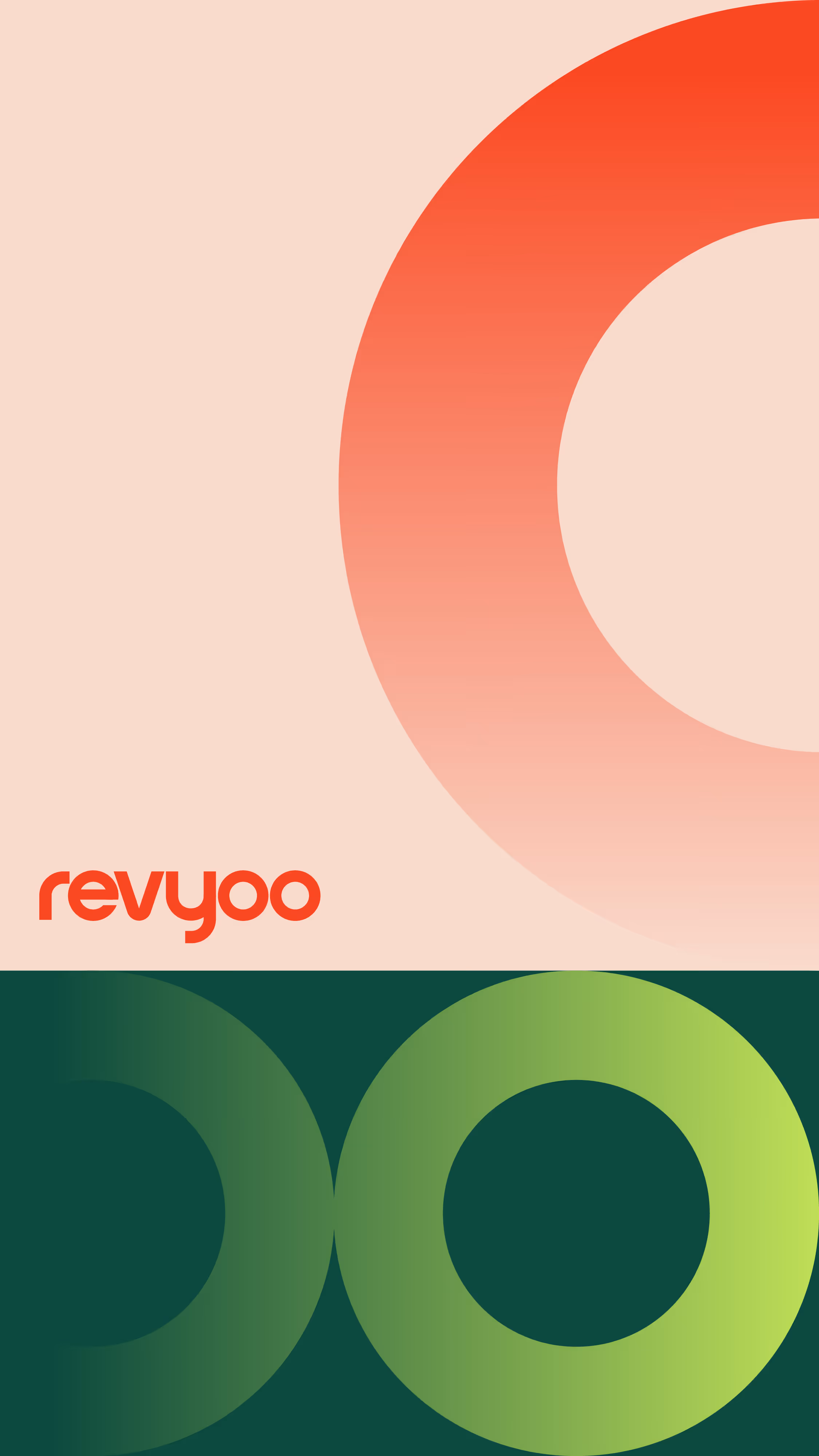
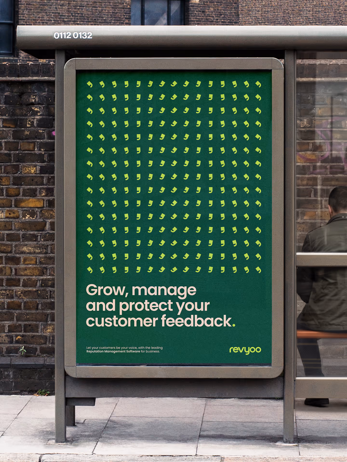
The existing wordmark used a speechmark graphic accent to visually tie the concept to reviews. But a single inverted comma felt undeveloped and cluttered the design. We removed the graphic entirely, instead using the comma form as the basis for a new iteration that incorporated the letter 'r' as its stem. This became a graphic motif appearing more decoratively as a brand icon across the design suite; retaining the connection to speechmarks while adding a more considered extra layer to the identity.
The client wanted a fresh take on a colour space, moving out of the ‘over-used’ cool mint green and into a softer, warmer space that was more in keeping with a lifestyle business. We tested a number of palettes and settled on one that allowed a lighter, warmer lime green and a tasteful dark green to live alongside softer pastel tones like peach and pink, with a bold orange and darker navy anchoring the palette.
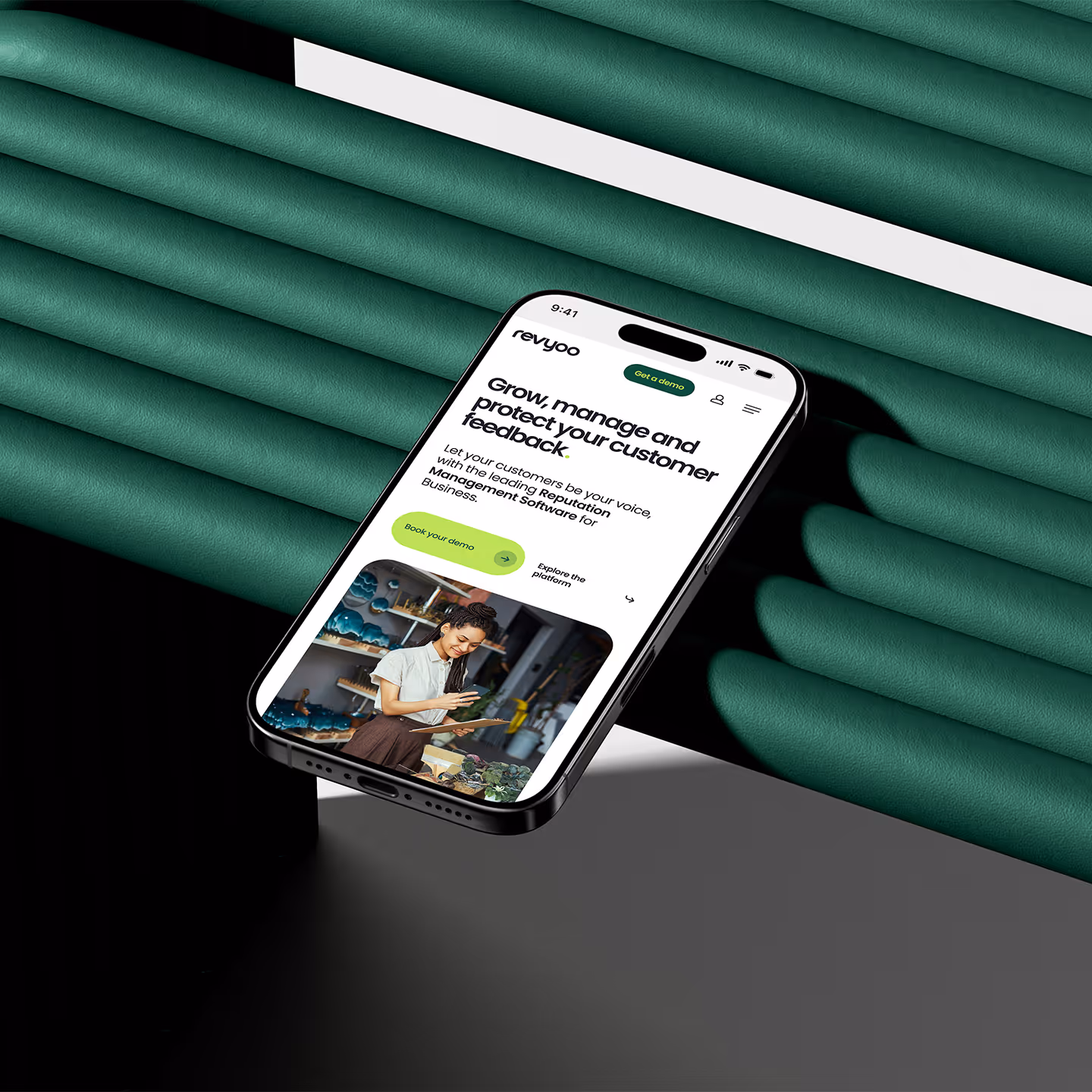
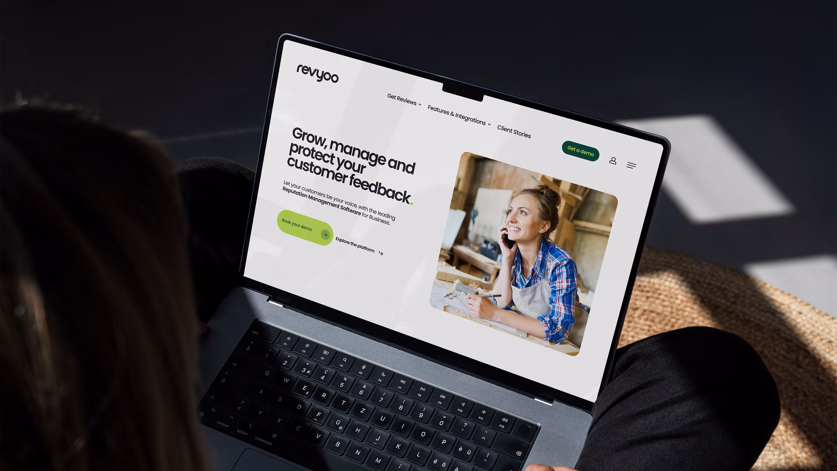
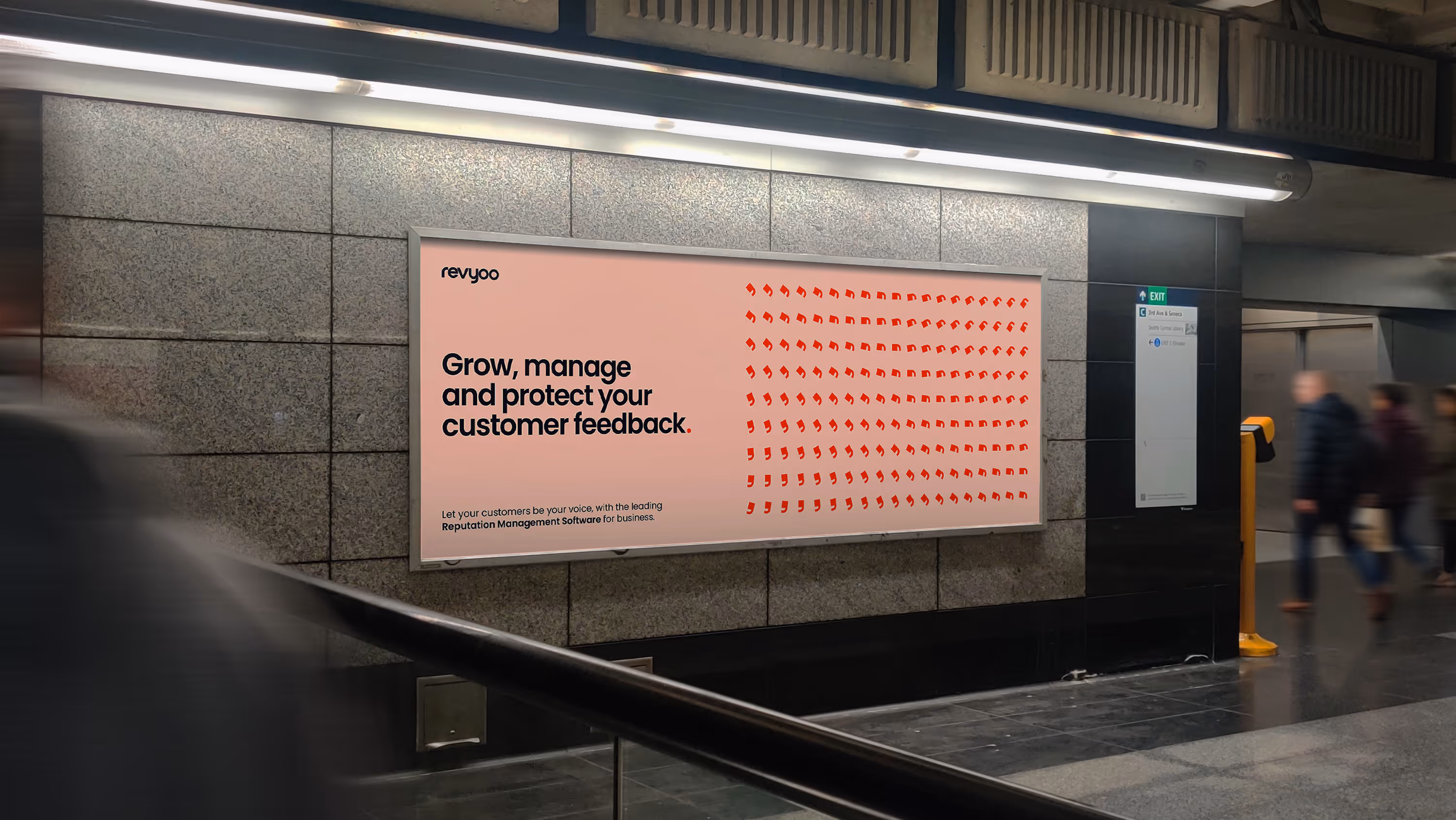
We then tested the versatility of the new designs in a series of mock-ups for out-of-home and device applications which the client was excited to move forward with.

“Working with In Development Studios on the rebrand of Revyoo was an absolute pleasure. From the initial conversation, Ed and the team immediately understood the direction we wanted to take the brand. They brought fresh ideas to the table, asked all the right questions and guided us through the creative process with professionalism and clarity.The final result was exactly what we were looking for; a clean, confident and versatile brand identity with a vibrant colour palette that perfectly suits our values and ambition. Huge thanks to the In Development team.”
Ryan Nesbitt
Founder - Revyoo