Sandag
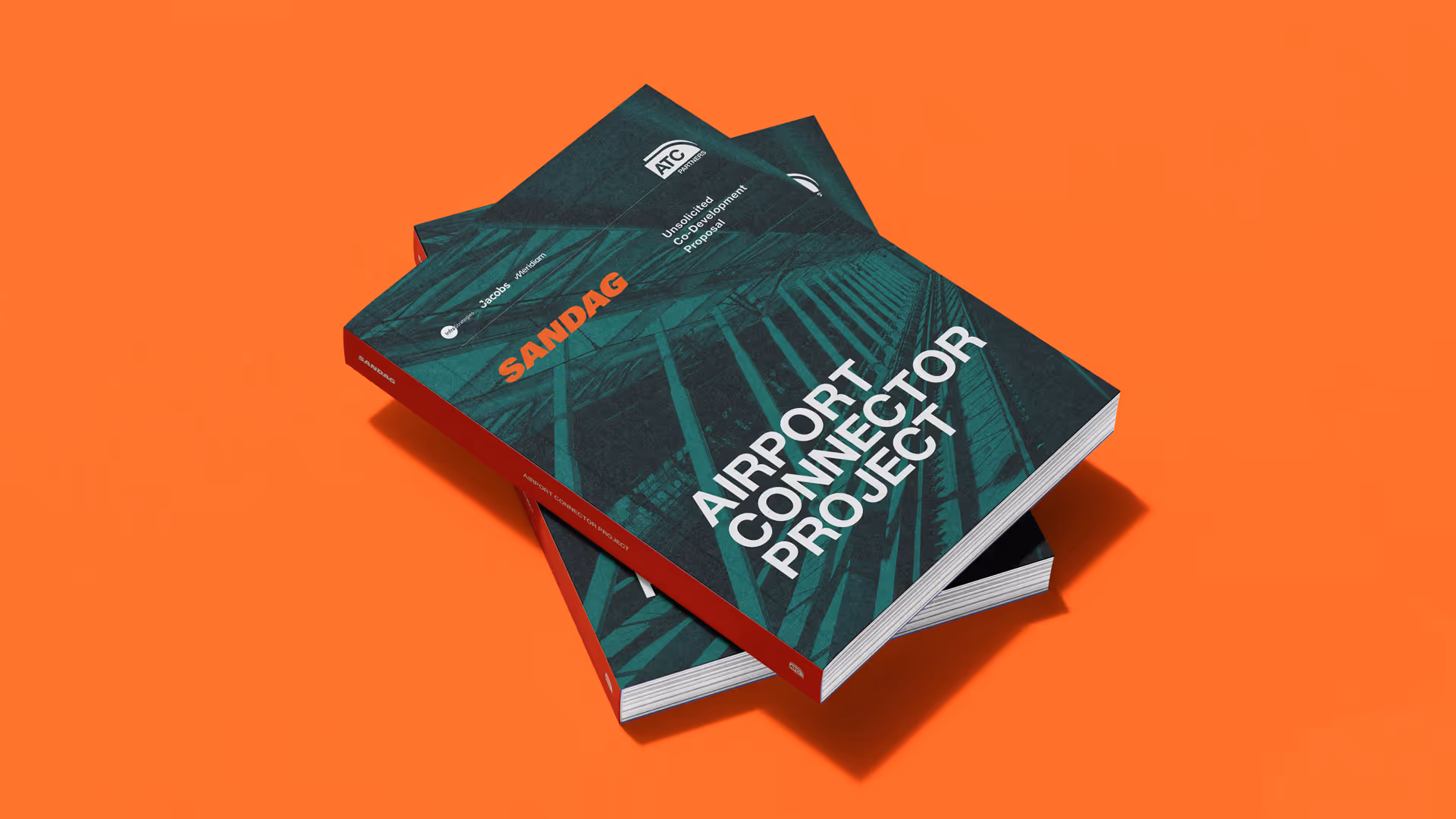

When Infrastrategies and Meridium brought us in to design their submission for the SANDAG Request for Innovative Concepts, the stakes were clear. SANDAG (San Diego Association of Governments) was inviting innovators, entrepreneurs and mobility experts to pitch transformative ideas for transportation Connector services, shaped by the region's ambitious 5 Big Moves vision. This was a competitive, high-profile tender and the bid needed to do justice to the ambition behind it.
The challenge was structural as much as it was visual. The bid was being assembled by a consortium of organisations, each carrying their own brand identity and institutional voice. Presenting that as a single, coherent proposal that felt credible, compelling and consistent. required more than a simple document design; it required a new visual identity and communication style.
Lorem ipsum dolor sit amet, consectetur adipiscing elit, sed do eiusmod tempor incididunt ut labore et dolore magna aliqua. Ut enim ad minim veniam, quis nostrud exercitation ullamco laboris nisi ut aliquip ex ea commodo consequat. Duis aute irure dolor in reprehenderit in voluptate velit esse cillum dolore eu fugiat nulla pariatur.
The consortium was named ATC Partners: a name built to unify the group under one umbrella for the submission. To solidify that identity we created a logomark which drew on the rail infrastructure at the heart of the project. Minimal, precise and purposeful, this needed to give the partnership a shared emblem that made it feel like a well established organisation.
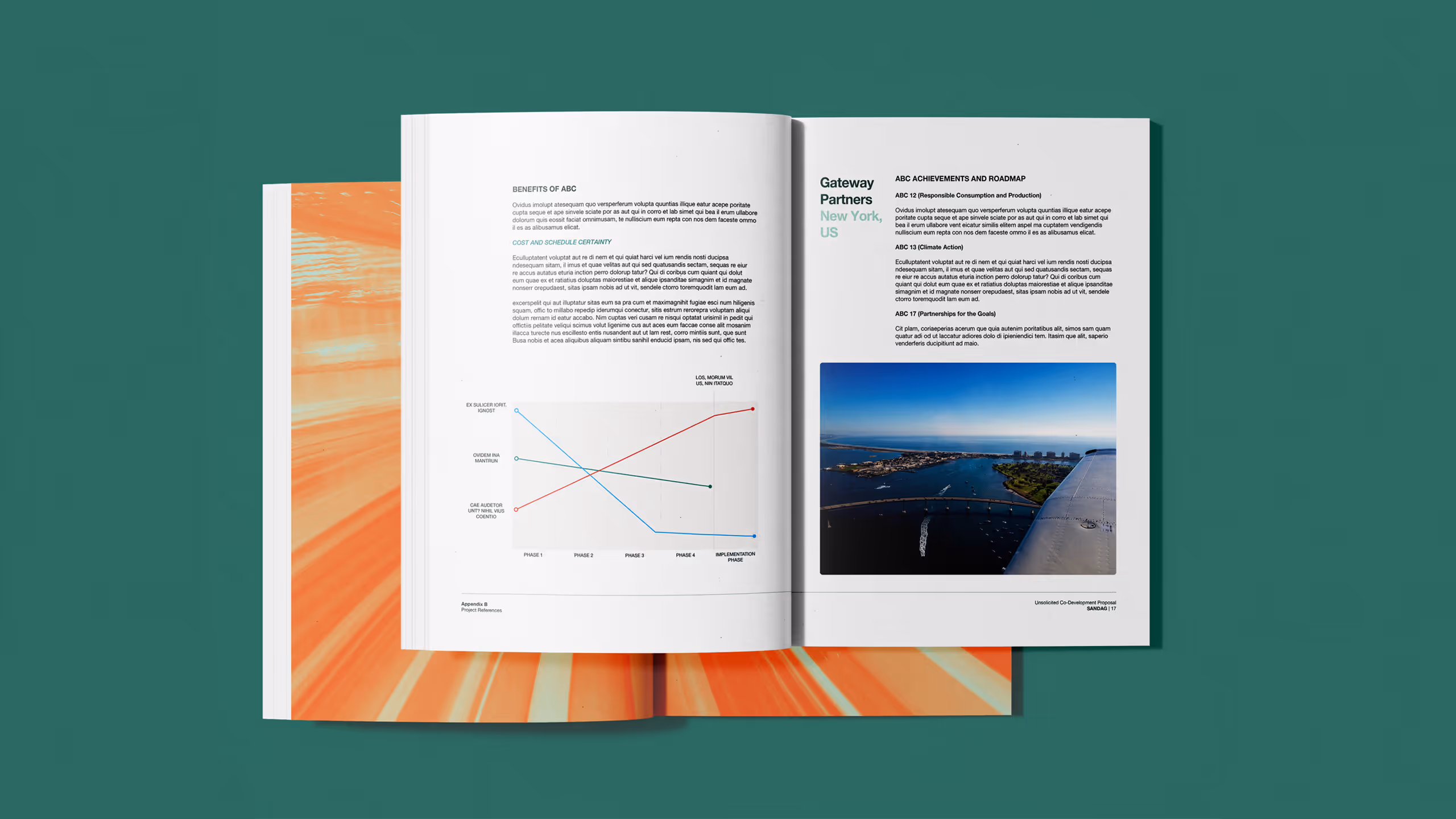
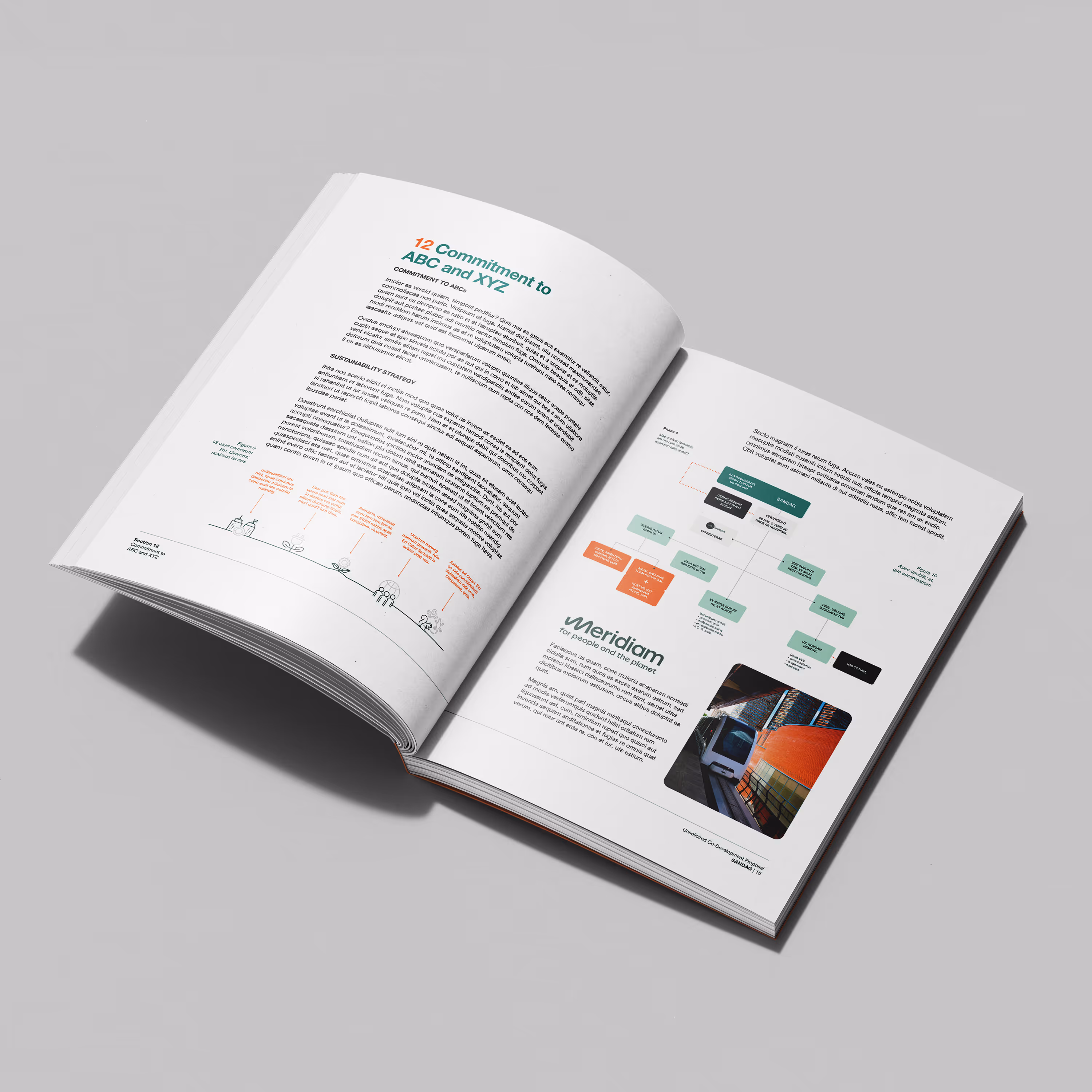
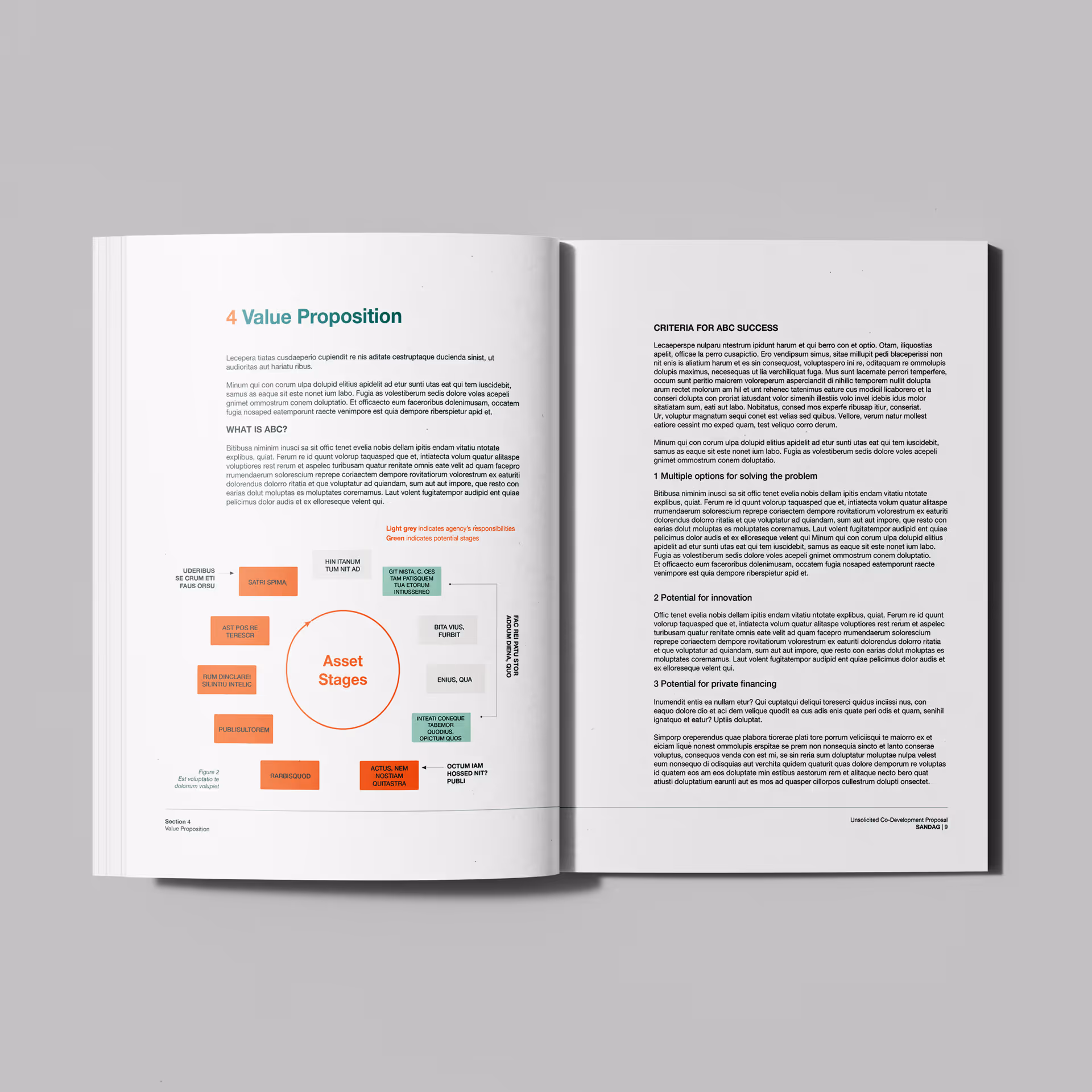
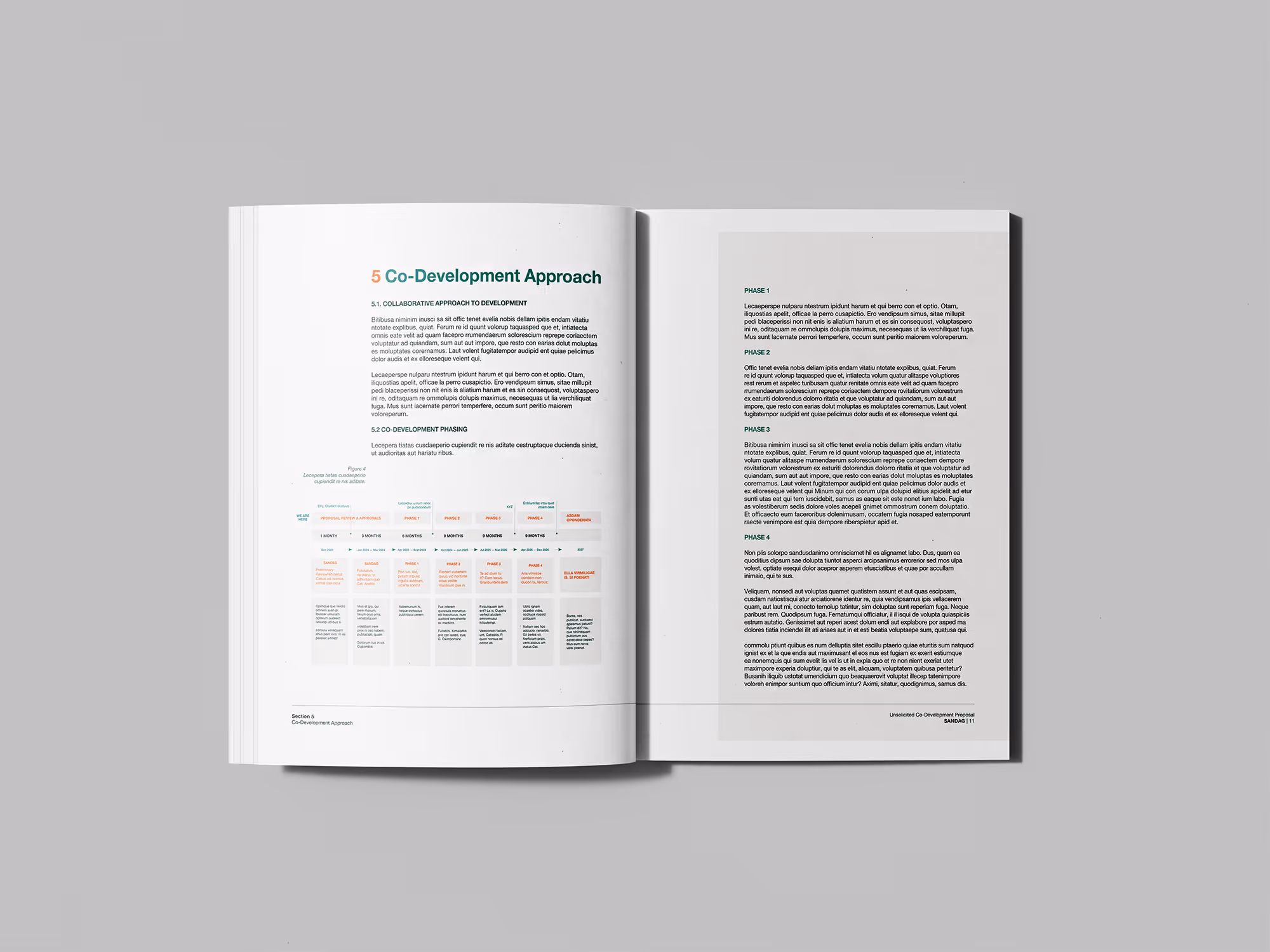
With the identity established, we turned to the document itself. The raw material was substantial, consisting of roughly 100 pages of dense text and data sourced from multiple contributing organisations, each with their own formatting habits and house styles. Our job was to turn that into a clear and enjoyable document to read.
The design language we developed sits at an intersection: authoritative enough to function as a formal bid document, but with a bright, optimistic, future facing style that was designed to engage and inspire confidence.
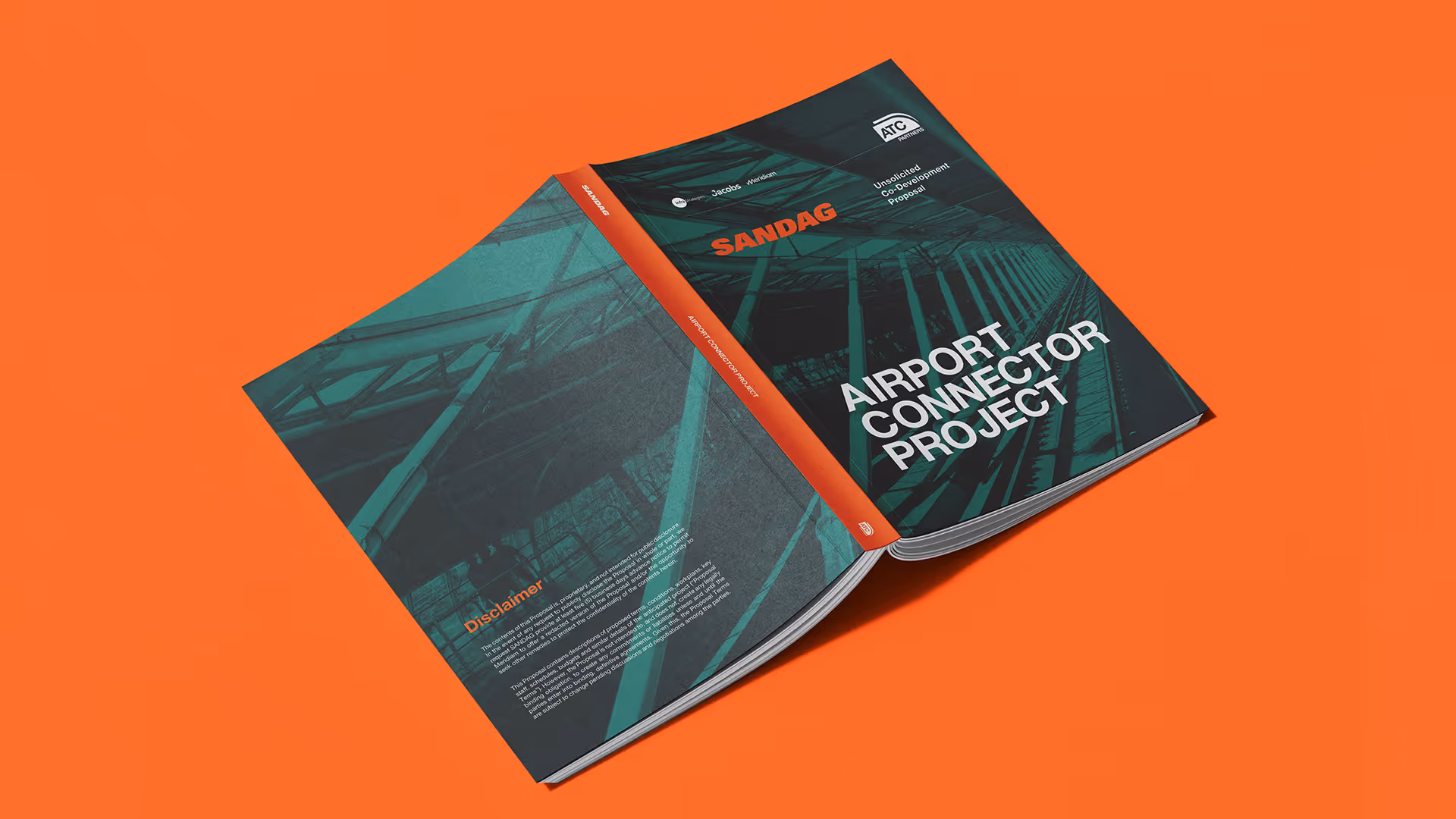
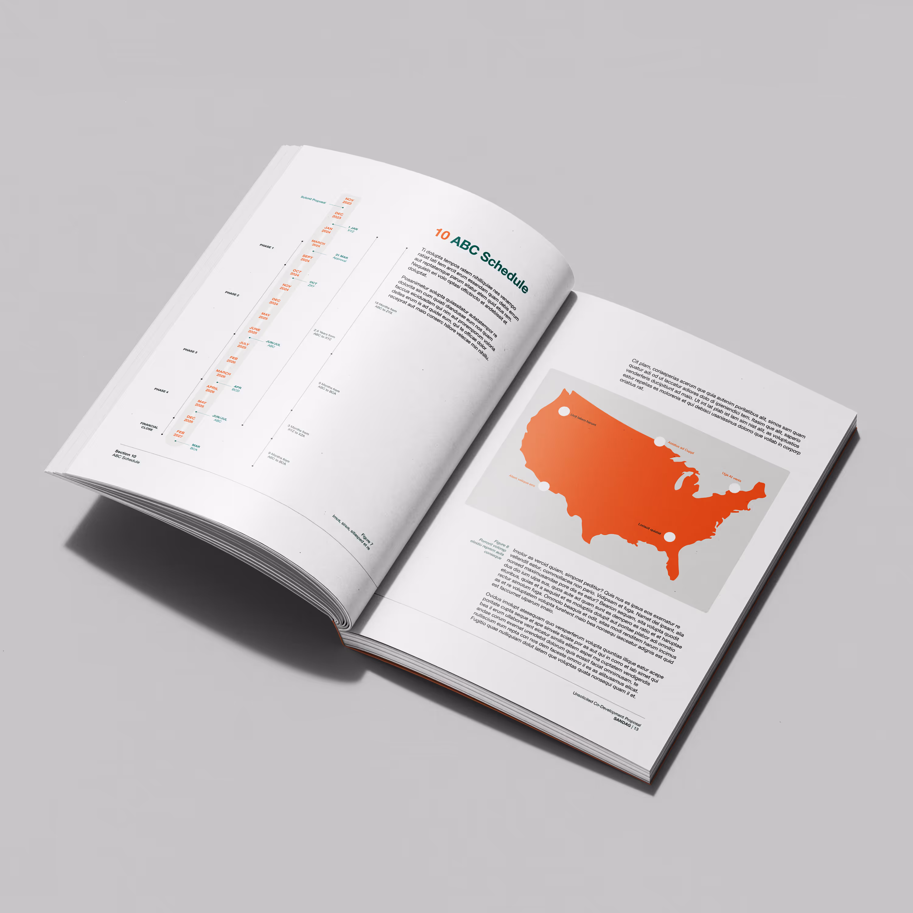
We also sourced and integrated licensed photography to carry the aspirational dimension of the proposal. Infrastructure bids can easily become abstract; filled with abstract future projections and policy language. The imagery grounded the vision in something felt, suggesting a project that already has a life in the imagination. Readers could picture the outcome before they'd finished the page.